
Showing posts with label GREETING CARDS BRIEF. Show all posts
Showing posts with label GREETING CARDS BRIEF. Show all posts
Wednesday, 12 December 2012

Tuesday, 11 December 2012
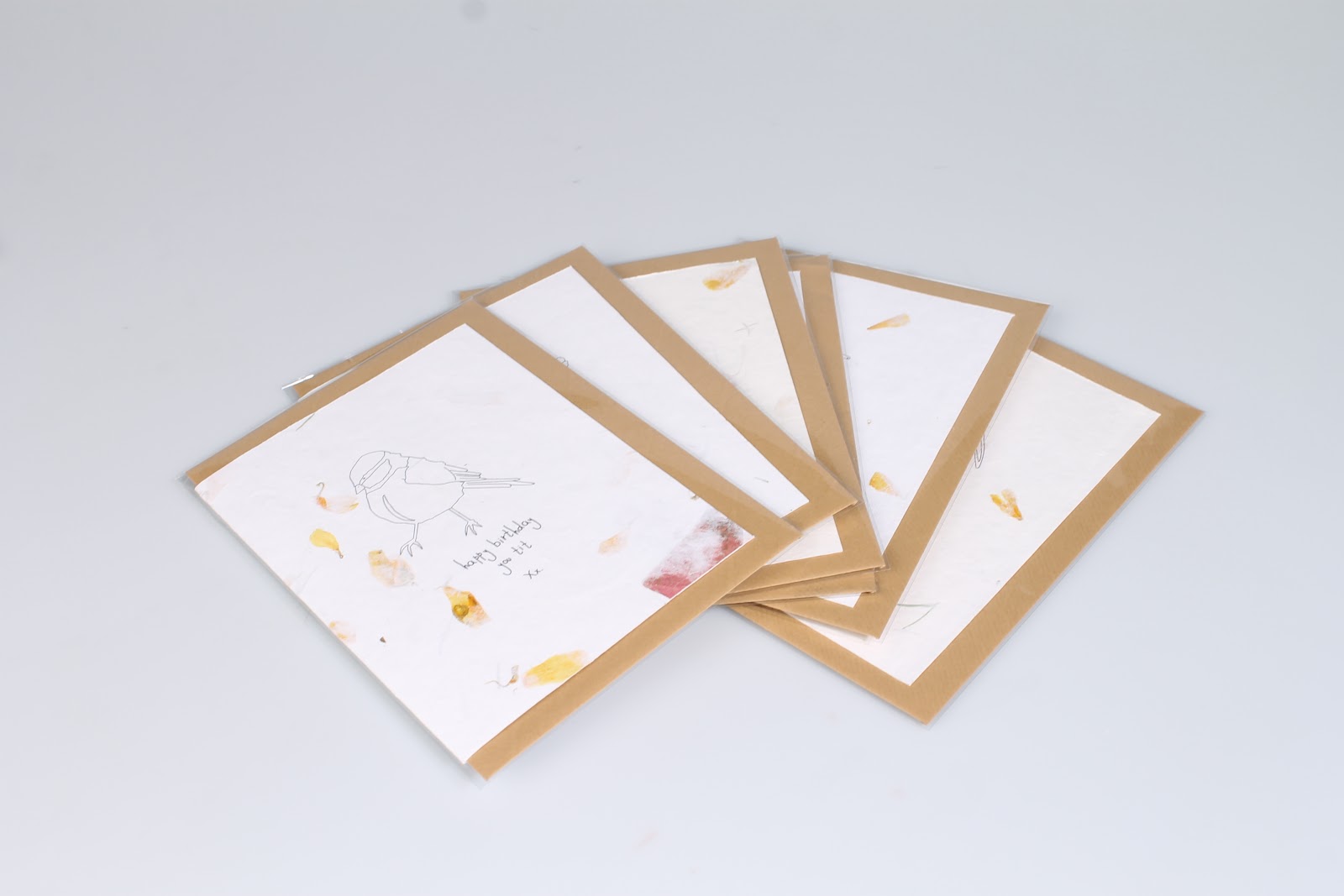
Greetings cards submission photos

These are the photos I took in the photography studio in preparation for my design submission boards.




Monday, 10 December 2012
Greetings card brief packaging stickers

I have designed sticker labels for the gift wrap and gift tag packaging. I have made my own barcode for the product. I couldnt use my typeface for the text on the label as it needed to be a bit more formal. Instead I used Century Gothic which is a nice simple typeface.

I have used my typeface for the label about writing your message as this fits with its content.

This is the final label, everything has been centralised and the only information on there is what is needed. These will be printed onto white sticker paper and placed onto the cellophane bags that the gift wrap and gift tags will be packaging in.

Greetings card brief gift tag designs

I then thought it would make sense to design gift tags to go with the girt wrap. The tags are the same pattern that is on the gift wrap but on a much smaller scale. These will be printed onto quite thick stock and be the standard size of a gift tag.


Greetings card brief gift wrap designs

The actual YCN brief just asks for a set of greetings cards with a theme but I have thought about extending the brief into making a range of products that can be sold together. One idea was gift wrap, it would be good if I had a matching gift wrap for each card so that people could coordinate their gifts.

I have used the animal and made a pattern from it which also includes the text. The pattern is repeated and will be of A2 format.

Some of the designs are more complex than others but you can always see what the animal is and obviously still read the text.

The penguin for some reason was the biggest challenge when trying to make some kind of pattern with it, I think this was down to the shape of the penguin. I have done two different designs for the penguin to try and decide which one is best.

I think that I prefer this one where the penguin is placed diagonally across the page. It just seems a bit more exciting.

My favourite three designs are the owl, the chicken and the blue tit. This is because of the shape of the bird it was easier to create more interesting patterns. They look quite pretty compared to the others.


Greetings card brief final card designs

This is how the cards are going to be set out for print. Everything will be central to the page and they will be blank inside for someones own personal message.

The size of the cards is going to be A6. I didnt want them to be much bigger otherwise the style of the animal didnt seem to work as well at a larger scale.

The balance between the type and the illustration works well, there is no hierarchy as such which means the whole design compliments itself.


Greetings card brief final critters and logo

These are the final animal illustrations and the second logo idea.

This is the final final set of animal illustrations and the final logo. I love how everything just works together. There is such a charm about it all.
Subscribe to:
Posts (Atom)