The B word...
The brief is to design a mail shot that can be send to an appropriate mail listing. The mail shot, much like part one of No news is good news has a restriction of two colours plus stock. The mail shot must pose a question, opinion or fact related to my initial research of tattoos, you can also combine these statements.
Statement of fact:
One in three Britons have a tattoo.
Statement of opinion:
Tattoos are a way of self expression.
Question:
Two out of three Britons dont have a tattoo, are you one of them?
Before i start to solve the problem set by the brief i need to answer the following questions:
What? What is it i need to communicate?
How? How am i going to communicate this?
Why? Why to i need to communicate this?
Who? Who am i trying to communicate this to?
Am i trying to inform, instruct, educate, persuade or promote?
When designing my mail shot, am i going to contain, conceal, deliver or reveal my message?
All these questions are being asked in order for me to deliver a message in a relevant and creative way in order to communicate with my target audience.
My initial idea was to design a promotion for a tattoo parlour, posing the statement of fact with a question:
' One in three Britons have a tattoo, have you got yours?'
This could work in two ways, either people can see it as simply a piece of promotional design for a tattoo parlour, or they could begin to argue against the fact that so many people have tattoos and they dont agree with it.
My audience will be over 18's, as thats the legal age for getting a tattoo and within that, people who dont have a tattoo. I want my mail shot to relate to the first part of No news is Good news, im going to use the same typeface, imagery and colour palet. With the imagery i was told that on my posters it wasnt clear what it was so im going to use it in a different context.
This is my first idea for my mail shot, it would either be the front or the inside of my piece of promotional design. I have kept most of the elements from my poster designs from message and interpretation. The imagery is the same but i have used it in a different context. It is now a sort of pattern to 'decorate' the background layer of my design. The tribal tattoo design has been combined in different ways with English Rose symbol. I have kept the font the same as i think it works well in terms of representing the theme of my designs.
This design is the layout for the inside of my promotional design, the centre of the centre rose is where it will fold in half. Im going to use red as one of my colours still because it links with tattooing in terms of that you bleed slightly when having a tattoo done, its also a visually strong colour which catches peoples eye.
Examples of mailshots
This is the cover/ back cover for the above design, i have placed my fact on the cover along with the decorative tattoo pattern. Im not really sure though if this would make people open my mail shot as theres not really anything they can immediatly engage with. But then again on the back of my envelope i want to state the question 'Have you got yours?' meaning have you got a tattoo, but they wouldn't know this until they opened the mail shot. It captures peoples curiosity and they then engage with the mail shot, this is important and must work within my design in order to fully promote my 'tattoo parlour' in an effective way.
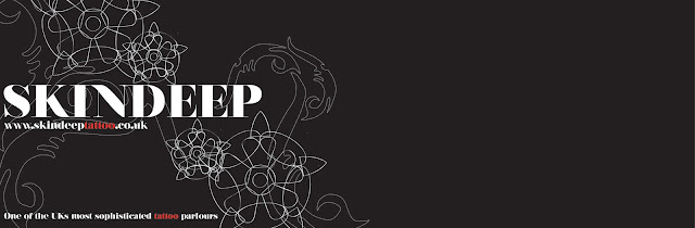
Because i am designing a promotional mail shot for a tattoo parlour, i did initially make a name up, that failed as it sounded tacky and boring 'Tattoo Ink UK'. So i changed it to 'SkinDeep', which is actually a tattoo parlour that exists. I think that this works a lot better as in a way it creates its so message : Is tattooing really just skin deep or is there more to it than what meets the eye, as people dont just have tattoos for getting a pretty picture permanently drawn onto their skin, they sometimes have a tattoo done for personal reasons as a way of self expression.
This is another design for the cover of my promotional design, again i've used the same font and decorative tattoo design. I have made a website up for my tattoo parlour, which does exist as a real tattoo parlour but is NOT the one i am designing for. This something i should of maybe researched before i chose a name.
I have looked at tattoo parlours in London as i want it to be linked with the English Rose design, i found a tattooing studio called Extreme needle based in London, whose colour scheme on their website is red, black and white so it fits in perfectly with my designs. Their logo also combines an elaborate design combined with the Queen, so again that link with England.
This is a 3 fold design, folding from the left to right, the question has been placed on the cover to capture peoples curiosity, the middle section has my fact on it which will also have a designed business card and once its opened out it will show the tattoo studios name and website next to it. I think this design works well, its simple and effective. I didnt want to over work my designs as thats not a style i like to work in, i think because i have like the decorative pattern that adds enough detail. If i were to make the mail shot's physical design too complex it takes the audience away from its purpose.

This design again is a 3 fold but it collapses down rather than from across. The question and fact will be on the cover together this time, although im not sure if its too much. The middle section which looks blank will have a business card in it and the bottom section has the tattoo studios name and website and a small caption that 'bigs' it up. This design could work well as a poster.
I then looked at making a poster that would unfold from a 2 fold design, because of the decorative pattern and the simplicity of the layout and use of text it could be something someone keeps and sticks on their wall. I did have a few technical problems when folding this poster up but i took it as a learning curve. I just had too many sections for being able to fold it down in an effective way.
This is the design for my business card, i have tried to keep it simple and to the point but kept the continuity going from the other designs. I think that the reversed out text at the bottom works well, it just adds a different visual element.
This design is a 4 fold, folding across from right to left. The decorative pattern helps to link the four sections together so it doesnt look awkward when its unfolded.
This is one of my sample ideas, it is set up much like landscape card. I wanted to use silver envelopes to post my mailshot in, but i soon found out that this was not practical.
These are the nets for the above idea, it works well in terms of the inside aesthetics but the way in which the whole thing is put together is a bit boring.
The design of my business card has pretty much stayed the same, i did change the font though as i felt this one was too bold and didnt really link with the idea behind my mailshot.
Above are the three final pieces to my mailshot. I changed the design so that people could interact with it more and it was more visually exciting and engaging. The outside of the mailshot, on the back, has a question 'Have you got yours?' this automatically engages with my audience, it sparks curiosity and makes them want to open the mail shot to see what the question is asking of. Then as soon as they have opened that back bit ive captured them and they'l hopefully read the contents. The insdie design contains details of the tattoo parlour im promoting, such as the address and website, i created a patterned design from the imagery i used in my posters. The design is set as a background so its not the main focal point but its still there, kind of like hidden symbolism.
The rose symbolises The English Rose which there links with London as its the capital, and the actual tattoo parlour is in London, and the tribal pattern is a well known style of tattooing.
The way in which the pattern starts to climb up the page well and the layout of the information makes it clear for my audience to read and understand.
The typeface that i have used is Footlight, its a serif font that has a gothic feel to it. I chose this font because it looked as though it resembled tattoos.
The colours that i chose all have a meaningful purpose of being used. The red used for some parts of the text including the word 'tattoo' indicates blood, as you bleed when you have a tattoo done, not only that but red is an English colour in terms of St Georges Cross. The black has been used because tattoos have a black outline and it is a sophisticated colour. Finally with the silver i was going to initially print onto silver paper but it wasnt practical once i had tried it, so i went onto photoshop and found a Pantone metallic coated silver. The silver indicates the needle when having a tattoo also sterilisation, again silver is also quite a sophisticated colour.
Above is my mailing list, i have chosen 10 addresses of which it would be suitable to send my mailshot to:
Leeds college of Art Student Union
I chose to add the student union to my mailing list as we are over 18, which is the legal age for having a tattoo. Quite a lot of people in my age group are interested in getting a tattoo so it seemed appropriate.
Liberty Park
Liberty Park is a hall of residence in Leeds, so again my mailshot could be put into each flats letterbox, its an easier way dispersing my mailshot.
Vue Cinema
Vue cinema have booklets in which people can advertise their company, i know its not the same as a mailshot but then again the business cards could be put somewhere where people can pick them up.
I then picked a few clubs in Leeds where its popular with the student community, people could stand outside giving the mailshot out, which i know is defeating the purpose of a mailshot.
Because the tatto parlour is in London i found a few places likes clubs and the London Arts Student Union address, because its closer to there it is important to promote to the local area of the tattoo parlour.
I am really pleased with the final mailshot design, i had a lot of challenges throughout this brief and i would say it was the most challenging so far. I had to really learn from the mistakes i made in initial designs to be able to create something that had all the qualities it needed to be a successful engaging visual piece of communication design.