

This is from the How to... brief, which was set between a small group.We created our problem and went through a range of process of ellimination to then find a resolution to the problem.The title of our brief is 'How to survive Leeds weather on a student budget'.From these brainstorms we will gather research to support our final outcome.


The brief came from situations in which students found difficult when moving to university.Ideas that we came up with included homesickness, time management, money management, weather change and things like the long walk to college.The concepts we came up with are something we can all relate to as we are new students.


I have done some research into pakamac ads and student booklets and informative graphics. I wanted to look at how current information graphics was used in the approach to the student generation, and of course looking into the history of the Pakamac which inspired my student survival kit.The student booklet image is very busy but the layout works.I wanted to keep my poster design simple as that is a particular style i prefer to work in.The pakamac ad is very retro and old, it gets straight to the point and has a very effective punch line.

The above photo summarises the ideas that i have for the particular message i am communicating to the student audience.

When we had been given the format that we had to work in (poster), we had to design suitable layouts that would be 'student friendly'. The idea of having an easy informative way of communicating with our audience all links with the type, colour and imagery we use.

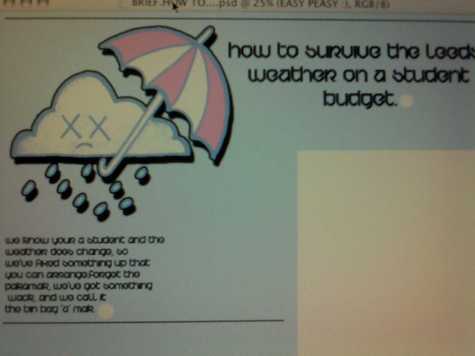
My ideas have began to come together in a sense that i know what sort of style i want my final outcome to be like.The layout i have chosen to work with is clear and simple, there is a fair bit of negative space, which makes it easier to read.The imagery i have used in this sample is hand drawn and then scanned and edited on photoshopped.The type is informative yet humourous, therefore making it more appealing to a student generation.


Within my poster i have also included photography, which is another design aspect i enjoy to work with.The photos are of the Bin bag 'a' mak being modelled by myself.This is a good selling point, if a student is shown wearing the product then it engages well with the student audience as it is an example of how it can be useful and student friendly.The first photo seems to formal where as the second is fun and more light hearted, again a good way to engage with a student generation.


The two designs above contain the type and imagery that will be in the final solution.After looking at the layout of the poster i thought that there was to much negative space, which made the poster look empty and incomplete.
I have changed the paragraphs of text into a colunm, it looks more organised and easier to read.


These are the final solution posters, they are communicating the invented idea of a student "Bin bag 'a' mak". The design is informative, yet i have tried to communicate my message in a clear and simple way. I figured if you overload a student with too much text, they just don't take the information in. Hence why i changed the text layout.The colour used for the base is a cold pastel blue symbolising cold, wet weather, but the red on the umbrella is very vibrant and draws your eye in. The steps of how to make the Bin bag 'a' mak have been put into a white box, this emphasises them and makes them easier to read.


The above images are the final outcome of the 'How to...' brief.The final solution was in the format of a poster, i have photographed them with the made product and an object that relates to the ideas.
No comments:
Post a Comment