Showing posts with label OUGD205. Show all posts

Sunday, 22 April 2012

Image// Self initiated brief..

For my self initiated brief I have decided to design a small pack that will contain information on the 6 most common UK Ladybirds. The pack will contain illustrations of the different species along with Ladybird facts and recording cards. My target audience is between the ages of 5 and 10, this means that my designs will have to be simple, colourful and engaging. The aim of the pack is that children would be able to go out with their parents and look for the 6 different species of Ladybirds, when they find a particular species they can record it on a card. The illustration cards will help the children identify the different ones.


I decided to use the illustrations that I had used for the Book works brief, as this brief is an extension from that. I have altered the images so that they look like the 6 common Ladybirds. These designs are the ones from the previous brief.


This was the first card that I made for the pack that would be a tick chart for the Ladybirds that had been spotted. When I printed it out the white circles were lost in the green and then after thinking about it I decided that the green was too dark and dull anyway.


This design was one from the Book works brief, I was going to print it out as an A4 poster but then didnt see the relevance.


This is the card that has the 10 facts about Ladybirds on it. I found these facts on a childrens website about Ladybirds which means they will not be too complicated for my target audience to understand.


For the illustration cards I tried laying them out like the one I had as a poster, with the circle and then the Ladybird crawling around it. I have then placed the name of the species in the centre of the circle.


I decided to stick to a certain colour palette for the backgrounds of the cards, which are blue, green and a loight brown. The reasoning for these colours are that they are bright and do not take over the Ladybirds.


This is the design for the recording card that will go inside the pack. I have put on the 6 species of Ladybirds so that the children can tally how many they see. There is also space for the place, date, weather and name for the children to write in.


After looking at the previous designs I decided to change round the layout of the illustration cards as I think that the Ladybird wasnt big enough in the other designs. I need the illustrations to be big and clear for my target audience. So I have moved the Ladybird to the centre of the card and made it a lot bigger. The type has then moved underneath it, so it is all central.


I then tried moving the type to the left hand side and running up vertically. I think this works better than everything being central because then children will focus more on what the Ladybirds look like rather than the name, as this will help them find the different ones that there are.


The above designs are my finals for the pack. It includes 6 illustration cards, one blue checklist card, an information fact card and four record cards.


Here are the illustrations that I used within my designs, they are the UK's 6 most common Ladybirds.


Tuesday, 17 April 2012

Image// Book Works brief..

Brief//

You are required to create an edition of 5 'books' visually/ contextually based upon one of the following:

- A colour
- A typeface
- A sound
- A shape

Considerations//

THINK VISUALLY. Consider what the visual essence of your subject matter. What are you trying to communicate and how do you do this most effectively?

Appropriate format, scale and content for 15th International Contemporary Artist's Book Fair.

You must explore colur, type, sound and shae before selecting a subject matter.

Practical considerations//

What is a 'book'? How can you challenge this in terms of media, proicess and context.

As you will be producing an edition of five books will this effect how you will have to make decisions regarding reproduction within the time scale and cost?

Background//

15th International Contemporary Artist's Book Fair, Friday 9th and Saturdaty 10th March 2012. The Parkinson Court, University of Leeds.

The Contemporary Artist's Book Fair presents unique and multiple book works by artist and publishers from around the world.

As part of the module I organised a space for BAGD to display works and submitted a statement and images for the exhibition catalogue.

Mandatory requirements//

All images should be supported by a broad range of visual investigation in the form of design sheets and notebooks.

An edition of five books to sell at either £5 or £10

Deliverables//

An edition of five books based upon either colour/ typeface/ sound/ shape.


-----------------

For my initial ideas I was thinking that I wanted to work with a shape, colour or typeface. I wasnt sure about the sound as I didnt really see what I could of done with it. The other three options were looking at either the colour orange, the typeface Century Gothic or polka dots.

I soon ruled out polka dots as I had already based a big brief on them in a previous module. With the colour orange I was thinking.

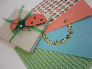
Below are my final designs for the book fair. In the end I decided on making a pack of postcards rather than an actual boook, I guess in a way it is a book of postcards. I made eight postcard designs all together each with a different pattern on. Some had singular Ladybirds and others were laid out in patterns.

I made 4 books altogether as one messed up. I decided to sell them for £5 and managed to sell just one.


Image// 2D to 3D to 2D Brief..

Brief//

In response to the drawn image you have created you are required to re- create the image three dimensionally and record the outcome photographically.

This brief will allow you to explore material, environment, scale and form.

Considerations//

THINK VISUALLY. Develop a range of visual solutions to this problem. How many ways can this narrative be recreated?

What scale do you intend to work on? Is the image sequential or static?

Does the photographic process you use reflect the tone of the drawn image?

Practical considerations//

This brief explores both drawing based principles and photographic processes.How can you translate one method to the other and how do you bring them together?

Are there any practical considerations you must consider in terms of how you work and how will you move beyond these?

Background//

The process of documenting methods and how you record/ catalogue/ collect these methods are as important as the final outcomes themselves.

You will rarely produce a piece of work three dimensionally and not have documented it in some form. This documentation is necessary for the image to communicate to an audience.

Mandatory requirements//

All images should be supported by a broad range of visual investigation in the form of design sheets and notebooks.

Deliverables//

One visually resolved 2D to 3D to 2D image submitted on A3.


---------------

The object that I was given was a glove. I then had to think of a verb and an adjective for the glove to communicate this through the 2D to 3D to 2D brief. My verb was unravelling and my adjective was busy.

We had to first draw an image of the object illustrating the verb and adjective.


This is the image that I drew of my object illustrating the two words.

The idea that I first had was to buy a glove and unravel it and then photograph it. I wanted to unpick the stitching and make it look really messy, but keep the shape of the glove with the fingers so it was still easy to see what it is.


These are some pictures of how I transformed my 2D drawing into a 3D object and have then photographed it. I dont think it works too well because I already had this glove and I had cut the fingers off which makes it less obvious its a glove.

Monday, 16 April 2012

Image// Rain Brief..

Brief//

The brief was to design an A2 poster that illustrated why rain in the UK was a good thing. For this brief I looked at ways in which I thought rain was romantic and fun and also the animals that enjoy the rain. The first thing that came into my head was ducks, ducks seem to love the rain. So for my poster design I have illustrated two ducks in love, standing in a puddle in the rain.

I think that the poster has worked really well. I like how its humerous and light hearted. People should love the rain because you can have fun in it.


Thursday, 12 April 2012

Image Brief Three// Scale/ Frame/ Format..

The Brief//

Using the object that you have randomly selected you must create an eye chart replacing the conventional series of letters with your object.

This brief will allow you to explore scale and format, as the object must be able legible and identifiable  from the distance of twenty feet and work across a scale range.

Considerations//

THINK VISUALLY. Develop a range of visual soutions to this problem. How many ways can this object re-created? How much detail must you maintain for it to communicate? How can it be simplified?

Consider the colour. Which colours will work across scales effectively? Add clarity or cause confusion.

Line quality will become an important factor, as the change in scale will affect the detail of the drawn image.


Practical considerations//

This brief is drawing based. You must explore a range of processes and the resolution may be either computer based or hand crafted but you must initially test a range of approaches.


Background//

Pictograms and signage must work across a range of scales and still maintain a clear and direct message. They might have only a second to communicate their message so their intention must be immediate and cause no confusion.

The image can exist entirely on its own, no explanation required.


Mandatory requirements//

All images should be supported by a broad range of visual investigation in the form of design sheets and notesbooks.

The final image presented on an A2 portrait format.

The eye chart must be produced using two colours (including stock)


Deliverables//

One visually resolved eye chart submitted on A2.


--------------------

To find out the object that we would be using as part of our eye chart, we were all asked to pick a random object (thinking of one on the spot was quite difficult, especially when you thought you'd be the one doing that object). Once everyone had picked one, we were told to pick a number, the number was with an object and we would be using.

When I first recieved my random word I was a bit concerned on what I would do as the brief restrictions only allowed 2 colours (one of which was the stock choice). I knew that we could use tones of a colour, which would therefore make things a little easier for me. There was also the problem that the eye chart would have to be readable from 20ft, which meant I would have to simplify the Rubix Cube to its simplist form.

Rubix Cubes arent that complicated to start with, but I wanted to make it as simple as possible, but still know what it is. What I decided to do was focus more on the coloured squares rather than the actual cube itself. This meant that there wouldnt be too many lines, so that when it was shrunk to a smaller size the lines wouldnt merge together and become messy.


For creating the Rubix Cube I used the rounded square tool and picked my blue. To change the colour I edited the opacity values of random squares to make it look as though the Rubix Cube had been played with, which I think communicates it better. I then lined the squares up like a Rubix Cube and used the rotate effect in Illustrator to give the three sides a 3D effect.

The eye chart above was my first attempt, I have tried to lay it out like a traditional eye chart, going from biggest to smallest. Im not really sure if it works that well, it looks very top heavy and the bottom cubes are far too small they just look like a blue blob. I think it may work better if I maybe have less of them and have them slightly bigger. There is no limit on how many we must have and what size they have to be, as long as it looks like an eye chart.


I started looking at patterns that I could make with the cubes that I could change the scale of to see if this approach would work better than the one above. I do think that this idea works better because it is different from conventional tests and it looks good too. This pattern works well too because of the angles of the cubes.


Here is another design trying out layouts. I think the first two rows work because they use a similar concept as the one above, but the bottom lines make it seem too top heavy and it just doesnt work.


This is the Rubix Cube that I first made, which I have then changed the scale and angle of for the eye chart designs.


I really like the layout of this eye chart. The scale of the cube varies making it relevant to the standard eye chart but it is done in a more creative way. I like the way in which I have used the angles of the cubes to create the circular shape, it helps balance out the larger cube at the top of the chart.


For the design above I though I would play around with the cubes to see what shapes I could make. This ones a flower. I wont be using it for my final eye chart, but it looks pretty cool.


Although I wouldnt be able to use this as an eye chart, I do think it looks really good. I think its because of the two different angles of the cube, it just looks really interesting.


This design is using the same concept as the one above apart from I have added another cube at the top and bottom. These two are the same angle as the one on the left but because of the one on the right, they all first appear to be at a different angle which I think makes it more interesting. This pattern could be used within my eye chart because I could experiment with the scale of it.

This is a further development of the two designs above. This is probably my favourite and the one that I feel works the best. I dont think it would work very well as part of an eye chart but it would look pretty cool as a poster printed onto cartridge paper.


This is the eye chart that I will be using as my final piece, it has a good balance to it and the cubes dont get too small so that you cant work out what they are.


These are a few examples of how different colours may work. I decided to go with the blue because its quite a neutral colour. It is also uncommon that people are colour blind to blue.


Monday, 23 January 2012

Image// Type as image: Brief two..

The Brief//

Select three quotes carefully from the given articles (each quote must come from a different article) and visually communicate them using only text in which they are written. No additional images are permitted.

Considerations//

THINK VISUALLY. Consider what the visual essence of your subject matter is (the quote) and how best to communicate this. What are the obvious responses? How can you move beyond these?

Will the quote exist in the environment, on someones hand or a wall? Is it handcrafted or digital?

Is colour important? Will you work with just one typeface or will you use a range? Do typefaces have to be hybrid?

Practical considerations//

There are no media restrictions. You can work photographically, across three dimensions, collage, incorporate print making methods or combine all of these processes.

You can work directly onto A1 or carefully attach your type. You must be able to record any three dimensional work in two dimensional form.

Background//

The context of a quote depends upon who said it, whom it was said to (even if there was no one there), the environment in which is said and the tone of which it was spoken. 'Words' do not exist out of context.

Working with type as image allows you to convey more than simply words that have been written.

The quotes exist in the context of the articles so how can this give you visual clues as to how the text from the quote may work as image?

Mandatory requirements//

All images should be supported by a broad range of visual investigation in the form of design sheets and notebooks.

The final image should be presented on an A1 portrait format.

Deliverables//

Three visually resolved quotes submitted on A1.

--------------

My chosen quotes//

Article: This column will change your life: A big effort doesn't always mean a big effort.

'Fuzzy feeling'


Article: Relationship maths.

'You have hundreds and hundreds of online friends'


Article: Doctor, doctor: Dr Tom Smith answers your medical questions.

'So if you want to boost your immunity, the easiest way to do it is to exercise regularly'


------------


I have been looking on the DaFont website to see if I can find suitable typefaces for my 3 type as image designs. I have tried to pick typefaces that would be easy to paper cut as this is the media I will be working in. Once I have hand crafted the the A1 quotes I am going to add coloured paper underneath so that they come through some of the letters. Again the colour will be chosen for the appropriateness of the article.


-----------------------

After trying out the method of paper crafting the three A1 designs and them not turning out very well I decided to turn my designs to digital.

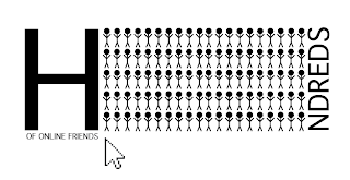
The quote that I picked for this design was 'Hundreds and hundreds of online friends. The idea that I had was to create 100 stick people to illustrate 'hundreds of friends' and then play with the word 'hundreds' to make the message more obvious. I then placed 'of online friends underneath. I think the concept works well but the way in which I have executed it isnt the best it could be. The typeface could be changed and also the arrangement of the contents.


With this design I tried to cut the words out of the people in Photoshop but it didnt work.


These designs have worked much better. I decided to change the typeface to a simpler one that fitted with the designs of the stick people. Then rather than having the word 'hundreds' I used exactly 100 stick people to illustrate.


I then started to play around with where I could place the remaining letters of the word 'hundreds'. I think that this composition of this design works well as its balanced and not too complicated. I have tried to make the main focal point being the 'hundreds' thats why I have made the 'of online friends' a lot smaller.


I think this design worked apart from the letter 'h' as it makes the design unbalanced and look as though its tipping it all to the left. I tried placing the 'of online friends' on the opposite side but it didnt have much effect.


This design is similar to the one above apart from I have made it balance out better by rearranging the letter 'h' and the 'of online friends'. It looks better than the previous but I think that the remaining letters of the word 'hundreds' that are at the bottom are too over powering and take your eye away from the people.


I then tried making the type smaller but it still feels really unbalanced.


I then moved the lower remaining letters to the side on an angle but its starts to look too complicated and I need my designs to communicate clearly.


I made the letter 'h' the same height as the people and then kept the remaining letters the same as the design above. I think this works better, because although the letter 'h' is big I dont think that it over powers the people.


I then tried changing the composition of the people to see how this effected my design. In a way I think that it works better than the previous designs, it feels less bulky this way.


On this design I added the 'of online friends' next to the letter 'h'. It looks okay there but it wouldnt make sense as its not the order of the words in the quote.


I then moved the type to either side of the people, this doesnt work at all as it makes the design really unbalanced.


After thinking about how I could add an element that would make the fact its about online friends more obvious, I tried adding a mouse arrow to the design and changing back the people to the original composition. I think the use of the arrow works well.


I then tried to make my design even simpler by taking away the word 'hundreds' and just using the people to illustrate one hundred, because of the plural I added the letter 'S' to make it clearer that I was trying to communicate hundreds. I have then placed the 'of online friends' with the arrow underneath the letter 's'. I think that this way of approaching the type as image has worked well because at first I found it difficult to think of ways to actually use type as image for this quote. But by using the people an less type it seems to have paid off.


On this design I have kept all of the elements the same as the one above except moving the arrow and 'of online friends' to underneath the people, aligned left. I then changed the colour of the type to blue as I feel this linked in with online friends such as Facebook social network.


I tried adding in the letter 'h' on the other side but I dont feel it works as well as it starts to become too busy.

To finalise my design I have added an effect on Illustrator which pixelated my design. The reasoning for this was that it helps better communicate the link with online.


------------------------


For my second quote from one of the articles I looked at 'fuzzy feeling'. I picked out this particular part of the article because I had an idea for it already. I decided to play on the visual elements of fuzzy. In this case I have used the static of a TV to visually communicate a fuzzy feeling. I traced a TV from an image using Illustrator and then used an effect in Illustrator which makes a shape look fuzzy like TV static. After creating the base I added type which also had the same effect on it and placed it on the TV.


This is the final image for this quote. I think it works really well and visually communicates 'fuzzy feeling' clearly. I decided to use Cooper Black as the typeface as it is very bold and curved which I felt suited the TV illustration. I also wanted to keep the typeface simple as it was going to be harder to read any way with the effect that it has on it.


I tried changing the opacity of the type to see how light I could make it with it still being readable. When I printed this one out, you can read what it says but you have to look closely which is what I think works best about it.


----------------------


This is the last quote that I looked at 'I wish I could', I think that this design is really simple but it does work. Stars are often associated with wishes, so I played on this when I used the stars. Its a really simple design. I decided to use this typeface because it reminded me of Hollywood and typefaces that are used in the movies. I placed the stars in random places because I already felt that the type was neat.