Here are my rationales for my chosen briefs for this Design Practice module
Brief One// Puffin Wind in the willows
- An illustrative investigation of childrens books with a focus on retail.
- A design for print investigation of illustration with a focus on childrens books.
- An illustrative investigation of childrens books with a focus on design for print.
- A design for print investigation of childrens book covers with a focus on illustration.
- A childrens illustration investigation of retail design with a focus on design for print.
An design for print investigation of illustration with a focus on children's books. I am going to design illustrative book covers and other print based designs for retail based on the children's classic The Wind in The Willows because this will allow me to develop my illustration skills and apply them to a range of outcomes.
My product is a set of children's illustrations for the children's classic story The Wind in The Willows. The range will be a set of book covers (at least five), book marks, posters and shop signage. The distribution for this brief will include children's books, e books, web, gift bags and shop signage.
Brief Two// Confectionery branding
- A branding and identity investigation of confectionery retail with a focus on packaging and promotion.
- A design for packaging investigation of confectionery retail with a focus on branding and promotion.
- A design for print investigation of confectionery branding with a focus on packaging.
- A brand and identity investigation of packaging with a focus on confectionery promotion.
- A packaging investigation of confectionery brands with a focus on new product promotion.
A design for print investigation of confectionery branding with a focus on packaging. I am going to brand and promote a new confectionery brand because this will allow me to develop my brand and identity skills along with my packaging and promotion skills.
The product I will be creating is the branding and identity for the confectionery brand, this includes a logo. The range will include a variety of confectionery items like chocolate bars, bags of sweets etc and the distribution will be the packaging, gift bags, shop signage and a website.
Brief Three// VW Beetle
- A print based investigation of car retail with a focus on publication.
- A design for print investigation of promotional publications with a focus on car retail.
- A promotional publication investigation of car retail with a focus on design for print.
- A type and layout investigation of printed publications with a focus on car retail.
- A print based investigation of car retail promotion publications with a focus on type and layout.
A print based investigation of car retail promotion with a focus on publication. I am going to promote the new VW Beetle using print based methods, I am doing this because it will develop my design for print skills, type and layout, illustrative skills and working on something out of my current comfort zone.
The product will be a promotional piece for the new VW Beetle. The range I can apply this to is a publication, magazine ads and a moving image. My methods of distribution include mailouts, retail environment and the web.
Brief Four// Origami
- A paper crafting investigation of self promotion with a focus on branding and identity.
- A branding and identity investigation of self promotion with a focus on design for print.
- A print based investigation of self promotion with a focus on Origami.
- An Origami investigation of design for print with a focus on self promotion.
- A design for print investigation of self promotion with a focus on Origami.
A design for print investigation of self promotion with a focus on Origami. I am going to use the art of Origami to explore ways in which I can promote myself using print, I am going to do this because it will help me to promote myself as a designer in a unique way.
The product will be my self branding and identity. The range will be a creative CV, a business card, letterheads, portfolio and a website. The distribution will include mailouts, email and website.

Showing posts with label WORKSHOP. Show all posts
Showing posts with label WORKSHOP. Show all posts
Sunday, 7 October 2012
Tuesday, 24 January 2012
After effects workshop// number 5..

This workshop was about looking at movement and how you could speed up and slow down objects to make things look more realistic.

This is where you can find the option to ease in or ease out objects along a position path. Ease in would make it start slow and speed up, ease out would do the opposite and then there is the option to do both together.


This screen shot shows how the dots on the line appear closer together if the object moves faster over this part of the line.


These graphs give you the option to change the balance of the speed along the position line.
Tuesday, 13 December 2011
//After Effects Workshop..
These are some practising experiments of using AE in a workshop. We were given the imagery to work with which was from either Photoshop or Illustrator. We then placed them onto a time line and changed time and movement elements in the effects palette. The aim was to try and make the word do what it said.
This motion was about bringing in a shape from Illustrator and using it as a guide for movement for the shape. When you then play the motion it moves around the shape but the shape isnt visible. This means you can make any shape in Illustrator and you can make the object move around it.
This was about revealing the word reveal, you make a white box over the text and on the timeline you set it so that as the time moves along the box gets smaller therefore revealing the word.
This motion was really fun to make, you bought in a word from Illustrator and make it so that you can manipulate the paths. As you add key frames within the sequence you can alter the vector path to distort your text. In this case I made it look as though it was melting.
This short motion was about making the box move along vector lines and bezier curves. Using AE to create short motions like this is actually fairly easy. Once you get the hang of it its simple to move the object around the space.
This was probably the most exciting thing I have learnt yet with AE.
Monday, 12 December 2011
Design for digital// Workshop 5..
As part of the silent movie brief, we have started looking at how key frames are used within a sequence in preparation to be taken to After effects. We had to choose a kinetic type video from the web and take screen shots of points in the video using equal time spacing. We also had to screen grab 25 key frames from the sequence.
We then put these onto a time line to show where they went within the sequence.
I learnt a lot from this workshop as I didnt really understand the importance of sequence making, time lines and key frames before now. I did actually do this exercise wrong as I didnt use the full video but I still learnt how to use the key frames across the time line.
I think that I mainly learnt the importance of knowing how to communicate timing when drawing out a sequence on a time line, because in industry you would need to effectively storyboard your ideas for the client before wasting time and money doing it all wrong when taking it to digital unfinished or just not ready.
The main problem that I encountered was the maths side of working out timing on the time line. Maths isnt my strongest area and I struggled to grasp the concept fo working out what had to go where. I think once I start placing my own sequences onto a time line and practise with existing videos it will get easier to understand.
In order to create an accurate time lined sequence you need to know how long the sequence is and how many key frames there are as this will allow you to create an accurate time lined sequence.
Sunday, 11 December 2011
Design for digital// Workshop 4..
This is the next workshop that continues through from the previous ones:


The aim of this workshop was to use one of our words and use it in a 5 frame sequence. For each idea we had we had to think of 5 ways in which we could show it. Therefore coming up with 25 sequences using five initial ideas. I decided to use the word expand as I already had a lot of ideas of what I could do with the word to portray its meaning.

I picked a particular typeface for each of the five ideas to give myself a bit more scope. The image above shows one of my five ideas in 5 different ideas. The idea behind this storyboarding page was to stretch/ expand the serifs of the typeface. With the top sequence I stretched out the serifs gradually on each letter, until they finally overlap. The second line I chose to gradually stretch an extra letter per frame, so starting with x on the second frame, then x and p, then x, p and a etc.

The third sequence was the word slowly expanding in weight over the 5 frames. I also tried to show movement throughout the frames by changing the position of the word as it grew closer to the front of the frame, this also meant that I have tried to show depth within this idea. With the fourth sequence I tried to gradually extend the ascenders of the letters so they looked like they were being stretched out.

The last sequence shows all fours 'corners' of the letter forms being stretched out and also enlarged. I think if I had more frames to work with then I would have continued this sequence until the word expanded into filling the whole frame.
I really enjoyed this workshop and feel like I have learnt so much. It was useful to know how storyboarding works with sequencing and also its has helped me to develop my visual communications skills because obviously the idea behind the workshop was to be able to effectively communicate the word through a visual manner.
Saturday, 10 December 2011
Design for digital// Workshop 3..
This workshop followed on from the two word experiments.


The focus within this workshop was to choose a letterform from one of the two words and make 5 sequences using 5 frames. The letter form I chose was S, although I accidently used D on one sequence. The word that I tried to portray was disperse, I used the typefaces that I collected relating to disperse as part of the sequence.

This workshop was very useful in terms of learning how to place ideas into frames and show the gradual change of the letter form based on one particular word/ idea.

This is also where we have been introduced to story boarding and what it is used for and its importance. When starting this module I thought it would all be computer based but in fact it actually focuses more on getting your ideas out on paper before you take it to digital. Making the story boards does take a bit of time but they are so helpful in helping you to understand how your idea will work.
Friday, 9 December 2011
Design for digital// Workshop 2..
After being given the research task for the two words 'expand' and 'disperse', we had to draw out a few ideas to represent the meaning of the word using just one letter from each word.


These ideas were taken from the word disperse, I have taken the letter 'd' from disperse and tried to portray its meaning to the letter form. Some of the things I have done include separating the counter from the letter, splitting the letter into several pieces, the letter dissolving and disappearing. Some of the ideas came from the typefaces that I found relating to the word. The arrows then show how the letter form would move in relation to the effect I have used upon it.

This design sheet was for the word expand and the letterform I am looking at is 'x'. I decided to use the letter x because I feel that it was an easy letter to do, not because I wanted to take the easy option, but because I felt it gave me more scope to try more experimental effects. The most obvious designs was to experiment with the 'arms and legs' of the letter, like stretching one, stretching two, stretching two opposites, stretching the whole letter form vertically and horizontally. I tried using the typefaces that I found to help me, there is so many more variations I could draw by using different typefaces and meanings of the word itself.
Design for digital// workshop 1..
This was the first workshop I have done within the OUGD202 module. The workshop focused on using visual communication to portray a message using just words and how you could communicate the effect of the word on the word itself, like word representation. The two words were picked out of the randomizer, I picked out 'expand' and 'disperse', at first I thought these words were very similar and was already finding it hard to define each one.
We were given a task of researching:
// 20 other words relating to each word
// 20 meanings relating to each word
// 20 objects relating to each word
// 20 situations relating to each word
// 20 typefaces relating to each word
----------------------
Expand//


These were the 20 typefaces relating to the word expand. I tried to find typefaces that looked as though they already held elements of 'expansion', for example fonts with large counters, serifs, an element of depth and thick weighting.
Words//
Bloat, inflate, enlarge, dilate, stretch, unfold, increase, unravel, magnify, amplify, elaborate, protract, broaden, bolster, heighten, widen, thicken, prolong, outspread, swell.
Meanings//
To increase the size of; to increase the volume of; to increase the quantity; to increase the scope of; to enlarge; to express the length of; to express in detail; to open up something; to unfold something; to develop something is to expand on it; to extend something; to expatiate something; to elaborate something; to blow something up; to stretch something; to grow something.
Situations//
Blowing a balloon up; rice expands when cooking; unfolding a map; pupils expand when you've taken drugs; belly expands when pregnant; stretching out stretch armstrong; expanding on a story; blowing bubbles; heat makes metal expand; looking through a magnifying glass; a bird stretching out its wings; the universe is expanding; bread expands because of yeast; muscles expand when exercising; inflating a hot air balloon; building a house extension; stretching an elastic band; getting stretch marks when gaining weight; growing up/ life expansion; smiling :).
******
Disperse//


These are the typefaces relating to the word disperse. I tried to find fonts that looked as though they were crumbling, separating or had large kerning.
Words//
Meanings//
To drive in different directions; to scatter in different directions; to strew; to distribute widely; to cause to vanish; to cause to disappear; to disseminate (eg knowledge); to separate; to move in different directions; to break up something; to dissipate; to leave/ cause to leave a gathering; to spread; to spray (ie water); to part something; to send something in various directions; to be dispelled; to diffuse something; to sprinkle something; to disunite something.
Situations//
Clouds dispersing rain; watering a garden with a sprinkler; tie dying a t-shirt; putting ink into water; the sun shining; sweet dispensing machine; someone throwing money in the air; blowing a dandilion; scattering seeds; a flock of birds flying away; police dispersing a group of rioters; cells separating; the light prism; soluable paracetamol dissolving; blowing out candles; bees collecting pollen and spreading it; fireworks exploding; throwing confetti; using a leaf blower; a spider dispersing its silk to make a web.
--------------
Tuesday, 29 November 2011
After effects workshop// 29th November..
After effects workshop// 29th November:


This image shows the AE workspace, including the time line, the frame and the design folders.

When creating a new AE document you need to select new composition.

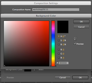
When you have selected new composition a settings box will open which will allow you to set the correct digital format, the frame rate, the time line and the size. You can also change the colour of the background of your composition.

There are many different digital options when working on AE, its important to select the correct one, and this varies on what you are designing for and also the country it will be viewed in.
In the UK we use PAL, which stands for phase analogue line. PAL uses 25 FPS (frames per second)

This is the colour setting box for your composition which allows you to change the background colour.

Once you have clicked okay to creating a new composition, it will appear in the top left box in the AE working space, it will show you the name, the file type and the frame rate.
If you ever need to go back and change any of the settings of your composition you can do so by following the links above.

Much like Illustrator and Photoshop, you can create new layers to work on within your composition, this will be useful when adding effects, shapes and text.

The above box shows you how to create a new object as a layer, in this instance I have created a square.

This shows how the square is placed within the frame, within the AE working space.
The new layer then appears with the composition.

The above image shows the time line. The vertical red line is what runs through the sequence when playing and it also allows you to move to certain points in the sequence.

This image shows how the shape layers are set on the sequence. This tool box allows you to change visual elements of the shapes.

This image shows the layers space and the tools which can be used to manipulate the layers. Such as the positioning, scale, opacity etc.


After adding a few layers I started to play with the positioning of the shapes and how they would move within the sequence. The way in which you would move something within AE would be related to the key frames tool.
The small yellow diamond shapes show key frames, these frames are here key changes happen within the sequence.

The red line shows the direction to which this shape will move when it passes a key frame on the timeline.

When it comes to saving your piece of motion you need to render it first. This prepares it for viewing.

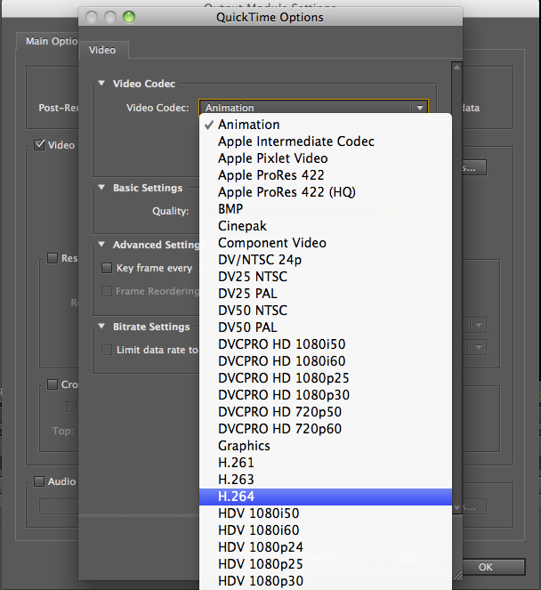 |

This shows the format that the file must be saved as.

Subscribe to:
Posts (Atom)