Tuesday 29 November 2011

After effects workshop// 29th November..

After effects workshop// 29th November:


This image shows the AE workspace, including the time line, the frame and the design folders.


When creating  a new AE document you need to select new composition.


When you have selected new composition a settings box will open which will allow you to set the correct digital format, the frame rate, the time line and the size. You can also change the colour of the background of your composition.


There are many different digital options when working on AE, its important to select the correct one, and this varies on what you are designing for and also the country it will be viewed in.


In the UK we use PAL, which stands for phase analogue line. PAL uses 25 FPS (frames per second)


This is the colour setting box for your composition which allows you to change the background colour.


Once you have clicked okay to creating a new composition, it will appear in the top left box in the AE working space, it will show you the name, the file type and the frame rate.


If you ever need to go back and change any of the settings of your composition you can do so by following the links above.


Much like Illustrator and Photoshop, you can create new layers to work on within your composition, this will be useful when adding effects, shapes and text.


The above box shows you how to create a new object as a layer, in this instance I have created a square.


This shows how the square is placed within the frame, within the AE working space.


The new layer then appears with the composition.


The above image shows the time line. The vertical red line is what runs through the sequence when playing and it also allows you to move to certain points in the sequence.


This image shows how the shape layers are set on the sequence. This tool box allows you to change visual elements of the shapes.


This image shows the layers space and the tools which can be used to manipulate the layers. Such as the positioning, scale, opacity etc.


After adding a few layers I started to play with the positioning of the shapes and how they would move within the sequence. The way in which you would move something within AE would be related to the key frames tool.


The small yellow diamond shapes show key frames, these frames are here key changes happen within the sequence.


The red line shows the direction to which this shape will move when it passes a key frame on the timeline.


When it comes to saving your piece of motion you need to render it first. This prepares it for viewing.


This shows the format that the file must be saved as.


Tuesday 22 November 2011

Design for print// End of module evaluation..

OUGD201// Design for print production: End of module evaluation;

1// What skills have you developed through this module and how effectively do you think you have applied them?

If I am going to be completely honest with myself, then I would say yes I have learnt a lot throughout this module, but when it has come to the point where I should be applying my new knowledge to my design work I think I could have done a lot better. Theres things like the application of colour through print, my final solution was in black and white and there is nothing wrong with that but maybe I should have eplored colour further, just for my own investigations. When it came to producing a final solution for the Good is brief, I found that I understood a lot about print and I did propose things for the printing of my final designs, I just wish I had been more organised and actually put the effort in to try and do some foil blocking and embossing etc. I now know a lot about print and how important it is, I have learnt things that I would have never of thought to be important before.

2// What approaches to/ methods of design production have you developed and how have they informed your design development process?

I have found out that there is so much more to printing than what meets the eye, after going to TEAM and looking around a professional printers, I realised how much thought and time goes into even the simplest of things like birthday cards, they we may take for granted in terms of print. I think I most enjoyed learning about all of the print finishes and what effect they have on a design. Another aspect that I found interesting after going to the printers was die cutting, its amazing how each net for packaging or even something that needs to be die cut has to be especially made! I have also learnt a lot about 'real life' print, things like billboards for example, they are everywhere but its not until we had spoken about large scale printing that I actually wondered how they were printed etc. I have a billboard outside my window and I have watched it being changed twice now and I get really excited about it, because I now appreciate it.

3// What strengths can you identify in your work and how have/ will you capitalise on these?

I think the main thing I have found over the last week of the module, is that I am starting to find myself as a designer and I think that is very important at this time. It may not be a strength but it definetly helps when it comes to designing things. I am very happy with my final solution, it took me a while to get into the swing of things but I am happy with what I have produced. I have also started to do a lot more supportive research within this module which has helped me understand certain areas of design and how it will impact my own design work. This is something I need to continue to do as it helps inspire me when I hit a brick wall in my idea generation process.

4// What weaknesses can you identify in your work and how will you address these in the future?

My biggest weakness through this module would have to be not trying things, like foiling and spot varnishing, I just dont feel like I made enough effort throughout this module and to be honest im disappointed in myself, I know I could have done so much better. I know that I would have enjoyed doing some foil blocking or even making a proper book for my work. I need to address this in the next module because not only will I actually enjoy trying new things, I will learn something new and my design ideas and work will benefit from it.

5// Identify five things that you will do differently next time and what do you expect to gain from these?

- I would of loved to have been a bit more experimental with things like foiling and spot varnishing, it just would have been interesting to see how it looked on my designs rather than me just proposing it.

- I wouldnt change my idea at the very last minute, I changed my idea 3 days before module submission which wasnt very smart. I didnt feel like my first idea was any good and I wasnt happy with it so I changed it. Next time I need to make sure I choose an idea that not only will I enjoy but will also work well as a piece of communication.

- I will try not to waste time or be lazy. I know for a fact that I have wasted a lot of time during this module messing about and I think this will definetly reflect in my grade. I had a 'i'll do it tomorrow' attitude and it did not help me at all.

- Try more things and generate more ideas at the beginning so that I have time to develop.

- Be more organised and stay late at uni, I know that if I go home I will get distracted so easily. I get more done when I stay at uni.

// Attendance: 5
// Punctuality: 5
// Motivation: 2
// Commitment: 2
// Quantity of work produced: 3
// Quality of work produced: 3
// Contribution to the group: 3

Monday 21 November 2011

Design for print// Good is: Final pieces..

These are the images for my final solution for the Good is brief. I decided to change my idea a few days before module submission which has made everything a bit hectic, but to be honest I wasnt happy at all with what I had previously produced, I feel that I could have done so much better so I have done something about it. My new idea is still based around the same concept and story, I have just changed the outcome. My new idea was one that I had written down at the beginning of the process, but I didnt feel that was enough. I did try and design a look book but I didnt gather enough material to create something decent and meaningful. This new outcome is a 'make your own polka dot pattern pack'. The pack contains 10 variations of polka dot pattern stencils, with a pot of black fabric paint, a roller and a small guide of how to use the pack.


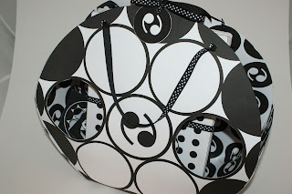
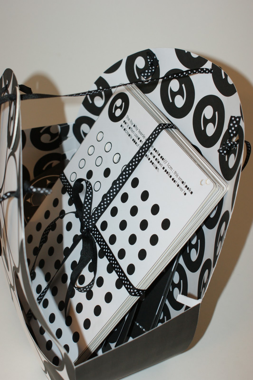
This is the bag/ pack that holds all the mentioned items to help make polka dot patterns. The bag is slightly taller than an A4 page which means that the stencils fit snug inside. The front of the bag has my logo inspired pattern on it, which has also become part of my branding. I was going to 'diecut' all of the white circles but realised this would make the front very flimsey and it may not support the contents. So instead I decided to cut out the two circles beside the logo, which makes the logo feel more centralised and helps it stand out.


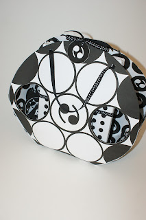
The sides of the bag are a little too short which meant that without the hole in the middle of the handles tieing it together, it would spread out wide. I think that this fault has worked to my advantage in a way because the bow meant that I could make a card tag with the logo on. The 'diecut' circles could maybe have accetate covering them so that nothing could fall out of the bag when it was being carried. I am proposing that the black on the front of the bag would be spot varnished, I think this would make it look more sophisticated. The stock I have used is white card, I think it is sturdy enough, but I would possibly need to use a stock with a slightly higher gsm so that when the middle bow was undone the bag wouldnt fall apart, but the length of the sides would also have to be higher.


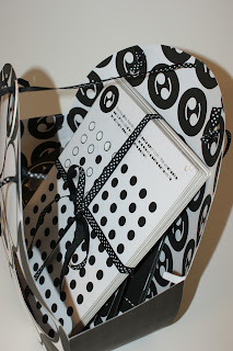
The inside of the bag uses a repeated pattern of the logo, I thought that this would keep continuity between all of my designs and it also looks better than just white or black. I think it would look really cool if one or two of the inside logos were silver foil blocked. Its not very often that the inside of a bag has that much detail, but I just think it would be a nice touch.


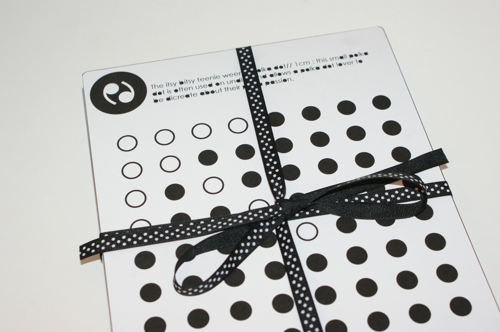
These are my ten polka dot stencil variations. Each one goes up by a cm in terms of the circumference of the dot. Each stencil is an A4 size with rounded edges, I decided to make rounded edges because I felt that ridged ones wouldnt fit in with my curvacious theme.


Each polka dot stencil also has a specific name for it and an example of what context it can be used in and what it means. I have tried to keep the names humerous as polka dot lovers are often fun and a bit cheeky. The names are as follows:

- Itsy bitsy teenie weenie// 1cm
- Piggy in the middle// 2cm
- Mediocre// 3cm
- Foursome// 4cm
- High five// 5cm
- Sexy sixer// 6cm
- 007// 7cm
- Acceptable in the 80s// 8cm
- After eight// 9cm
- Larger than life// 10cm


Each stencil has white and black polka dots on it, and where possible, I have created a white dotted arrow which points to the name of the polka dot and its meaning. In an ideal world I would of liked to have had the white dots diecut and the black dots would have been perferated so that the 'customer' could have popped them out as and when they liked and used them to decorate things with polka dots.


Each stencil has the brand logo on the top left corner and along side that is the definition and name. The logo would be silver foiled on each stencil just so it makes it that bit more attractive.


The stencils would be kept together by polka dotted ribbon tied in a bow, this would then be placed within the designed polka dotted bag.


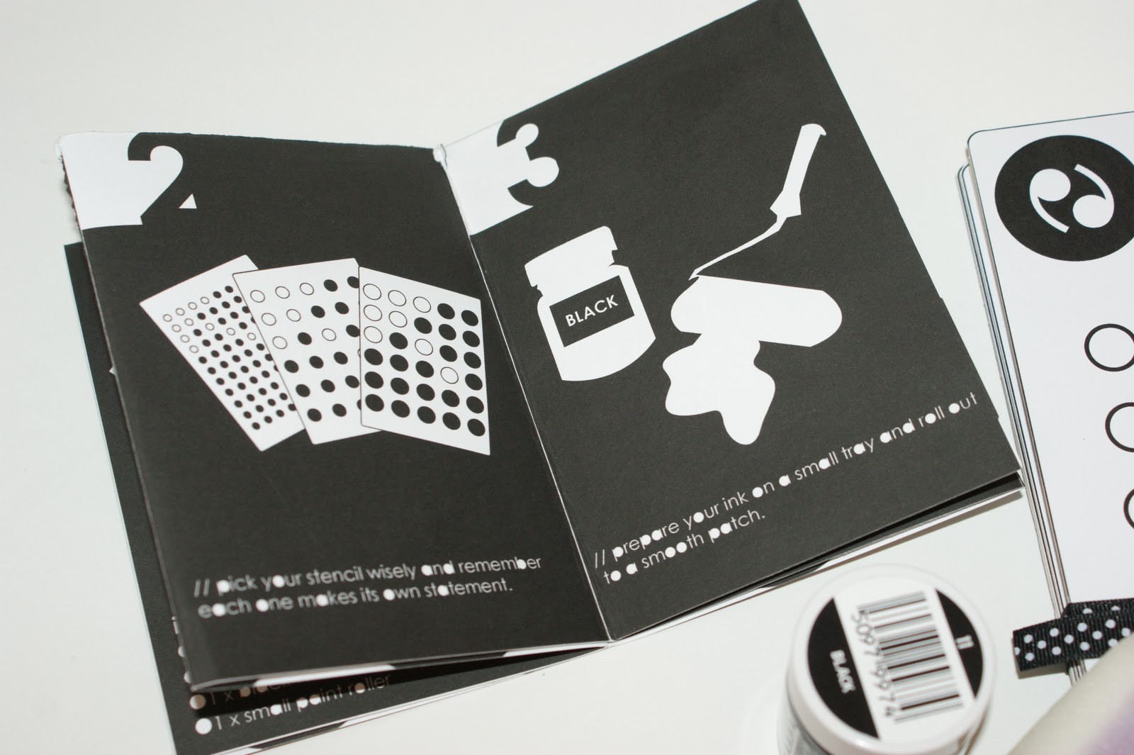
This is what the pack would include (there will also be a tshirt but I forgot to buy one). There is the 10 stencils, the pot of black fabric paint, a small roller and a hotdog book explaining how to use them all.


The fabric paint will last a long time if used correctly on the t shirt, by providing this it also means that the customer can apply the stencils to other fabricated items, including canvas bags etc.


The book is illustrated with simple images and clear instructions on how to use the pack.


The inside of the hotdog book has the same pattern as the polka dot bag.


This photo shows the design continuity between the hotdog book and bag a bit better.


Looking through a diecut hole onto the patterned inside.


This a slightly closer photo of my final collection of design outcomes. I also designed mailshots which can be seen leaning against the bag on the right hand side. These would be made of thick card, double sided, with foil blocking on the logo. These would be handed out in retail hotspots to fashionistas and of course anyone seen wearing polka dots. I say mailshots because they could also be sent to boutique shops that may be interested in coming to my big polka dot event.


This is probably the best shot I got of all my final solutions, you can clearly see all the outcomes and I think that it can be clearly understood what it is. This photo also shows how there is a visual consistency between all designs and how well they all work together.


This last design is part of the promotion for my event, it uses the logo and pattern to brand it. I want to slowly promote my event by designing a series of posters that lead up to this last poster that contains all the information needed to attend the event. I also have the pun 'be there or be square' which I think would work really well as a tag line for the event to get people interested.