Showing posts with label DESIGN FOR PRINT. Show all posts

Tuesday, 22 November 2011

Design for print// End of module evaluation..

OUGD201// Design for print production: End of module evaluation;

1// What skills have you developed through this module and how effectively do you think you have applied them?

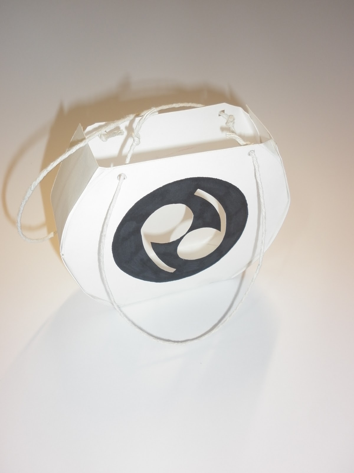
If I am going to be completely honest with myself, then I would say yes I have learnt a lot throughout this module, but when it has come to the point where I should be applying my new knowledge to my design work I think I could have done a lot better. Theres things like the application of colour through print, my final solution was in black and white and there is nothing wrong with that but maybe I should have eplored colour further, just for my own investigations. When it came to producing a final solution for the Good is brief, I found that I understood a lot about print and I did propose things for the printing of my final designs, I just wish I had been more organised and actually put the effort in to try and do some foil blocking and embossing etc. I now know a lot about print and how important it is, I have learnt things that I would have never of thought to be important before.

2// What approaches to/ methods of design production have you developed and how have they informed your design development process?

I have found out that there is so much more to printing than what meets the eye, after going to TEAM and looking around a professional printers, I realised how much thought and time goes into even the simplest of things like birthday cards, they we may take for granted in terms of print. I think I most enjoyed learning about all of the print finishes and what effect they have on a design. Another aspect that I found interesting after going to the printers was die cutting, its amazing how each net for packaging or even something that needs to be die cut has to be especially made! I have also learnt a lot about 'real life' print, things like billboards for example, they are everywhere but its not until we had spoken about large scale printing that I actually wondered how they were printed etc. I have a billboard outside my window and I have watched it being changed twice now and I get really excited about it, because I now appreciate it.

3// What strengths can you identify in your work and how have/ will you capitalise on these?

I think the main thing I have found over the last week of the module, is that I am starting to find myself as a designer and I think that is very important at this time. It may not be a strength but it definetly helps when it comes to designing things. I am very happy with my final solution, it took me a while to get into the swing of things but I am happy with what I have produced. I have also started to do a lot more supportive research within this module which has helped me understand certain areas of design and how it will impact my own design work. This is something I need to continue to do as it helps inspire me when I hit a brick wall in my idea generation process.

4// What weaknesses can you identify in your work and how will you address these in the future?

My biggest weakness through this module would have to be not trying things, like foiling and spot varnishing, I just dont feel like I made enough effort throughout this module and to be honest im disappointed in myself, I know I could have done so much better. I know that I would have enjoyed doing some foil blocking or even making a proper book for my work. I need to address this in the next module because not only will I actually enjoy trying new things, I will learn something new and my design ideas and work will benefit from it.

5// Identify five things that you will do differently next time and what do you expect to gain from these?

- I would of loved to have been a bit more experimental with things like foiling and spot varnishing, it just would have been interesting to see how it looked on my designs rather than me just proposing it.

- I wouldnt change my idea at the very last minute, I changed my idea 3 days before module submission which wasnt very smart. I didnt feel like my first idea was any good and I wasnt happy with it so I changed it. Next time I need to make sure I choose an idea that not only will I enjoy but will also work well as a piece of communication.

- I will try not to waste time or be lazy. I know for a fact that I have wasted a lot of time during this module messing about and I think this will definetly reflect in my grade. I had a 'i'll do it tomorrow' attitude and it did not help me at all.

- Try more things and generate more ideas at the beginning so that I have time to develop.

- Be more organised and stay late at uni, I know that if I go home I will get distracted so easily. I get more done when I stay at uni.

// Attendance: 5
// Punctuality: 5
// Motivation: 2
// Commitment: 2
// Quantity of work produced: 3
// Quality of work produced: 3
// Contribution to the group: 3

Monday, 21 November 2011

Design for print// Good is: Make your own..

I decided to alter my final solution as I wasnt happy with what I was producing (look book).


-----------


--------------


---------------


----------------


Thursday, 10 November 2011

Design for print: Good is// Packaging designs..

As part of my big idea for this brief I am creating a look book that polka dot lovers can take away with them when they leave my event. The book will come in a bag, which I have started experimenting with below. I tried to create round bags so that it links in with the theme of polka dots, I also didnt want my packaging to be anything too ordinary, as polka dot lovers tend to be quite bold and 'out there', this needed to be reflected in the packaging.

----------------


I tried to design a net where I would make a circular bag, after a few attempts I managed to design a net that was circular but with a flat base so that it could stand up. This design has a diecut front which reveals the brand logo. The bag would be made out of thick, pure white card and the logo would have a matte, black finish to it.
---------------


This bag uses the pattern from my previous poster and billboard designs. The pattern is at the front of the bag and will be diecut. The back of the bag will have a diecut hole on the back with the logo printed onto acetate filling it. Again the bag will use the same stock as stated in the first design. The logo on the front of the bag will be silver foiled to add sophistication.
---------------


This bag would simply have the logo printed onto it using a black spot varnish. This design is very simple but if I were to carefully select appropriate print finishes, it could make it look very sophisticated.

---------------


This design again uses the pattern I designed for my promotional material. I have used it on the front but it will not be diecut. On the back there is a polka dot pattern that will have some dots diecut, so that you can see a snippet of what is inside the bag. The design on the back and front could use spot varnishing on selected areas.

--------------


I really like this design, I think its very fun and reflects the polka dot personality. The front will have the logo on it with the pd being diecut. The inside of the bag will have a polka dot printed all over it. The logo circle would be spot varnished.

---------------


This was one of the first I designed, hence why it has a flat top and bottom. This design is the same as the one above apart from it has no polka dot pattern on the inside.

-------------

Tuesday, 8 November 2011

Design for print: Good is// Bringing my ideas to life..


As part of my promotional material for the big polka dot event I am creating, I have started to look at poster designs and where they could be placed. I was hitting the wall at this point and didnt really have a particular design approach, other than knowing I was going to be using a black and white palette. I then started to play around with ideas and this is one that I came up with that I think works really well. What I have done is placed circles next to eachother, like they would be in a polka dot pattern, I have then used the pentagon tool in Illustrator and placed one in each polka dot. This then changes the interpretation of the polka dot pattern. This is because I have used another shape inside the polka dot pattern. I just think it makes it more original and exciting, than just having circles.


This design is exactly the same as the one above apart from I have moved the text to align with the angle of the pattern.


This design looks like a mish mash of everything and is a bit complicated, but in a way it sort of works. I have used an actual polka dot pattern that fits into a larger circle, which re iterates polka dots. I have then placed the above pattern over the top and placed a white bar with the event date underneath to break it all up a bit. I also came up with a bit of a pun, which I think makes it all a bit more light hearted and fun, much like the personality of a polka dot pattern. ' Be there or be square' it plays on the fact that if you dont come to the big polka dot event, then you are clearly a square person.


This design is experimenting with the composition of the pattern and information that will need to be included about the big polka dot event. I decided to change the angle of the pattern, as I think it works better and make the page look more even. The top part is also useful to direct people to particular pieces of information, it almost create heirarchy within the design. In this design I have used the pattern to direct to the pun, this means people will read it first and then it will strike wonder on what it is about. The date of the event has then been placed underneath the pattern, and will be the next thing the audience will read. I still need to include the place of the event and a sentence saying what the event is. I have also used the logo within the pattern, so that when my audience sees this logo on its own, they will know what it means and what it is associated with.


This design includes all the relevant information needed for people to know and understand what I am trying to communicate. I have tried experimenting with the composition of the information, the pattern is directing to the date, which is also in a larger point size. This creates heirarchy and therefore it will be read first, they will then see the place which is aligned with the left side of the pattern. The last piece of information will be what my event is. I think by placing the information in this way means that I will keep my audience on their toes. They know a date, but what is it for? They see a place and date, but what is it for? It keeps then interested until they see what its all about, hopefully they will understand the pun and remember my message.


This design is pretty similar to the one above, but I have moved the date to align with the right side of the pattern. It makes the whole design feel more like one piece, but im not sure if it makes it clear on what piece of information should be read first.


This design I think is quite clever, I have used the pattern again to direct to particular pieces of information and I have also used a polka dot pattern to create another direction. The polka dot pattern points to the pun and so does the pattern, the patteen then points to the place of the event, which then leads down to the date and summary. I think its clever how I have used the shapes to create heirarchy for the information, but I feel that it just seems to complicated. I want my message to be as clear as possible but without it looking boring and its just a case of finding a good balance.


This design is like a simpler version of the one above. I have kept the large circle in the centre of the page which has the pun within it. This means that it will be read first. All the information is together at the bottom of the page and the pattern has again been utilised to direct to the information from the pun. The pattern also looks as though it is 'poking the dot' which sounds similar to 'polk-a-dot'.


Same as the above design, but I have taken away the pattern. Doesnt really work too well with my previous designs and logo, because there is no visual consistency.


This design is experimenting with the pun, I have used a square rather than a circle and then placed a polka dot pattern within it. The information sits within the polka dot pattern and the pun is underneath the square, to help eleviate its message.


With this design I have taken away the pattern again but kept the logo and made it the centre piece. The information them fits around the logo. Its very simple and easy to read. The only thing I would change, would be to make the arched piece of information at the top a bit bigger.

--------------------

Another thing I started to look at is the use of billboards for promoting an event. My designs would have to have a visual consistency with the previous designs I have done. They would also need to be eye catching but fairly simplistic too.

(Image taken and developed from Google images)

-----------


 With this design I have taken the contents of one of the poster designs and placed it onto a billboard environment. I still think it works at this scale, the only thing is that there is no event information, but this could be one of a series of billboard designs that would be released in the run up to the event. If my audience began to know what the pattern, logo and pun meant, they could start to link together information seen on different things.


Again I have used elements from a poster design and placed it onto a billboard format. This design includes all the information, but I do feel that it is a bit uneven on the right hand side.


Theres a lot going on with this design, I have used a polka dot pattern to fill half the format. The rest contains the information of the event and I have also written a small event summary explaining what the event is.


I have included the pattern again with this design and used its angles to place the information about the event. It needs to be slightly more to the right, this design is probably the most effective and visually interesting.


This plays on the pun, its very simple, but I just feel that it looks a bit boring.


This design is literally just the logo. I think if I was going to release a series of billboards leading up to my event then it would be appropriate to do something this simple. It means you are getting people to think about what it is which creates interest. Each time you release another billboard you could include another piece of information, so they slowly begin to understand everything. It will also keep them interested and on their toes.


Wednesday, 2 November 2011

Design for print: Good is// Logo development..

As part of the Good is brief, I have designed a brand and identity for my final solution which will be used on my promotional material for my polka dot event. I have tried to keep my logo simple and clear to understand the appropriateness with polka dots.


This logo came from the task set by Fred, to design 150 logos related to our concept (mine being polka dots). The circlr represents the dot and the two shapes inside the circle are a p and a d, standing for polka dot. I think the design really works because it is simple although this logo was said to look like 69 or remind people of that figure. After having a crit my tutor said that the logo worked well even with the sexual interpretation because it keeps it a bit cheeky.


I tried experimenting with different gradients over the logo above to see how it effected its communication. I dont really think that this logo works too well as the white on the left hand side bleeds into the p which makes it less clear than the d.


This one again doesnt work too well in my opinion, I think its because the pd is black and it doesnt stand out as much as the white in the above logos.


This logo is altered from the second logo down where I have used a gradient. On this logo though I have changed the letters to black and the gradient is reflected. I think this version works better than the one similar as the letters stand out more.


With this design I tried to create a two toned effect by using reverse tones on either side with the semi circle and the letters. I dont think it works particularly well because the lighter semi circle is using too many different tones which I think over complicates things.


This design still uses a gradient but I have used a stroke around the circle to make it more complete and together, the gradient is also a lot more even in terms of a brighter or darker side, which helps the pd stand out.


I then started to experiment with colour and how this would effect the design. Again I used a gradient. I think this colour palette works really well with the logo and the white pd really stands out. But the colours have no relevane to polka dots. It is not one of the first few colours I think of when I think about polka dots.


This design just uses one colour and white, the one colour keeps it simple and helps it to really stand out, again though I dont really think of orange when I think polka dots.


I then went back to gradients and tried using reds into oranges, because red is a colour associated with polka dots. I have kept the pd white as I think it works better with the red, rather than keeping it black. It feels as though there is too much going on though.


The gradient on this design is a lot more subtle, which simplifies it.


Another example of the one above but using orange.


This one again has an even subtler gradient over it, but it makes such a difference by just having it there ever so slightly.


This design uses a purple and blue gradient, I think the colours work really well with the white, it looks really crisp and the gradient is very smooth compared to some of the above.


I then looked at changing the logo ever so slightly to see if I could perhaps make it communicate my message a bit clearer. I took away the pd on this design and replaced it with the words polka dot. This made it more obvious and clear on what I was trying to communicate. It is still very simple, I have used Century Gothic for this particular design.


This design is a lot more 'quirky', I think this is because the type looks more hand rendered and it flows very well. The type face adds character and interest. This logo could be used for a kids polka dot clothing label. I want my logo to be quite neutral, because my event is for everything polka dot, not just clothing so I need it to be suitable to represent everything polka dot, as well as appeal to my target audience and varied age range.


This one got a bit too complex I think. I tried to combine the Century Gothic logo with the original, by taking the pd and using them to replace the p and d in the words. Im not really sure if the underlining on this design is nessessary.


This design is similar to the one above but I have moved the p down (as they are both lowercase). This made the design very uneven, hence why I underlined it, which made it look even worse.


I then tried to combine both of the logos again but in a different way. I literally took their two circles and placed them next to eachother. But I think it makes it less clear as to what I am trying to communicate.


This is using the same principles as the one above, but combining the other logo.


This works slightly better than the two above. It uses the same technique but I have made it more obvious that it is two circles next to eachother.


I then tried taking away the circles as an 'enclosure' and used them as counters instead. I think this looks really good and works well. Not sure if I needed the polka dot at either end as it makes it look like it says 'opolkadoto'.


This is the same as the above, but without the two circles either end and a full stop instead. I think it makes more sense now and again it keeps it simple.


This one is still using the cirlces as counter replacers, but here I have used the two o's as polka dots and left them with white counters. Its just a simple way of making the message even clearer and simpler for my target audience to understand.


This design has just used a black counter for all the letters, it makes a huge difference to the typeface which I quite like.

------------------

It has helped me a lot by experimenting with what I could do with my logo and how it has effect on what and how my target audience would percieve it.