Showing posts with label IDEA DEVELOPMENT. Show all posts

Monday, 10 December 2012

Greetings cards brief typeface


I wanted the typeface for the greetings cards to be in a similar style to the drawings, so what I have done is free hand them using the pencil tool in Illustrator. They have come out very well and work well with the animals. I could have probably found a typeface online somewhere like DaFont. But I felt that if everything was hand drawn then the cards would feel more personal.


I used the typeface for the logo and the little puns on the front of the cards.


It works well with everything as it all works together as a concept. I have been making the words by copying the letters and then placing them together. If I had more time I would of made it in Fontographer which would have made it a lot easier to type out the words.


Each animal has its own little message with it which links to them. I have tried to keep the cards light hearted and humorous which fits with the charm of the animal illustrations.


The puns are quite simple but have a huge effect on the personality of the card. 


This concept could be used for so many different animals, as long as you can think of something to play on words that links with the animals.


I have put 2 kisses after each greeting because again it feels personal and quite sweet.


Tuesday, 16 October 2012

Chocolot Brief: Idea generation/ Packaging


As part of my Confectionery Brief Chocolot, I have begun to generate ideas for packaging designs. These arent for packaging nets as current, just visual designs. I have applied the small icons I previously made and created a repeat pattern with them, and then added the logo. The idea was to have this design printed onto paper foil to wrap around the chocolate.


I have tried the same design on a few different ranges, I do think they work pretty well although there is plenty of room for development. I think I may have to play about with the logo and its placement and appearance on these designs but the pattern seems to be a good idea.


I have just noticed that this one's logo is not centralised like the others so its a good job its not a finished idea! Stock is something I really need to consider throughout this process. The stock I choose to work with will reflect on the brand, if I am wanting to portray that my brand is quite sophisticated then I will need to pick a stock that reflects on this, for example a gloss or silk stock.


These are the above foil designs and the design for the front to match. The front has been kept quite simple, mainly using just colour to represent a flavour. The main logo is at the top and then underneath I have placed the flavour logo to help communicate what the product is offering. I liked these designs whilst doing them but now looking back at them im not sure if they actually work that well.


I have then gone on to play around with a pattern on the packaging so that it feels a bit more sophisticated but trying to keep it fairly simple. This design doesnt work. The logo doesnt stand out and the layout is just all wrong. In other words its crap.


This design works a lot better than the one above. Im still not convinced by the pattern. It looks as though it has just been stuck there for the sake of it. The arrangement of the type seems to work very well. I think this is because its centralised and there isnt a load of information crammed on.


It appears to work across a range of colours too which is always good to know.

Friday, 25 May 2012

OUGD203// YCN: Webpage..


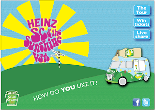
These are the website Home page designs that I did. We decided to just do the home page to give an idea about the tone of voice and what the content of thewebsite would be if we were to design the whole thing. This was the initial design that I came up with. I tried to link it with all of the other designs that I had created to keep it consistant. The links on the Home page include info about the site, how to win festival tickets, the tour and a link about Heinz Salad Cream.

I think that it became too over complicated with the name of all the festivals and a link for the tour.


So with this design I took away the festival names and use one direction post with just a few festivals names on it that wouldnt be links, just to give an idea as to where the tour would take place.


This design worked a lot better as it was simple and gave all the information needed. We didnt use this one in the end though as it did have a resemblence to the Snap Tag poster.

This is the final design that me and Lisa decided on. Its still very simple and we have taken away one of the links that was not necessary. The design approach is consistant with all of the other designs.

This is what the Home page would look like.

OUGD203// YCN: Posters..


These are the posters that I designed to go on Ad Shells to promote the Salad Cream tour van. There will be a series of posters that will be released as the tour evolves. The first poster will give information about Snap Tagging and how to win festival tickets. There will then be one about buying salad cream with a Snap Tag on it and finally the poster with all of the information on it about Snap Tagging and winning festival tickets.


I have kept the designs simple and used the same colour palette, illustration technique and tone of voice as the salad cream van to keep everything consistant. I decided to use a typeface that reflected our tone of voice, Bell Bottom is very 60's and fits perfect with the design approach we are going for.


The Snap Tag poster is very simple, it is literally just the Snap Tag itself as I didnt want to add to much information so that people would become disinterested or distracted by other things.

These are the posters mocked up as Ad Shells. They have turned out really well.


Wednesday, 2 May 2012

OUGD203// Self- initiated brief: Research List..

Here is a list of things that I will be researching throughout this self- initiated brief to help me fully understand the subject of the brief and how to communicate it as well as exploring product, range and distribution within specific design relating to my concept.

I will also need to look at socially fabricated days to help me understand what makes a particular 'day' or event memorable to a wide target audience.

Here is my research 'to do' list:

- Firstly I need to do extensive research into what Peace Day is. Including its history, aims, ethos, ambitions for the future, current target audiences and potential target audiences for the future.

- I will need to research into large event campaigns to gain an understanding of the best methods of communication to a large target audience.

- Moving image design that has been specifically made to communicate a message that persuades a target audience into investing time into a specific event or product (Although I am not primarily wanting to focus on the advertising of any products that are to be sold).

- Viral events that have caught the attention of the world (for example the recent Kony Campaign) and how they have approached methods of communication.

- Look into the history of days like Valentine's Day and Mother's Day to see how they became socially fabricated events that have become an annual event. This will help me understand what approaches I will need to take to make Peace Day a memorable day.

- Look at promotional material for large events, which could include the upcoming London Olympic Games. Exploring things like t-shirts, goodie bags and other souveniring items. I do not want to make Peace Day too commercialised, so therefore must look for ways in which I can use this deliverables but in a non or low profit way.

OUGD203// Self- initiated brief: First Draft..


Brief Title// Create a memorable name for Peace Day

The problems are:

-          Not many people know what Peace Day is.

-          Peace Day want the whole world to get involved.

-          Peace Day needs to be as memorable as popular annual days such as Valentine’s Day etc

-          How will the concept aim to communicate with a large and broad target audience?

-          If it needs to memorable, how will I do this and what methods of product, range and distributions will best support and give hand to this?

I intend to (inform/ instruct/ persuade/ direct/ educate/ promote to):

Inform and promote Peace Day to a specific target audience. They will be informed about the day itself, I will then promote to the target audience and persuade and educate them to get involved.

… A group of (identify your specific audience or context):

My target audience will be very broad; I am aiming to focus on targeting people of power within different parts of the world including Presidents, Prime Ministers, and Politicians etc. I will also need to work towards communicating with the general population of the world to make them aware of Peace Day, but it will be the people of higher power that will influence the majority of my final solutions.

…. That (state your message, idea or concept):

I will be branding Peace Day which will promote itself on a global scale to help the population understand and participate in this one day, yearly event.

In order to achieve this I will produce…

(Specify at this point in time what you aim to produce, the method of delivery/ distribution/ the context in which it will be viewed):

Product, Range and Distribution//


Here is a list of the products, ranges and distribution methods that I could and will either create or propose as part of this self- initiated brief:


1// A campaign to 'promote' Peace Day


Campaign will include things such as:


- Posters:


Posters will be kept fairly simple and communicate a clear message of what Peace Day is and what it involves, using mainly image as a means of visual communication.


- Flyers:


Flyers will have a similar concept as the above mentioned posters, I will be creating these as a deliverable as it gives me another product of which I can create a range. This also means that I will be able to explore scale and format as part of the brief and therefore developing my skills.


- Information guides:


Creating some kind of guide will give me the chance to explore with editorial design, of which is something I am not keenly interested in, it will be good practice to try and create something within this brief.

The guide could include information about the Peace Day itself and what the day will entail, along with the aims of Peace Day and the effects it has and will have on the world if it is made to be memorable.


- Booklets:


The booklet in a way would be similar to a guide, although I could focus this product on introducing Peace Day and using it as a piece of factual information that will tell the story of Peace Day and how it came about, where as the information guide will be focusing more on the future of Peace Day.


- Souvenirs:


When I say souvenirs I don’t mean silly things like hats and mugs, I mean things like t-shirts which can be worn by participating individuals on the day to promote it. The t-shirt designs could be very simple and just have the logo design on them. This means I will add to my product list, therefore allowing me to explore a range and look at deliverables and how the t-shirts will be distributed and packaged.


2// A moving image:


- The moving image may be a proposal or storyboards dependant on how much time I have and taking in to account the other products that I will be producing.


- If I am going to create a moving image then I will not be creating a particularly long one, maybe up to 30 seconds long.


- The moving may be used to set and show the tone of voice to my design approach to the brief or a short piece used as promotional material. I think that at the present time I am looking to try and use image as the main focal point, along with a piece of audio as part of my design approach to this particular deliverable.


OUGD203// Self- initiated brief: Initial ideas..

After analysing the 4 live briefs that I had chosen from D&AD, YCN, ISTD and one of my choice, I have started to come up with some initial ideas ready to solidify my concept and the path that I will be taking through the second part of this module.

I know for certain that I am wanting to do something that is related to branding and identity as this is an area within graphic Design that I am very passionate about. I am also wanting to explore many other areas that I have either not tried before or I want to develop my skills in. This includes editorial, moving image, image based design and possibly hand crafting.

Here are some of the initial ideas I had for this brief:

- Branding Peace Day: This brief from D&AD was about promoting and making people aware of Peace day all over the world. I feel that if I brand the Peace Day much like that of Valentines Day and Mother's day then it will instantly become recognisable. Obviously I will have to do this in a more creative way than just advertising it in a very commercialised way as the other well known 'days' mentioned above.

Peace Day is also a known profit organisation so I dont want it to become too much about giving money, it is about stopping violence for one day a year and giving aid to those who need it most. Peace Day's aim is for everyone in the whole world, for one day only to unite and reduce the violence in the world. Targeting the whole world will be a challenge, but one that I am ready for.

I will have to do a lot of research to be able to determine what the best way is to communicate with such a large and broad target audience and also on how to make one day within the year be so memorable and unforgetable that people from all over the world will instantly know what it is and have the willingness to take part.

- Swarovski is another brief that I have been considering doing. My initial ideas for this brief were to create a launch event for the new younger generation jewellery range. I could produce the POS, advertising, packaging and catalogue for the new range to be within the stores and distributed using other methods of delivery including the launch party.

To expand on this concept I could create a monthly launch event for new items of jewellery to the range therefore broadening the possibilites and outcomes of the brief. One thing that has already put me off completing this brief is that in the first part of this module I had already seen the outcomes of others that had worked on it. I fear that seeing their work that has been produced may subconsiously effect decisions I make when approaching the brief.

- The main ideas and concepts that I have thought of mainly relate to the Peace Day brief and I do believe this is because it seems like such a challenge and it will also allow me to develop skills I already have and try new things to then I can also develop.

Product, Range and Distribution//

Here is a list of the products, ranges and distribution methods that I could and will either create or propose as part of this self- initiated brief:

1// A campaign to 'promote' Peace Day

Campaign will include things such as:

- Posters:

Posters will be kept fairly simple and communicate a clear message of what Peace Day is and what it involves, using mainly image as a means of visual communication.

- Flyers:

Flyers will have a similar concept as the above mentioned posters, I will be creating these as a deliverable as it gives me another product of which I can create a range. This also means that I will be able to explore scale and format as part of the brief and therefore developing my skills.

- Information guides:

Creating some kind of guide will give me the chance to explore with editorial design, of which is something I am not keenly interested in, it will be good practice to try and create something within this brief.

The guide could include information about the Peace Day itself and what the day will entail, along with the aims of Peace Day and the effects it has and will have on the world if it is made to be memorable.

- Booklets:

The booklet in a way would be similar to a guide, although I could focus this product on introducing Peace Day and using it as a piece of factual information that will tell the story of Peace Day and how it came about, where as the information guide will be focusing more on the future of Peace Day.

- Souvenirs:

When I say souvenirs I dont mean silly things like hats and mugs, I mean things like t-shirts which can be worn by participating individuals on the day to promote it. The t-shirt designs could be very simple and just have the logo design on them. This means I will add to my product list, therefore allowing me to explore a range and look at deliverables and how the t-shirts will be distributed and packaged.

2// A moving image:

- The moving image may be a proposal or storyboards dependant on how much time I have and taking in to account the other products that I will be producing.

- If I am going to create a moving image then I will not be creating a particularly long one, maybe up to 30 seconds long.

- The moving may be used to set and show the tone of voice to my design approach to the brief or a short piece used as promotional material. I think that at the present time I am looking to try and use image as the main focal point, along with a piece of audio as part of my design approach to this particular deliverable.

I have given myself a lot of work to do, but I do feel that it is achievable.


Tuesday, 1 May 2012

OUGD203// Brief selecting..

For the self initiated brief for the second part of OUGD203, we were asked to choose 4 briefs (of which I have done and can be viewed earlier on my blog). I have begun to analyse each brief and write down why I have chosen each one, the problems I may encounter, what deliverables I could produce, practical and personal skills I could develop within the brief, the contexts of which I will need to explore and also important things to consider that may have been left out.

--------------

D&AD Brief: We want to make it impossible for anyone to ignore Peace Day

Problems I may encounter//

- Has a very wide target audience so it might be a challenge to create designs that appeal to anyone and everyone

- There is no set restriction on the final deliverables, which could make it hard for me to decide on what I feel would be the best method

- Trying to make Peace Day as popular as days like Valentines day, set days in the calendar take years to become tradition, how will I be able to make Peace Day as popular?

Deliverables I could produce//

- A promotional campaign/ advertising campaign including posters etc to engage with a ranged target audience

- Branding material for Peace Day to try and make it more recognised and give it a memorable identity

- Some kind of information guide about Peace day to educate people of its purpose and the importance of joining in

- A short moving image piece highlighting how important Peace Day is

Practical and personal skills I could develop through this brief//

- Strengthen my skills in branding and identity as this is an area of Graphic Design that I am very interested in

- Improve my researh skills, this will be very important as I will need to make sure I research in depth for this brief to be able to fully understand it and how I will communicate it

- I want to try new methods of delivery and expand on methods I already have an understanding of as this will build up my skills and help me to become more creative by thinking outside of the box

Contexts that I will need to explore//

- What is Peace Day and why isnt it as popular as days like Valentines Day (how did they make Valentines Day so popular?)

- What is a campaign? How many different ways are there to approach a campaign?

- Branding and promotion of large events


----------------------


YCN Brief: Swarovski

Problems I may encounter//

- The target audience is specified but is still quite broad (20- 30 year olds) which means I could focus on students, young working adults or young families. Even though they would have an interest in the latest fashion trends I can still see this may be a problem

- Swarovski at the moment have a much older target audience and although the purpose of the brief is to make it more appealing to a younger audience I would still have to persuade a younger generation that Swarovski isnt 'old fashioned' as such

- Deliverables is quite open which can sometimes be a problem if I do not know exactly what problem I am trying to solve

Deliverables I could produce//

- A promotional campaign launching the Swarovski range to the younger generation

- Packaging for the new fashion jewellery items

- Instore POS to advertise the new range

- Website designs to launch the new range

Practical and personal skills I could develop through this brief//

- Apply branding and identity to the new range to make it memorable

- Research into Fashion which is an area I know little about

- Develop my knowledge of packaging and how the packaging of an item can effect its communication

Contexts that I will need to explore//

- Different ways of packaging jewellery, what works and what doesnt

- Research into the fashion industry and new trends

- Look into the popularity of fashion jewellery

- Look at POS for jewelers and see how this effects communication to a specific target market


---------------------


ISTD Brief: It happened on this day

Problems I may encounter//

- The brief is very open, which means I may struggle to initially find a solid idea and concept to stick to. Any day ever in history gives me a lot to consider

- Deliverables is restricted to type only. Typography is not my strong point

- I must decide on who my target market will be, the event that I focus on will help me determine this but I can still see this as being a difficult hurdle to jump

- Method of delivery is very broad, it states that any media can be used, which isnt necessarily a problem but it does give me a lot more to consider

Deliverables I could produce//

- A piece of editorial design focusing on the event I choose

- A series of posters about the event to educate and communicate to my chosen taregt market

- A piece of moving image using kinetic type

Practical and personal skills I could develop through this brief//

- Develop my skills and knowledge of type

- Build up my confidence in trying something new and exploring with type

- Thinking outside of the box, I am used to using image to communicate

- My ability to make informed decisions about what I will be focusing on

- My ability to be specific when defining my concept

Contexts I will need to explore//

- Type based editorial design

- Kinetic type

- Ways of making memorable day memorable


--------------


SELF CHOSEN Brief: Puffin and Penguin

Problems I may encounter//

- It is a very open brief, which book cover would I illustrate and how many?

- There is a restriction on deliverables being that I can only produce a book cover

- I wouldnt be able to push any limits as the brief restricts this

Deliverables I could produce//

- Limited edition book covers

- A series of book covers

- Could possibly design packaging for the books

- Design covers for both Puffin and Penguin books

- Online/ digital deliverables for the books

Practical and personal skills I could develop through the brief//

- Develop my illustration skills

- Develop my drawing skills

- Thinking outside of the box when it comes to pushing the concept

- Idea generation, I will need to think of ways to get the most out of this brief

Contexts I will need to explore//

- Childrens and adults book covers

- Packaging Limited edition

- Styles of illustration that arent necessarily similar to the way in which I currently work

Wednesday, 1 February 2012

Design for digital// Top 10: Title sequence idea generation..

Title sequence//

Below are some experimental idea generation clips for my Top 10 title sequence, along with the final outcome. I am very pleased with what I have produced and feel that I have learnt a lot through out this module.


This is the beginning of the titke sequence. What I have done is created the character and used the scale and position key frame tool in After Effects to make him appear into frame from the bottom left hand corner. I tried to make it look as though he was walking up from the corner by changing the rotaion slightly with the other two key frames. Once he gets to mid frame, still on the left hand side, I started to bring in the speech bubble which 'blew up' slowly. The text then appears in this speech bubble when it has reached the required size. I have then used an After Effects effect called type writer which makes the text appear letter by letter, like a type writer.


This shows the first half of my title sequence which took me a good few hours. It is using the same elements as the first video but then adding bits. This sequence slightly changed as I developed my ideas. I had changed the timing of some elements as they either moved too fast or too slow. 


This is my final Top 10 60 second title sequence. I am very pleased with the final outcome and I think I have learnt a lot whilst making it. At first I found it difficult to grasp After Effects because it was new to me but once you learn a few simple techniques theres no stopping you. I think the thing that works best about the sequence is the music and the transitions. The music is everything in all of my sequences, it is what makes it. The transitions were hard to solve at some points, as I couldnt just randomly go into a frame, they had to be smooth and clever. I think the ones that work best are the skydiving and mountain frame transitions because I gave myself room to merge elements together which made transitions smooth but also added a bit more humour to the sequence.

There are obviously things that I would tweak if I had more time such as the timing in some frames and the placing of some elements, but nothing is ever 'finished'. 

Design for digital// Top 10.. Idents..

Idents// Development:

Here are my ident developmental ideas for the Top 10 brief. My Top 10 is 'Top 10 things to do before you kick the bucket'. I am creating four 10 second idents that will be shown at specific times of the day to remind my target audience of when my proposed programme would be shown. Each ident has been designed to give a snippet of what the show is about without giving too much away. The design approach is consistant throughout all the idents and the title sequence. I have tried to keep each one simple and light hearted, keeping to the tone of voice of the 60 second title sequence and the proposed programme.

I have also tried to find audio that fits well with each ident rather than using the same music as the title sequence. The music is still taken from the film The Bucket List film where I found the soundtrack album on YouTube. A lot of the music from the album is quite upbeat jazz and there are also songs that are a lot slower.


From my list of 'Top 10', skydiving is number one. In this ident I have tried using just one off of my list to keep it simple and not give too much away. I also wanted to keep the transitions simple so that it didnt become unclear or confusing on what I was trying to communicate. The character is parachuting through the frame after the type has disappeared. I decided to add in the sentence 'What will you do before you kick the bucket?' because it communicates my topic and the way in which it is asked just before the parachute is quite inspiring. It will make my audience think about what the programme may be about, and then the illustration gives them a clue. I think that the way in which the channel name, day and time appear after the parachute has moved past the centre of frame works well, its simple and an effective transition. I used an After Effects effect called 'write-on' for the type that appears first. This works well in time to the music and it has also helped me to learn how to use effects effectively within my sequence. The main thing that is consistant between all of my sequences is the background, which I think is important. I didnt want to keep changing it as this could look too confusing and the same with the illustrations, I wanted to keep things simple but still use After Effects in an effective way.


This is probably my favourite out of all my idents. Its so light hearted and fun and I think it works really well. The character has gone to get a tattoo, which is something off of my 'Top 10'. He 'walks' across the frame and shows his bum to reveal he has a 'peace' sign tattooed on his bum cheek (this idea came from the fact that one of my flat mates is considering getting this tattoo on his bum cheek, but keeps chickening out!). I would say that this ident is slightly different from the others because I have used the frame space in a different way. The tattoo parlour takes up the a lot of the frame and the character is almost restricted in where he can move. I have made it so the character looks as though he is walking away from the tattooist before turning to show his tattoo, I did this by changing the position and rotation key frames along the time line. The music again has been chosen specifically for this ident, rather than always using the same one. I think the music makes the whole sequence more light hearted and funny because of its beat and tone of voice. I have used the speech bubble as I did in the 60 second sequence, as this allowed me to place the 'Top 10' title within something and it then also looks as though the character is saying it. The channel name, time and day fades in the tattoo shops window, which again I think is a successful transition.


This is my second favourite ident. I think that its the music that makes this sequence work so well, its a very upbeat and happy song (again taken from the film 'The Bucket List'. The music along with the smiling face of the character just makes me giggle. This ident is showing the character climbing a mountain. I have used the position and rotation key frames to make him look as though he is climbing it. Once he is at the top of the mountain, a speech bubble grows and the 'Top 10' title appears, this stays for a couple of seconds then fades out while the tv channel, day and time, rotates and changes scale as it replaces the speech bubble. I think that the way in which the mountains enter the frame work well. It seems to make them feel really tall (which mountains obviously are) and just makes it a bit more realistic.


This is one of the last idents that I created that was based around scubadiving. I designed it so that my character would be swimming through the sea with some fish and then some how the tv channel, day and time would appear. I think that this ident is quite clever with its transitions. I started off by creating the imagery for the fish and the character in scubadiving kit. The fish appear first to set the scene and then the character moves in as though he is swimming, I did this by using the position and rotation key frames. I think it has worked quite well because of the way in which I have created a smooth line for the character to follow. Once the character has gone out of frame the octopus comes in from the top left hand corner and squirts ink. The ink then fades out, using the opacity key frame tool, and the tv channel, day and time appear. I have made the octopus the same colour as the BBC Three logo so that the visual elements work better and feel more consistant. The music fits really well with the sequence and it is again taken from the film The Bucket List. It is a slowish jazz piece that has a chilled out tone of voice which I think suites the under sea environment. I decided against using sound effects within certain sequences like this, even though suggested during peer crits. This is because I wanted to be able to pick a piece of audio that told the story and fitted with the emotions of taking part in this activity, and I feel I selected the music very well.

Friday, 27 January 2012

Design for Digital// Top 10: Visual elements..

For my new design direction for my Top 10 title sequence and 4 idents I have decided to go for a more illustrative approach. The imagery will be created on Illustrator as vector images and them placed into  After Effects to add motion. I like the fact that the imagery will be vector based an using block colours but I feel that it will look too simple and plain if the backgrounds were block colour too. So I have looked into having a texture merged with the background colour to give it more detail without being over powering. I wasnt too sure what sort of texture would best suite my designs without being too much to look at, I need something subtle but still noticable.

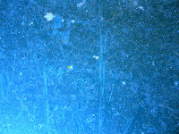
There are a few textures that I found on Google images that seem as though they would work well with my vector based designs. This blue texture has a grungy feel to it which I think would work well in contrast to the solid colour illustrations. It has a very scratched surface, yet it is still quite simple.

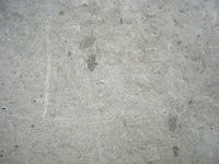
 This texture has a similar feel to the one above but it has less scratching. I do believe this is a concrete texture so it sort of has a smooth look to it. I think this could work well if a blue overlay were added and the blend mode set to multiply.

I like how this texture got slightly lighter near the centre, again it has a grungy feel to it. The only down fall is that it has a very dark line and corner on the bottom right hand side. I know I can always crop this so it is still a possibility to use in my sequences.


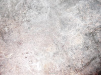
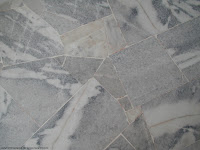
This texture is of marble, I quite like all of the different shapes created by the marble but I think it might be a bit too detailed for my background.


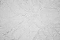
This is a crumpled paper texture, I think this could work really well with my designs but the only problem I have is that someone has already used this texture with a blue background within their sequences and I dont want to seem as if I am copying.

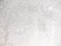
This is the texture that I am going to use within my sequences. It is grungy and simple and the pattern is quite light. There is nothing on there which is too harsh or prominant for my illustrations and with a blue overlay this will look perfect. Just adding the right amount of detail.


This is the colour palette that I will be using throughout my sequences. I have tried to keep them simple by selecting colours that will best represent my topic. I chose the orange and blue because they are used in the film 'The Bucket List'  movie posters and dvd covers. The blue is much like a sky blue, and as I am having a lot of frames with sky within my sequences, I find it appropriate. The orange will be used for some of the type and will also be included in the skydiving frames and the hot air balloon frames. These two colours also remind me off a clear blue sky and a sunrise, which are both very inspiring like my 'Top 10' subject matter. The different tones of black have been used for the character, mountains, bucket and elements of text.


Below are my vector images that I have used within my idents and title sequence. They were all created using Illustrator and I have kept them very simple. I think that the simplicity of the images has worked well because it doesnt over complicate the sequences and what I am trying to communicate.


With the bucket, I found an image on Google Images and then traced it in Illustrator (freehand). I then added the colours myself accordingly.


This is my character who I created to show taking part in the activities from the bucket list. He is basically a blob that I created with the rounded rectangle tool in Illustrator. I think that he works well being so simple because it allows him to adapt to all situations. I created him with a smiley face that again is really simple. I think that his simplicity makes him funny, you cant help but smile when you see him especially when he's in particular situations. I think that his mouth either looks like he's smiling or he's sticking his tongue out, either way it works.


This is the same character as above, but with this I had to give him a temporary 'extension' so that he could 'kick the bucket'. In my crit feedback it was sugested that I give him a real foot, but a tutor said that I would make it difficult for myself if I tried to start animating my character. I decided on just using this method as I felt that it fitted better with the design and detail of the character. I think that a proper foot would have been too much detail compared to the rest of the character and other imagery that I am using.


This fish is for the scuba diving ident and frames within the title sequence. Again I found a tropical fish on Google Images (which is a clown fish) and then traced over it myself and added the colours. There were a few details that I didnt add from the original image, because much like the other imagery, I wanted it simple.


This is probably one of my favourite pieces of imagery that I have created for this brief. Its funny because the character doesnt seem fased by the fact he's parachuting. I havent changed the facial expressions throughout the sequences because I feel that its more light hearted if he just stays happy. In a way I guess it is communicating that all of these activites are good fun if the character has a permanent happy face. I created the parachute from tracing a Google Image and then added the straps to the character. I know that this image is supposed to represent skydiving but he is clearly parachuting. It was more interesting and slightly easier for me to illustrate the second half of a skydive when you are parachuting down. I think that this is one of my favourite images because I can relate to it more as I have actually done a skydive.


This is a speech bubble that I created in Illustrator using the curved rectangle tool and then adding anchor points so that I could drag a corner out. The speech bubble was used at the beginning of my title sequence and the end of a few idents.


This is the character for the scuba diving frames. All I have done is copied the original character and then added scuba diving elements to him. I was going to add flippers too but I felt that it would get too complicated when I tried to make the character and his flippers move in the sequence.


The hot air balloon was also created in Illustrator, I found an image on Google Images and then traced the actual balloon shape. I then added the basket with a curved rectangle shape and added the ropes to attach the two shapes together. I added an Artist effect to the balloon to make it look more realistic, it is a plastic wrap which gives the balloon a 3D look and a slight shine.


This is the bungee jumping character, again I have copied the original character and then tuned him upside down and added safety harnesses and a cord to make it look as though he is bungee jumping. I realised once I had done it that I have made the cord look like rope, and you obviously wouldnt bungee jump with rope as you wouldnt bounce back.


This cloud was created with the free hand pen tool in Illustrator, this was used in the mountain frames to add a more realistic element. They floated across the frame.


These mountains were created for the mountain climbing frames. They are very simple illustrations because I didnt want to add to much detail because nothing else was like this. They are literally made from one free hand triangle I drew using the pen tool, that have been copied and the scale and width changed.


This octopus was used for one of my ident ideas. I created 3 legs then copied and reflected them. The colour of the octopus is the same as the BBC Three logo so that in the sequence I didnt have clashing pinks by using two different colours.


The tattoo parlour was created for the tattoo ident. I used simple shapes to create the shop and the door. With the window I added an Artist effect in Illustrator to make it look more realistic and I have done the same for the glass in the door. I have then added an open sign and used a typeface that reflects on what would be used in a real tattooist.


This is the back of the character, designed to show off the tattoo that the character got in the tattoo frames. I have created bum cheeks and then added a Peace symbol tattoo on his right bum cheek.


Design for digital// Top 10 proposal: Take 2..

I have slightly changed my idea from my initial proposal. My design direction has changed as I felt I was working in a way that was too complex for my After Effects skills and didnt really suite the way in which I wanted to communicate my Top 10. I was going to have quite a formal but light hearted title sequence but I feel that its not really the best way to portray this subject to my target audience.

I want my titke sequence to be light hearted and funny but still obviously communicate my message clearly. So I have come up with the idea of using illustration rather than found imagery and photographs. I feel that it will be more engaging and help push the tone of light heartedness.

The title sequence and idents will have an illustrated character in them that shows the Top 10 in different ways. For example the character would be shown skydiving. I dont want to include type within the illustrations of the activities anymore as I feel it is making my idea too literal and in a way it takes the fun out of it. The opening of the title sequence will introduce what the programme would be about and then the character would briefly appear taking part in the Top 10 things.

The idents would then be taken from the title sequence and edited accordingly to fit within the 10 second sequence.

I am still going to use similar colours as to what I was in my first proposal as I think they are still relevant to my subject theme and the tone of voice that I will be communicating. These colours were a light blue and orange, along with the white of the character and shades of black for other small elements. There will be a visual consistency between all idents and title sequences which will then run through into the packaging design for the submission disc.

My target audience has also slightly changed from the first proposal. It was being designed for 18-40 year olds because I felt this was the age where you were most likely to go off and enjoy life in this way. But after changing my design direction I have decided it best to lower my age of the audience to 16-21 year olds. This is because of the design of my moving image pieces which will be more illustrative, I just feel it would appeal more to a slightly younger audience. Another reason that changed my mind was watching BriBrys (the young Irish guy) Youtube channel. He was a young lad and I found him inspirational as im guessing many young people do. His videos are always fun and light hearted so I wanted to use this approach for my project. When your young you have your dreams and ambitions set and your raring to get out there and fulfill them. So my set of moving image would be there to inspire and motivate those young people to just get out there and do it!

The channel that it would be shown on is BBC Three. The reason for this choice was because BBC Three often show random programmes, that are often just for fun. Including things like Dont tell the bride, Worlds craziest fools, Russell Howards Good News and Family Guy. On their website is also says:

'BBC Three: Never afraid to try new stuff... We're fearless'

This is one solid reason why this channel is perfect for my theme!

BBC Three go live at 7:00pm everyday which means that my title sequence could be played at 7:30pm. The idents would be shown throughout the day at these times: 8:00am, 1:00pm, 5:00pm and 6:30pm. The reasoning for these times are because my target audience are likely to be at school, college or uni during the day. S o I would show one in the morning before they set off to school etc, one at lunch incase they were art home for lunch. Then the two in the evening would be when they are back home from college etc and one an hour before the show would start to remind them it was on.