For the second part of the Design Practice 2 module we were asked to find Live briefs/ old briefs that we were interested in and would want to work with. We asked to pick a D&AD, an ISTD, a YCN and another live brief of our choice. The briefs could have some relevance to the practice that I want to pursue or they could just be one that sounds like a challenge.
Here are the four briefs that I have chosen:
D&AD// We want to make it impossible for anyone to ignore Peace day.
YCN// Swarovski.
ISTD// It happened on this day.
MY CHOICE// Design a Penguin adult or Puffin children's cover.
------------
D&AD Brief// We want to make it impossible for anyone to ignore Peace Day.
We want to make it impossible for anyone to ignore Peace Day. We want to make it a day that everyone around the world engages with, so the governments and leaders in conflict zones have no other choice but to implement it. The task is to grow grassroots awareness and active personal engagement with Peace Day, to make this day ubiquitous and as part of our social fabric as Valentine's Day or Mother's Day.
Tone of voice//
Stimulating, optimistic, realistic
Proposition//
Dont let Peace Day be ignored.
Points I have taken from the brief//
- Aim the brief at everyone, but try and focus down on people who are change- makers, those who believe in actions rather than symbols, in the practical rather than the theoretical. Those who enjoy getting their hands dirty and believe in the power of individual actions to build a greater future.
- This idea needs to work everywhere in the world irrespective of cultural particularities.
- Peace Day is a non- profit organisation, Peace Day relies on all- inclusiveness.
- They want something that works beyond media and across cultural, political and denominational frontiers.
- Collaboration is key to Peace Day and should be key to your solution.
My reasoning for picking this brief//
I decided to choose this brief as I liked the fact that there was no restrictions on deliverables. The brief is very open and I feel that there is a lot that can be achieved with it. I also find the subject interesting, everybody wants world peace but no one knows how to go about it or even if its possible. If everyone worked together then Peace Day would be easily achievable, I would just have to inspire, convince and educate people about it. Where theres a will theres a way!
------------------
ISTD Brief// It happened on this day.
We want you to consider how best to interpret the project theme. Is it what happened through the centuries on a specific day in the month/ year or could it be the story of one particular day in time? The 'Big Bang'; Battle of Hastings; the first pulls of Gutenberg's 42- line bible; Elvis Presley on the Ed Sullivan show; assassination of JFK; Liverpoll's European Cup win in 2005 or the atrocity of 9/11- you are spoilt for choice.
Howerver fascinating the topic and the information that you select, yoru challenge is to create a delivery platform that demands the reader's attention. It needs to address the norms of information architecture while actively working to evoke an emotional response from the reader or viewer.
Use print, screen, combined media- the choice is yours- as long as it expresses a solid idea, informs us and shows your typographic skills. Remember that words and language are our collateral and that your submission should essentially be typographic.
Reasoning for choosing this brief//
The reason that I chose this brief is similar to the D&AD brief, there is a limited amount of restrictions on this brief which means I have a wider variety of outcomes to consider. One thing about the brief that I do not particularly like is the fact that the outcome does have to be type based. Type is not a strong point of mine, but I could maybe re- jig the brief so that it fits to my skill set and interests.
-------------------
YCN Brief// Swarovski.
- Attract the next generation of Swarovski fans.
We'd like you to creatively demonstrate how you think Swarovski can relevantly and powerfully engage their fashion range with younger consumers. You are free to explore all marketing channels, demonstrating the media and enviroments that you think the target audience will be most receptive to messaging and engagement. You can consider all elements of marketing, PR, advertising, in- store applications, points of sale, packaging, social media, experiential ideas and everything inbetween.
Points taken from the brief//
- Target audience: Swarovski are interested in reaching a new younger audience (20- 30 year olds) primarily targeting young urban UK females who love their jewellery, like to keep up with the latest trends and fashion, and want to express themselves through jewellery.
- Aim of the brief is to take the repositioning of the brand to the next level, concentrating on attracting the next generation of Swarovski fans to their fashion collection.
- Daniel Swarovski I said: 'Evolution never ceases. Reforms in one area lead to further reforms in other areas. One must, however always be alert to the opportunities'.
- Swarovoski want to broaden its appeal and desirability to new consumers.
Reasoning for choosing this brief//
The first reason that I chose this brief is because it is one that I was considering greatly for the first part of this module, it really interested me because there was a branding element to it and branding and identity is a path with Graphic Design that I am currently very interested in. The brief is again very broad which has made it very appealing, the only restriction really is the target audience, which even then has some breadth to it. Although I am not really into fashion, I do really love Swarovski which I think helps if you are going to do a brief on it.
---------------------
Penguin and Puffin Brief//
Design a Penguin adult or Puffin children's cover.
Reasoning for choosing this brief//
To be honest I dont really feel that the brief has much structure to it and the reason that I chose it is because it sounds fun and it will also give me the chance to use my image skills. I think that in a way it is good that the brief is so vague because it means I can interpret it in my own way and pretty much do what I want with it.

Showing posts with label STUDIO BRIEF. Show all posts
Showing posts with label STUDIO BRIEF. Show all posts
Monday, 30 April 2012
Tuesday, 17 April 2012
Image// Book Works brief..
Brief//
You are required to create an edition of 5 'books' visually/ contextually based upon one of the following:
- A colour
- A typeface
- A sound
- A shape
Considerations//
THINK VISUALLY. Consider what the visual essence of your subject matter. What are you trying to communicate and how do you do this most effectively?
Appropriate format, scale and content for 15th International Contemporary Artist's Book Fair.
You must explore colur, type, sound and shae before selecting a subject matter.
Practical considerations//
What is a 'book'? How can you challenge this in terms of media, proicess and context.
As you will be producing an edition of five books will this effect how you will have to make decisions regarding reproduction within the time scale and cost?
Background//
15th International Contemporary Artist's Book Fair, Friday 9th and Saturdaty 10th March 2012. The Parkinson Court, University of Leeds.
The Contemporary Artist's Book Fair presents unique and multiple book works by artist and publishers from around the world.
As part of the module I organised a space for BAGD to display works and submitted a statement and images for the exhibition catalogue.
Mandatory requirements//
All images should be supported by a broad range of visual investigation in the form of design sheets and notebooks.
An edition of five books to sell at either £5 or £10
Deliverables//
An edition of five books based upon either colour/ typeface/ sound/ shape.
-----------------
For my initial ideas I was thinking that I wanted to work with a shape, colour or typeface. I wasnt sure about the sound as I didnt really see what I could of done with it. The other three options were looking at either the colour orange, the typeface Century Gothic or polka dots.
I soon ruled out polka dots as I had already based a big brief on them in a previous module. With the colour orange I was thinking.
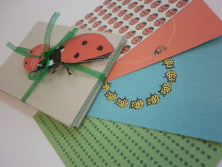
Below are my final designs for the book fair. In the end I decided on making a pack of postcards rather than an actual boook, I guess in a way it is a book of postcards. I made eight postcard designs all together each with a different pattern on. Some had singular Ladybirds and others were laid out in patterns.
I made 4 books altogether as one messed up. I decided to sell them for £5 and managed to sell just one.


You are required to create an edition of 5 'books' visually/ contextually based upon one of the following:
- A colour
- A typeface
- A sound
- A shape
Considerations//
THINK VISUALLY. Consider what the visual essence of your subject matter. What are you trying to communicate and how do you do this most effectively?
Appropriate format, scale and content for 15th International Contemporary Artist's Book Fair.
You must explore colur, type, sound and shae before selecting a subject matter.
Practical considerations//
What is a 'book'? How can you challenge this in terms of media, proicess and context.
As you will be producing an edition of five books will this effect how you will have to make decisions regarding reproduction within the time scale and cost?
Background//
15th International Contemporary Artist's Book Fair, Friday 9th and Saturdaty 10th March 2012. The Parkinson Court, University of Leeds.
The Contemporary Artist's Book Fair presents unique and multiple book works by artist and publishers from around the world.
As part of the module I organised a space for BAGD to display works and submitted a statement and images for the exhibition catalogue.
Mandatory requirements//
All images should be supported by a broad range of visual investigation in the form of design sheets and notebooks.
An edition of five books to sell at either £5 or £10
Deliverables//
An edition of five books based upon either colour/ typeface/ sound/ shape.
-----------------
For my initial ideas I was thinking that I wanted to work with a shape, colour or typeface. I wasnt sure about the sound as I didnt really see what I could of done with it. The other three options were looking at either the colour orange, the typeface Century Gothic or polka dots.
I soon ruled out polka dots as I had already based a big brief on them in a previous module. With the colour orange I was thinking.
Below are my final designs for the book fair. In the end I decided on making a pack of postcards rather than an actual boook, I guess in a way it is a book of postcards. I made eight postcard designs all together each with a different pattern on. Some had singular Ladybirds and others were laid out in patterns.
I made 4 books altogether as one messed up. I decided to sell them for £5 and managed to sell just one.


Image// 2D to 3D to 2D Brief..
Brief//
In response to the drawn image you have created you are required to re- create the image three dimensionally and record the outcome photographically.
This brief will allow you to explore material, environment, scale and form.
Considerations//
THINK VISUALLY. Develop a range of visual solutions to this problem. How many ways can this narrative be recreated?
What scale do you intend to work on? Is the image sequential or static?
Does the photographic process you use reflect the tone of the drawn image?
Practical considerations//
This brief explores both drawing based principles and photographic processes.How can you translate one method to the other and how do you bring them together?
Are there any practical considerations you must consider in terms of how you work and how will you move beyond these?
Background//
The process of documenting methods and how you record/ catalogue/ collect these methods are as important as the final outcomes themselves.
You will rarely produce a piece of work three dimensionally and not have documented it in some form. This documentation is necessary for the image to communicate to an audience.
Mandatory requirements//
All images should be supported by a broad range of visual investigation in the form of design sheets and notebooks.
Deliverables//
One visually resolved 2D to 3D to 2D image submitted on A3.
---------------
The object that I was given was a glove. I then had to think of a verb and an adjective for the glove to communicate this through the 2D to 3D to 2D brief. My verb was unravelling and my adjective was busy.
We had to first draw an image of the object illustrating the verb and adjective.

This is the image that I drew of my object illustrating the two words.
The idea that I first had was to buy a glove and unravel it and then photograph it. I wanted to unpick the stitching and make it look really messy, but keep the shape of the glove with the fingers so it was still easy to see what it is.


These are some pictures of how I transformed my 2D drawing into a 3D object and have then photographed it. I dont think it works too well because I already had this glove and I had cut the fingers off which makes it less obvious its a glove.
Monday, 16 April 2012
Image// Rain Brief..
Brief//
The brief was to design an A2 poster that illustrated why rain in the UK was a good thing. For this brief I looked at ways in which I thought rain was romantic and fun and also the animals that enjoy the rain. The first thing that came into my head was ducks, ducks seem to love the rain. So for my poster design I have illustrated two ducks in love, standing in a puddle in the rain.
I think that the poster has worked really well. I like how its humerous and light hearted. People should love the rain because you can have fun in it.


Subscribe to:
Posts (Atom)