The brief:
Through process of collection and categorisation of content specific to your own interests and recent research explore/ communicate through:
- PRODUCT AND PROMOTION
- PRODUCT AND PACKAGING
- PRODUCT AND DISTRIBUTION
--------------------------------------------------------
I have decided to focus on either
PRODUCT AND PROMOTION or P
RODUCT AND PACKAGING. I will research existing pieces of design and product that relates to my chosen theme of glasses (spectacles) in order to gain some inspiration, this will relate to part 3 brief.
Ideas i have:
- Selling glasses...advertising campaign/ promotion/ packaging
- T- shirt designs...illustrations of blind animals wearing glasses...product and promotion
- T- shirt designs...using eye test charts with hidden, comical messages/ eye jokes...product and promotion
- Stop motion of people wearing different styles of glasses/ 100 pairs on one person...product and packaging/ promotion
- Type as image, designing glasses with words in the lenses/ hand crafted/ digital posters...product and packaging
- Making a book with different styles of glasses
- Make 100 pairs of glasses and take photos of someone wearing them, to then compile a book.
-----------------------------------------------
The main thing that i am looking at in this brief is styles of glasses, as they have changed so much throughout history. I started by researching glasses through history and found a book in the library called spectacles and sunglasses, it illustrated glasses from hundreds of years ago to the present day, including practical and weird and wonderful specs. I found a lot of inspiration from this book and it was a starting point for my design development. The book has helped me a lot throughout my design process, i have refered to it several times for inspiration.


I decided to focus on weird and wonderful glasses i found that they were more visually interesting and would attract more attention. I have then made 100 pairs of glasses made from white card, with inspiration from the above book. Each pair is different and from different times in history. It took me about 2 weeks to complete the glasses. I think that they have turned out really well and they are well crafted. I decided to do them white because i felt that it stood out more, as the typical colour for glasses is black. My main focus was on the shape of the glasses rather than any kind of practicality in terms of using them for bad eye sight. As i made each pair i tried them on, which made me laugh. They can be worn as i have made the lense and ear pieces to size.
If i had more time i think that i would of liked to have made them from perspex or some kind of stronger material. My original idea was to create a book with the glasses and have a word for each pair, but after thinking about it, i thought it would of been hard to think of 100 words and a different one for each pair!
I then thought of taking photos of someone wearing each pair, but in a crit i was told that the repetition of the same persons face could become boring for my audience. I have taken a photo of each individual pair and then compiled them into one large image so you can see the variety. The large 'poster' of all the glasses looks really exciting. In yet another crit i was asked what the purpose of my poster was, but i feel that it just is what it is. The purpose of my work is to simply celebrate the aesthetics of wonderful glasses, i dont see why it has to have any kind of text on it.
This is another experimentation with my poster design, i tried adding text to se what it looked like, as in my crits people suggested i add a title. I think that the text takes away from the actual glasses, although i do like the blue against the black and white.
I have also taken some photographs of all the glasses in a pile, i think that it looks really interesting and quite exciting to see them all together. The glasses are very intricate.
----------
The collection of photographs of the glasses looks really good in my opinion and in the opinion of others, i am going to print this large like poster format. I dont feel that i need to add a title as i think it is clear what it is about. Simply just a poster to celebrate weird and wonderful glasses. I think that if i add text it would mess up the neatness of the layout. It just is what it is. Purely for visual enjoyment.
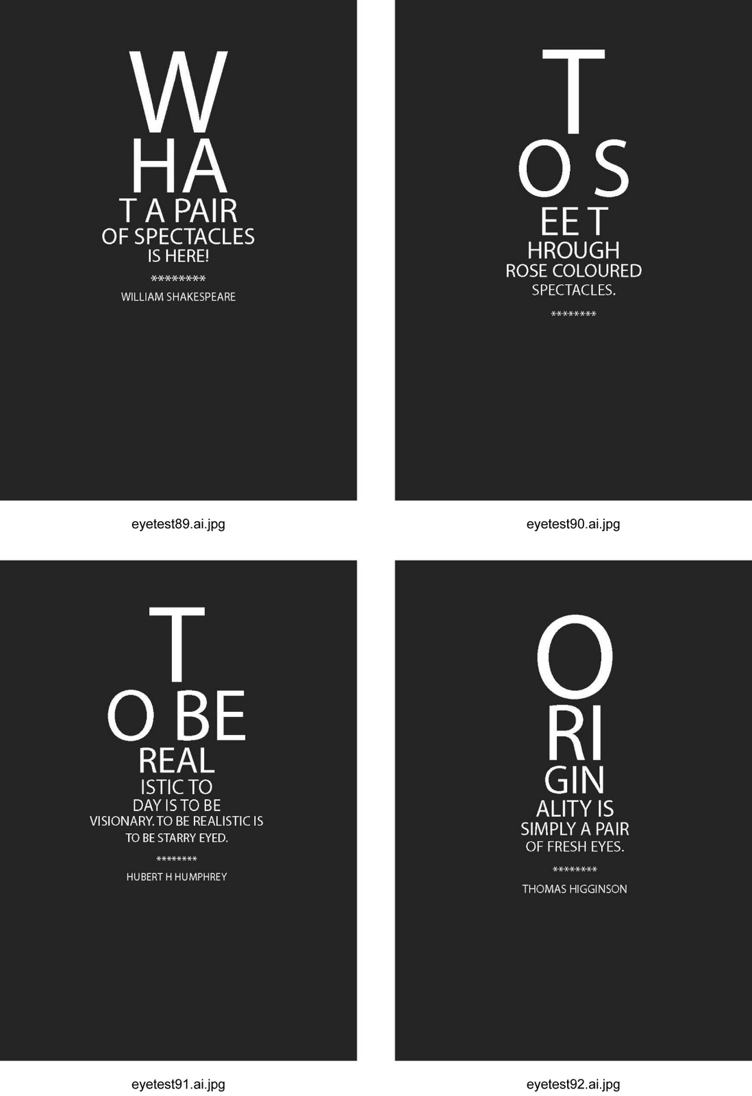
I have also created a collection of 100 quotes, song lyrics and proverbs about sight, vision, eyes and glasses. These have been formatted in the same way as an eye test, where each line becomes smaller in point size. I had this idea a week before the deadline, so managed to get them done in a few days. I think the most successful part about them is how each one obviously has a different quote on them, and as i have spread words across two lines they have created new words, of which some are funny. So i think it again more interactive with my audience and fun too.
In terms of my target audience, i think that i would be promoting my work to a younger audience between the ages of maybe 10 to 20. The younger end of my target audience would be because of the funky styles i have created and for the upper age of my audience i would say the interest would still be in the glasses, maybe partying glasses and also the quotation cards because i, myself find some of them quite inspirational. The sort of thing thay would motivate me.
I have experimented further with the eye tests by adding colour, i have combined complimentary and contrasting colours together so that some are hard to read, as i feel this links in with sight. After having learnt a lot about colour during colour theory seminars i felt that it would be useful to combine my new skills. This coloured cards could act as a double side to black and white versions or even a poster. In some cases i dont want the text to be legible that is the whole point.
The eye tests themselves have worked well, they have ben kept simple. The purpose of them is to simply quote or inspire sight, vision and glasses, they would become part of the collectors edition i am designing.
It also links with people who are colour blind, not all blindness means you cant see anything.
Colour blindness doesnt actually mean that a person cannot see colour, it means that they often cannot differentiate between some colours. For example the red background with pink text i can see only just, to a colour blind person they would just see the red box.
After a crit i was told that the poster, glasses and quote cards did not link together, so i decided to design a collectors item. The glasses would come in packaging along with a quote card and poster and a pair of the glasses.
This is the first mock up of my collectors packaging, i have used image of the glasses on the front and back, on the front is my punch line ' its not how you see, its how you look'. Which means the glasses purpose isnt for people who cannot see, they are for 'fashion' purposes or just for shear fun.
On the back it states what the package contains and its purpose. My product is just for fun.
I have experimented with the packaging in order to come up with the best and most appropriate design. With the above design i have added a hint of red on the back, this is to indicate which pair of glasses you will get in the pack, so it makes it easier for people to collect their favourite pairs. If this isnt shown in some way then people may end up getting the same pair 100 times which would then put them off purchasing my product. People these days like to know what they are buying.
I then tried the sam technique but using blue instead as i felt that the red was too harsh and in a way made it look tacky. Blue is a lot softer and links with blue eyes. It is also a colour that i think works well with black and white. It adds a nice effect to the glasses when it has been printed, it almost looks embossed. I have also added a barcode onto this design to make it look more like a finished product.
The glasses themselves within this product would not actually be made of card, but maybe perspex or thin plastic. Something not too heavy but something that will be quite durable.
I have then added the same blue to the title of my product on the front of the packaging just so it links together more, also i think that it will stand out more with a bit of colour.
With this design i have made the whole of the front of the packaging blue and then turned the package's blurb white. The blue cover shows that there are 100 to collect in relation to one being coloured on the back to indicate which one is in the pack. I prefer this design of packaging as it has that little kick of colour which stops it from looking quite plain.
This are images of what you would find in the collectors package. I think all together they work well, i like the contrast between the black and blue with the crisp white of the glasses. As an overall product i think that its purpose is to be fun and in a way it has no practical function. It is what it is. The packaging is effective and reflects on the contents, it remains young and eye catching and i think would attract and sell to my proposed target audience.