
To create a full typeface (A-Z and 6 glyphs of your choice) for your partner based on their personality, character and personal preference.
I started off by asking my partner questions about things that she liked, including things like her biggest achievement; where she was from; earliest childhood memory etc.
I then asked her about her typography interests and preferences, i found out a variety of aspects of type that inspired her.
- Serif
- Vintage
- Old fashioned
- Italic
- Outline
- lower case
- Detail
- Illustrative
- Transparent
- Collage/handmade
- Small/delicate
- Big gaps/kerning
- Over worked
From the specifications that my partner had given me about her personal preferences in regards to type, i had to choose 5 adjectives that described the character of my partner.
Precise : Definitely or strictly stated, defined or fixed.
Elegant : Tastefully fine or luxurious in dress, style, design.
Direct : Straight foward, frank, candid, headstrong.
Proud : Having, proceeding from, or showing a high opinion of one's own dignity, importance or superiority.
Vintage : Representing the high quality of a past time, old fashioned or obselete.
I have looked at different fonts that i feel fit one of the objectives or a few in one typeface.

Cast iron...

Fontleroy brown...

Romantiques...


English...

These are the initial ideas that i came up with when i first recieved the brief and my five adjectives. The ideas are based upon adjectives combined rather than all five. I have experimented with swirls and flowing serifs to portray the words proud, elegant and direct. Aspects of type anatomy i have also experimented with are the serifs, stems and line.


This is an example of one of my ideas tested on four letters, the design is simple and legible at this point size but if i were to shrink the point size it may be hard to read.I think this design works well though as it expresses the adjectives visually and it is a simple typeface.

From the design above i then experimented with line and blocking out the letters, also playing with the swirls within the letters. I think the one on the left works well as the swirl is subtle and it doesn't become to complicated, but again at a smaller point size would it be readable?

I have again tried the first simplistic design on different letter forms to ensure my logic would work throughout the whole alphabet.

A tutor suggested i try adding the swirls underneath the letterforms rather than inside them as to make it more legible and readable at a smaller point size. I don't think it flows as well as my initial ideas as it elongates the letterform too much and the swirls begin to look awkward on some letters.

I drew out a base typeface to work from with my ideas, these were designed from the existing typeface Romance Fatal Serif. I exaggerated the serifs and the stems and also slightly adjusted the curves of the bowls and the counters.

I used one of my more decorative designs to create my partners name to see what the letterforms looked like as a word. It's very readable and is visually interesting.

Although you can't really tell, this is my partners name again but at the size of the name badge i have to make. The font becomes slightly too complex as it gets to a smaller point size but it's still readable.


The most simple idea of my final 3 ideas, the serifs have been blocked in to portray direct and the elongation of the letterforms portrays elegance and proud.


With this design it's the next level from the above design, as it contains the swirls within the letterforms. I like how the elegant swirls give the letterforms a flowing formation.


This is my favourite typeface i have designed, it portrays nearly all of the adjectives in one, including vintage. The letterforms are filled with lines which, from this photo make them look grey. The detail of this type is beautiful but would be spoilt and lost at a smaller point size.


Next stage to this brief is to experiment, experiment and then some more experimenting. I have kept the same base font to experiment with , just changing elements to see what happens. The above typeface is still using the consistent use of the bloated serifs but i have taken away the counter which leaves a shape but it is still recognisable as a letterform. It works well as its simple, thats it really.


This font is based upon my favourite typeface i designed before, but i have changed the line direction within the letters to diagonal rather than vertical, this doesnt make it seem so 'magical', ive also left the bloated serifs and swirls white, which again gives it a more simplistic look. This design looks very light and subtle, the slight shadow defines the letterform and helps to bring it out from the page.


This design again is the same base as the above design, but i have changed it. This time everything is blocked out, the bloated serifs are no longer visual. The design looks more sophisticated as it still has the elegant swirls but theres no internal lines, its just black.

I have tried out several ideas with the letters ABCDE. Again it's the same base letterform design but i have changed elements each time.
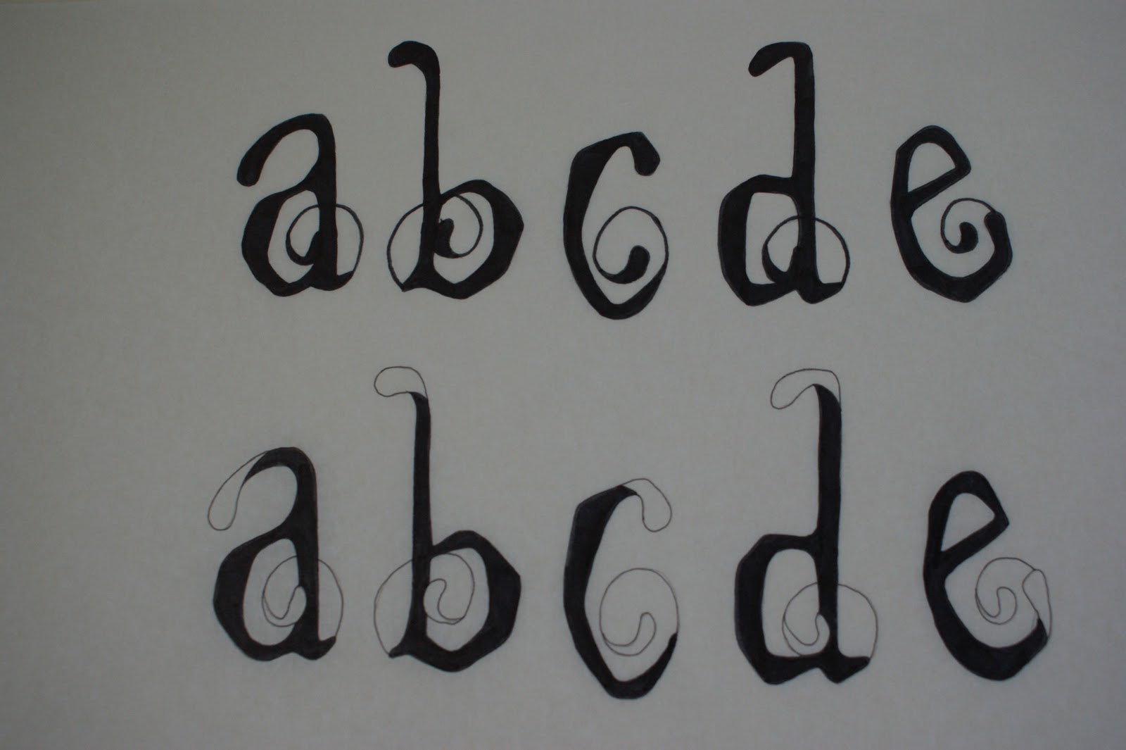
These two designs simply involve blocking or keeping white the bloated serifs and swirls, yet there is such a huge visual effect to this modification.

The top design is blocked in, with no swirls and the bloated serifs have internal lines in them. I particularly like this idea as its simple yet theres still some subtle detail. The bottom idea has all the serifs but i have placed the elegant swirls under the letterforms. I dont think this works well as the swirls look lost.

The bottom design is just the outline of the letterforms but still has the bloated serifs. I have then blocked out the serifs to define them.

The top image is the reverse of the image above.

Above i have applied the same logic to my favourite design to uppercase letterforms, it still works and i would like to design the whole alphabet in uppercase too.


This idea looks very contemporary, i have made the internal size of the serif larger and also added in internal directional lines.


Above i have used some designs and spelt out the name of my design partners name to see how the letterforms work in words and whether or not they are readable.


I started experimenting with one of my developed typefaces in a style inspired by Milton Glaser's 'I lOVE NEW YORK' posters. But i have done it as 'I LOVE GRAPHIC DESIGN'.


I tried out different compositions with the type and i also applied the same style to the heart imagery.


What personality traits do you interpret from the typeface designed to represent you?
ReplyDeletePrecision
Nature
Elegant
Vintage
Describe what you think of the typeface:
Really like the detail and the thought process which has gone with it. It's well designed and quite aesthetically beautiful. Its legible, but detail may not be seen when downsized.
In what ways is it effective or innaffective of representing you?
Its a decorative, vintage style which i like and is consistant throughout. As a typeface I feel it really works well!