Wednesday, 25 May 2011

OUGD103 end of module evaluation...

1. What skills have you developed through this module and how effectively do you think you have applied them?

One of the main skills that i have started to develop further because of this module, is experimenting and trying out new things. As it is the last module of the first year i felt that this was my last chance to really go all out and use methods i hadnt yet used. Things like screen printing for the Communication is a virus brief, i really enjoyed the process and the outcome, although it takes a long time it is so worth it. It is defiantly a skill that i want to keep progressing with into the second year. I feel like my confidence has grown too, i have really tried hard in this module and find i have more confidence in my designs and ideas, i am also starting to find an approach to Graphic Design that i really enjoy.

2. What approaches to/ methods of research have you developed and how have they informed your design development process?

With the what is graphic design for? brief and communication is a virus, i did a fair amount of research but feel that i still havent grasped the importance of good research, with the speaking from experience brief i did a lot of primary research to try and solve my problem, i also did work on my design context blog looking at packaging design and survival kits that already existed, to give me inspiration and an idea  of what should go in my own.

3. What strengths can you identify in your work and how have/ will you capitalise on these?

Strengths that i think i have gained and improved on throughout this module, include experimenting more and trying harder. I know these are both things that i should have been doing anyway but i feel that i am really getting into it all now and i wanted to experiment with more methods and mediums than i had before. Things like screen printing, transfers, making stickers and designing packaging. These are now skills i can develop further in the second year. I am becoming a bit better at researching for briefs too which is a very important process, i wouldnt say that i still do enough but again this is something i can really push myself with when entering the next year. Another strength i think i have developed a lot would be time management, i have really tried to do work when i get it (apart from the what is Graphic Design for? brief, which i have left till the last few weeks). When i was asked by people if im on top of everything they seemed really surprised which then made me think i had missed something out or forgotten something important!

4. What weaknesses can you identify in your work and how will you address these more fully?

Even though i mentioned in my strengths that i was improving on research methods and gathering, i feel that it should be a weakness too as i still havent fully mastered research or the understanding of its importance. I think its good that we point out our weaknesses as it motivates you to do better next time.

5. Identify 5 things that you will do differently next time and what do you expect to gain from doing these?

- Research, research and research some more, i feel i really need to get it into my head that research is VERY important!

- I wont leave research briefs (what is graphic design for) till the last minute, this is a brief and a process that i should be doing all the time. Looking at other designers work for inspiration is very important, it will help me to learn what is good, bad and graphic design that i like and aspire to be like!

- Not panic! At the beginning of the module i was ill and missed out a lot of things in relation to the Opposites Live brief, i panicked thinking i would not catch up, but after speaking to my mum she said i could and would do it! I think really believing in myself is something i will do from now on!

- I think that when we worked as a group for the communication is a virus brief, it would have been good if we had worked just that bit harder as a group. I guess everyone finds group work hard because we all think differently but next time i would like to put more effort in.

- Listen to feedback more and respond to it, i wont lie sometimes i dont even take feedback into consideration because i feel i dont always need to. But sometimes your peers know better than you and the feedback is there to help you, its not them telling you your idea is crap!
6. How would you grade yourself on the following areas? 1= poor, 5= excellent

- Attendance: 5
- Punctuality: 4
- Motivation: 4.5
- Commitment: 5
- Quality of work produced: 4.5
- Quantity of work produced: 4.5
- Contribution to the group: 4

-----------------------

Additional comments:

Overall i have really enjoyed this whole module and feel i have put nearly 100% into it. I have learnt a lot about myself, like how i work, what i like and what i dont like. It has had its good bits and bad bits and its quite sad that its the last module of the year! Bring it on second year!

Thursday, 19 May 2011

Speaking from experience..final outcome...

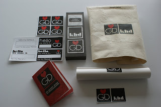
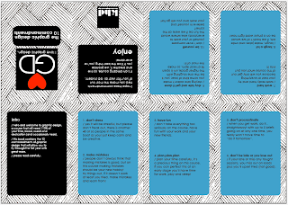
Below is my final solution for the speaking from experience brief, my final outcome is a pack that would be given to the new students on the first day to help get them settled in and hopefully make them smile. I have kept my whole project light hearted as i think this would help the new students feel more at ease when they start. The pack contains a poster, a tote bag, a pen case, name stickers, graphic design stickers and a '10 commandment' book.

I have kept the colour theme consistent throughout my designs as i wanted to create a branding and identity for the whole thing. the colours i have used are black, white and red and i also created a linear pattern which is on the majority of designs.

--------------------


I am really pleased with my final designs and i feel that they not only answer the brief in a creative way, but they have also started to show the way in which i like to approach graphic design. The packaging has changed a few times through out the whole process, due to technical hitches and overall aesthetic quality, to complete my box for presentation i bought some ribbon with love hearts on, to seal the deal. The ribbon links in with the love heart within my designs.


If the box were to be a real product that would be produced in large quantities, i thin i would have to re- think the stock or possibly find a sturdier version of the one i have used, which is cartridge paper. As at the moment it does seem a little bit flimsy, but cartridge paper has a nice texture to it and i like how it has toned down the colours during printing, the paper absorbs a lot of the colour.


I think if i were to be given more time i would possibly create more items to go inside my pack, such as the things i mocked up on illustrator (i.e t- shirts, lanyards etc). The book and more info could be placed onto a memory stick that would also go inside the pack. To be honest i think it would be pretty cool if i could brand the graphic design area, i.e using my design/ branding for the studio labels etc, and personalised GD notebooks.


This is the contents of the box, i think it all works really well together due to the consistent colour theme and design. John gave me some good feedback about my work, and he particularly liked the logo (as he love the designer Milton Glaser with the 'I <3 NY' designs).


I decided to add a tote bag design into the pack because a lot of the time we have lots of things to carry and sometimes your one bag just isnt enough, not just that, but people love free stuff! I am really pleased with how the stickers came out, i have never printed any before so it was quite exciting. I have been sticking them around and given one to a few people.


The poster that is included in the pack and which is also printed onto the tote bag is very important. This is because it is an email response i personally received from a designer, and the advice he gave me was so honest and helpful. I would hope that it would inspire the new GD students like it does me.


Wednesday, 18 May 2011

Type and grid...

We continued to develop our skills in type and grid after receiving the InDesign brief. In the two sessions with Lorenzo we had to choose to articles, one from a high end magazine and one from a low end magazine. We then ha to compare the visual differences on content and layout. 

The differences that i found between the magazines were:

- the high end mag uses a lot of serif fonts which are quite elegant, compared to the low end which uses more plain san serif fonts, it doesnt show much sophistication.
- the high end mag has a more formal and structured layout, that is well organised.
- the low end mag is very cluttered and doesnt seem to make good use of its grid.
- the low end uses a lot of text wrapping around images through the article, which makes it appear messy and disorganised.
- the low end uses a coloured gradient background on every page, which makes it look cheap and a bit tacky, where as the high end has crisp white backgrounds which allows the information to have complete hierarchy over a busy background.
- the low end mag has puzzles besides the article, which makes the pages look crammed and too busy, it also takes away attention from the article and important information.
- the high end just focuses on the main article with no distractions.

------------------

I chose to focus on the high end mag's layout to re design, first i had to do a rough word count. I did this by averaging the amount of words on a few lines, i then times the average by the amount of lines within the whole article. Me and the people on my table had a guess as to how many words there was before i counted, as its good practise to try and work it out by the eye.

After doing the word count i read my article and wrote a short paragraph about the content to show that i understood what i was designing for. This is an important part of editorial because your layout needs to reflect on the content, which will make the whole piece work:

The article talks about the royal wedding of the Duke of York and Lady Elizabeth Bowes- Lyon (the Queens Mother), in 1923. There is a small section that talks about her beautiful wedding gown. On the other page a lady tells her story of seeing the Royal wedding all those years ago and how it was such a wonderful occasion. She talks a lot about about Lady Elizabeth and how she was much like any other person, quite normal and common.

-------------------

Below are my re designs for the first image, which is the chosen article DSP


I created a grid for my designs which has 8 columns each page working on a scaled down format of 50% of a 210x210 mm square per page.


I also gathered relevant images to the article, so i could experiment with layouts using different images at different scales. Images include photos from the most recent Royal wedding of Will and Kate, Royal wedding memorabilia, Union Jack flag and bunting, historical wedding photos and celebrity weddings and the 'royal gypsy wedding'.


I did an array of layouts, some formal and others a bit more playful. This particular layout was more formal, i have extracted a quote from the article and enlarged it on the right hand side, this quote helps the reader know what the article will be about. On the left i have moved the illustration of the lady in the dress to the left hand side and moved the old vogue magazine image to the right and made it slightly bigger, the writing in this has been shaded darker, as has the main heading, to show hierarchy. I have used an elegant font for the title as this reflects the elegance of the topic, which is a Royal wedding. I have made the title very large as to emphasise on its importance, the title is very straight to the point and the reader would straight away know what the DPS is about.


This layout is another more formal one, i particularly like the enlarged image with text wrap on the right hand side, it keeps it interesting and there is a nice balance between the amount of text and the image, i think this is important as the original article layout had a large amount of text block, so i think breaking it up like this makes it easier to read. On the left hand page, i have enlarged the Vogue magazine image and placed it in the centre of the layout, with the illustration of the woman in the gown slightly smaller but she fits in the space nicely, the text is then wrapped to fit between the shapes of the two images. I dont think that the size of the heading works well on this one, it is set along the length of the top of the left page, but because of its size it doesnt seem to have much hierarchy, which i think it needs.


This layout is a more playful one, compared to the ones above, the illustration of the horses has been enlarged and is set along the length of the DPS. There is less text on the left hand side, with the title being a lot bigger than previous, but still using an elegant serif font, i have emphasised on the year as i think it makes it clear that the article is celebrating a historical wedding rather than the most current of Will and Kate. The right hand page has a smaller image placed at the bottom right hand corner, but i think it looks a bit odd, it kind of makes it unbalanced, but i think this may be good. I have enlarged the first letter of the text to show where the reader should start.


This one again, is a playful layout, i have used the separate images i collected within this design. I took the image of the bunting and used it to 'decorate' the DPS, it is very patriotic. The year of the wedding has been kept enlarged to make it clear which wedding it is. The title on the left page has been left aligned to the second column of text, which wouldnt usually happen, although this gives the impression that the reader starts reading from the second column. I have placed a wider image that fits along the length of the two columns of text, which in a way makes it more formal and organised. The text on the right hand side has been kept to one column and the rest of the space is taken by the images and the enlarged quote.


In the crit, people liked ow the text fitted around the outlined dress, they said that it made the dress stand out and gave the text a more interesting shape. The heading has been placed central to the page and has been shaded darker to show it is to be read first. The left hand page has been over taken by a union jack, two wider columns fill the top half of the page on top of the image, whilst the title fits in the centre.


I have used the bunting again on this one, but made it neater and only on one half of the DPS, i have kept the information on both sides in an organised way, with a bleed surrounding them. They both have three columns of text on them and an image too. They are pretty much opposite to one another in their layout. The quote on the right looks a bit astray from the rest of the content, but in a way this makes it stand out more.


This layout is very busy, especially on the right page, i have used a similar layout  to the original apart from i have swapped the placement of the text and image around. The left hand side has a lot on it but there is still a fair bit of negative space. I have allowed the illustration of the gowned lady to fill half the page, with an image of the Queen sitting down the left hand side with a caption above and the year of the wedding the article talks about. I like how the enlarged quote sits over the illustration, as this shows hierarchy.


This was another layout that was liked in the crit, this is because the illustration of the lady overflows onto the left page, from the right, the text on the right fits against the shape of the woman, and the enlarged caption is clear to read and stands out the most out of the whole DPS. The left hand page looks a bit messy, i think this is because of the two smaller captions.


This layout is very se-metrical with its text placement and the images. I think its very boring an doesnt make good use of the space, although sometimes less is more.


Monday, 16 May 2011

Speaking from experience..post-crit2: design development...

On friday 13th May i had another crit where i showed the development i had made from the week before concerning my initial ideas. My progress received good feedback and i was given some more ideas or things that i could develop for the final crit on the 20th May.

Things that were mentioned were:
- try out different colour themes with my branding to see what effect it has visually.
- using my created brand for this brief to brand graphic design as a whole, such as doing things like using my logo on the studio labels etc.
- trying out my branding on objects such as lanyards/ hoodies/ badges.

------------------------

From the crit feedback i have experimented with different colour themes on my hotdog books.


I dont think that the blue on this layout works particularly well because the greyish background makes the colour seem dull, also because of the red logo, the blue just doesnt seem to work in this layout.


Using the same blue as the layout above, i changed it to a background colour overlaying the pattern. This one seems to work well with the blue and i think this is because the use of white makes the blue seem brighter, which then also exaggerates the red in the logo.


This is the same as the above layout but i have changed the colours in the logo, but i dont think this works because the logo no longer stands out against everything else, it has been lost within the rest of the design. The logo needs to be clear and make a statement.


This is taking the same elements from the design above in terms of having the blue overlaying the pattern, but only in a small block. Im not to sure if this one works or not, it may seem that it has become too complicated, because the black boxes have a blue outline too.


This has had a grey overlay on the patterned area, there isnt really much difference between this and the original.


The orange in this design looks a bit tacky and too bright, but if i made it any duller it would probably look even worse, orange just doesnt suite the other elements of the design.


The green in quite refreshing and works better than the orange, but because of the red in the logo, im not sure if its a suitable colour.


The brown is something that really works, it is a subtle colour that doesnt take away any attention from the information on the design or the actual layout, but then im thinking maybe its too boring and dull?


With this one i just thought id see what it looked like using all the colours of the rainbow, but it looks tacky again, theres just too much going on. Im glad i experimented with the colours because it has allowed me to justify why i have chosen the colours and designs that i have.

-----------------------

Below i have changed the colour of the packaging to see what it looks like, some work whilst others do not. I think if i were to create this package for the masses, then it would be nice to have a choice in what colour box the GD students could have, i guess it makes it more personal if you can choose the colour.


-------------------

Below i tried to design a different sort of packaging after researching kits online, but it doesnt have the same effect as the box.


----------------


I decided to change the design of the box slightly because i felt that the striped pattern would be too much for the eye, so i added in black squares to tone it down, i have also changed the blend mode of the logo on the lid to normal, so it no longer looks stripy. I did this because some of the letters became lost in the pattern and i didnt feel it was legible enough.

------------------------

In the crit i was told to try out my branding in different contexts, so i tried out my designs onto badges, some of them are just my original logo or elements i have consistently used and others are new ideas, purposely for the badges. I think in most cases, badges like these have funny and quite simple designs on them and a lot of people put them onto their bags or pencil cases. I think there are 3 or 4 designs that i would consider using as a final outcome, including the 3 bottom designs and the middle design on the second from last row. They are simple and some light hearted designs. The badges need to be something that a GD student would actually want to wear or use.


I also tried out some t-shirt designs, i tried to keep them simple. I thought about whether i would wear them and when i would wear them if they were a real product. On some of them the logo is too big and to be honest i wouldnt wear it to uni! But maybe as pj's or scruffs. The grey design on the top row would be ok because the logo is quite small and subtle, another one that i wouldnt mind wearing is the bottom right red t-shirt. It may not be as obvious what it is, but if your a GD student you would understand the abbreviation. The logo could be on the back or on the inside label, just to fully brand the t-shirt.

Below, i started to add branding to GD related items, such as lanyards (because we will have to start using them next year, i thought the GD students could have their own design), also added the logo onto a usb stick (because we get one when we start the course, it also helps if you lose it because whoever finds it would know your a GD student), i then put it onto a portfolio case to see what it looked like.


After the crit and Amber saying that my box could be an ice breaker for the new students, i thought about creating something that would be funny and a chance for the newbies to talk to one another. So i made a card polar bear and he holds a card saying:

'How much does a polar bear weigh?
Enough to break the ice!'

Yes i know, a bit cheesy, but hopefully it would make people laugh and talk about its awful cheesiness!


I took some photos of the things that will be going into the pack, including the hotdog book and the pen case with a matching pen. Below is the same set of things but with the cute polar bear too! :)


-------------------

A few months back i emailed a Graphic Designer called Stuart Eaton, who is the director of Mothership Software Limited. I was actually meant to be emailing the Argos Graphic Designer, who has the same name. But through a case of mistaken identity, i managed to get some really helpful and quite inspiring advice from the incorrect Stuart. The advice he gave me really inspires me and when im feeling like i cant be bothered, i read his email which motivates me. I picked out one particular piece of advice that i thought could help the first years and i have turned it into a poster to put inside my GD pack, i am also going to print it onto a tote bag.


I have kept the design of it really simple and to the point and then added the branding i designed to link it all together. I think this quote pretty much sums up how we should all be working on this course, and fits with the whole thing of ' you will only get out of it what you put into it!'