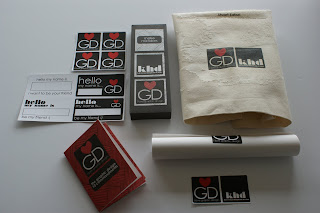
Below is my final solution for the speaking from experience brief, my final outcome is a pack that would be given to the new students on the first day to help get them settled in and hopefully make them smile. I have kept my whole project light hearted as i think this would help the new students feel more at ease when they start. The pack contains a poster, a tote bag, a pen case, name stickers, graphic design stickers and a '10 commandment' book.
I have kept the colour theme consistent throughout my designs as i wanted to create a branding and identity for the whole thing. the colours i have used are black, white and red and i also created a linear pattern which is on the majority of designs.
--------------------
I am really pleased with my final designs and i feel that they not only answer the brief in a creative way, but they have also started to show the way in which i like to approach graphic design. The packaging has changed a few times through out the whole process, due to technical hitches and overall aesthetic quality, to complete my box for presentation i bought some ribbon with love hearts on, to seal the deal. The ribbon links in with the love heart within my designs.
If the box were to be a real product that would be produced in large quantities, i thin i would have to re- think the stock or possibly find a sturdier version of the one i have used, which is cartridge paper. As at the moment it does seem a little bit flimsy, but cartridge paper has a nice texture to it and i like how it has toned down the colours during printing, the paper absorbs a lot of the colour.
I think if i were to be given more time i would possibly create more items to go inside my pack, such as the things i mocked up on illustrator (i.e t- shirts, lanyards etc). The book and more info could be placed onto a memory stick that would also go inside the pack. To be honest i think it would be pretty cool if i could brand the graphic design area, i.e using my design/ branding for the studio labels etc, and personalised GD notebooks.
This is the contents of the box, i think it all works really well together due to the consistent colour theme and design. John gave me some good feedback about my work, and he particularly liked the logo (as he love the designer Milton Glaser with the 'I <3 NY' designs).
I decided to add a tote bag design into the pack because a lot of the time we have lots of things to carry and sometimes your one bag just isnt enough, not just that, but people love free stuff! I am really pleased with how the stickers came out, i have never printed any before so it was quite exciting. I have been sticking them around and given one to a few people.
The poster that is included in the pack and which is also printed onto the tote bag is very important. This is because it is an email response i personally received from a designer, and the advice he gave me was so honest and helpful. I would hope that it would inspire the new GD students like it does me.


No comments:
Post a Comment