After taking photos and researching and drawing for the 'what is a line?' brief, focusing on skylines, i have started to develop my ideas to produce a final outcome. I have completed a sketch book and a half of drawings of skylines, mainly from Leeds, London and Amsterdam. I used a tracing paper sketchbook so that i could trace the skyline from photos that i have taken myself. It worked really well using the tracing paper because you can see all the skylines through the pages, as tracing paper is opaque.
I have scanned in examples of what my sketchbook looks like, it looks really interesting, simply because of the stock i used. I am going to scan each page individually so i can play around with the drawings. I also drew skylines with more detail, there are snippets of buildings so it gives you an idea of where and what the skyline is of.
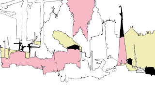
Below i started scanning in and editing the simple drawings and adding them on top of each other to make a more complex drawing, much like the pages of my sketchbook, just tidier. As you add more skylines, it becomes very busy and maybe messy, you can still see its skylines but its just another way of seeing them.
After creating a linea image i then started to experiment with adding colour to the shapes that had been made by the overlapping lines. When i edited my scanned images i lived traced them in Illustrator and then took them into Photoshop for the final editing. The colour was done by using the colour fill tool in Photoshop. It's quite interesting adding colour to the shapes that were made because it makes it harder to see that they are skylines, i started by adding a small amount of colour spread out and then added more colours into more shapes. I stuck with pastel colours as i thought they were a lot softer which allowed the linea drawings to be more dominant.
With the above design, i think the blue works really well, it represents the sky, which allows the top skyline to stand out. Because the lines were quite weak, the blue bled into the shapes, which makes it look abit weird.
I think these pastel colours kind of work well together, and i really like the style i am working in, its very illustrative. Below i added black to see how it would affect the softer colours.
I tried adding text, it reminds me of postcard designs, i think the typeface on the above design works better than the one below, it looks more sophisticated, where as the other one makes my design look cheap and tacky! Which is not good.
I experimented with other colours, but i think i prefer the colour palette of the first designs. As a 'designer' (in the making), and my personal preference, i tend to like simple designs, like less is more in my eyes. Thats just how i roll, so i think i might take my designs back to basics and see what happens from there.
Just had another go with different skylines overlapping. This one looks more interesting than the first one.
I actually think this would look pretty cool screen printed onto a t-shirt (but with my crap time management skills, i now dont have time before hand- in!)
The colour fill felt like colouring 75% of this design blue, but because its only one colour i think it looks alright.
This reminds me of chavs!
And this one is a tad rubbish (but we have to put up our mistakes to learm from them). To be honest i used black on the colour fill and it did this, and i didnt know how to get rid of it! So i started again with the colour.
This was using gradients on the coloured skylines, I dont think the colours work on this one, it has taken away the black outline so it makes it hard to see what the drawing is.
I was lucky enough to to Amsterdam and take pictures for this brief (you cant escape Graphic Design, even on holiday!) I got some of the really pretty houses along the canals in the city centre. So the next few designs are developments from a tracing from one of my photos.
The above image is just the lived traced drawing. Nice and simple.
I then added a blue colour fill, which filled nearly everything apart from a few windows, i then added a gradient over he whole image, which made it look like the sun was setting and it was dusk. The windows that werent coloured blue look like they have lights on, adding to the 'night time' effect.
I then added a circle and put it in the sky area, and it looks like a moon. I changed the blend mode so it had a slight gradient on it too. Under the moon i have added the word 'Amsterdam'.
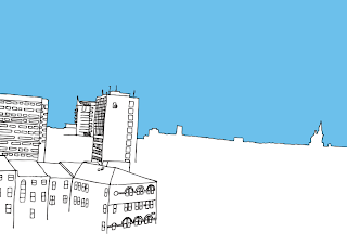
I found a style that i liked, using the more detailed drawings, i made the sky blue and kept the rest linea black and white. It keeps the focus on the skylines but the block colour seems to bring it together and highlight the skyline.
With the design above i added orange at the bottom as it is the opposite to blu eon the colour wheel, the detailed areas are almost stuck int he middle, separating the two colours, it works quite well, but i think theres too much going on with having two colours like this.
Using the blue sky also makes the bottom part, bottomless, there is alot of negative space which gives a lot of focus to the linea drawings. I have added text 'what is type?' in the sky area, keeping it subtle.
I looked at various different skylines throughout this brief, the ones that are from Amsterdam are very picturesque and busy, whereas Leeds looks more domestic and practical in terms of the buildings. They are very square and boring, so there is a good contrast between the two.
The above designs are of Leeds, taken from outside my flat window on the 5th floor, the buildings that are detailed are part of a council estate, and the linear skyline is the distant city centre. I used a cream with the blue and whit on this design, but again i think more than just the blue makes it too busy. I tried one with just the orange at the bottom part of the image, but without the blue to contrast like a previous design, i think it looks too bright.
The Amsterdam designs are probably my favourite, i like the detailed buildings, they are very pretty. I have added 'Amsterdam' under the sun very subtly, i decided to use century gothic as my typeface, because it is a very simple and modern styled san serif, which works well with my designs, it also has a very thin stroke, so fits in with the linear drawing.
The blue that i used is above, it has been used for the sky and some text in my development ideas.
The Pantone for the blue is: 6CC0EB
C: 53
M: 8
Y: 0
K: 0
I then started to play around with my illustrations and the photographs i had taken for them. I tried overlaying the two images together and then changing the blending mode. The one above was set to multiply, it doesnt really work too well, the blue sky has turned into a turquoise and the detail had been lost in the illustration. The photo is too dominant, which i dont want it to be.
The blending mode on the above design is screen, but where the sun is coming through the clouds on the photo behind, it is taking the black out of some of the linear drawing, which looks odd when down the bottom of the image the black lines are still fully visible.
This design works really well, its actually quite hard to see that the background image is a photo at all, it just looks like a block coloured skyline that has been simplified. The only thing that gives it away is the clouds and smoke in the sky, this adds more detail but with the blue overlay from the illustrated sky, it doesnt become over dominant. I have then added a white circle on the part of the sky where the sun comes through the clouds, which makes the circle look like the real sun. Then i have written the title of the brief horizontal to the right of the sun.
I tried it again with another design, the photo has actually been partly used in the illustration so it works fairly well. The blending mode used on the other design didnt work as well on this one, so the blend mode i used was screen, but it takes away some black lines. But the concept is good,the outcome just didnt follow through as well.
Unfortunately i didnt go to China to capture this really traditional building, it was a canal restaurant in Amsterdam that could hold something crazy like 800 people for dinner! All the images used were primary sourced, all the work is my own, not Google images!
I thought it would be a cool idea to place all of my illustrations next to each other in a subtle way, so that they flowed into one big long skyline, showing the contrast between the different places i visited. The image below shows how i have laid them out. I had to do it on an A1 art board because i cant afford to print them out in one long line. There are four designs next to each other on each row, the white gap at the end of each is where i will stick them together to make one long line. I am also going to print out this as a poster.
The above image is the last section of my long skyline, i chose this particular illustration because it has an end line. where the skyline disappears. This is the Leeds market, with the photo being taken from the car park. I have kept the title of my work straight to the point, the names of the places i got the skylines from and then the word skyline to mention the focal point of my work, presented with my name.
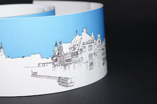
Below are photographs of a mock up of my long skyline idea, i printed this small in the mac room to show how my final outcome will work. It could be a wallpaper border in a room if it was mass produced.
---------------------------
After doing my design for the long roll of skyline, i thought i could do more, so i set about creating a hot dog book. It has a similar content to the roll but it includes my quotation about line which is "a formation of people, objects or things on besides/ behind the other."
The design above was the one that i originally came up with, it presents my theme, the title of the brief, the quotation and my name.
When i got to print and looked again at my design, i thought that the front and back page looked really out of place when the book was laid open, so just before printing i changed my design. I really liked the negative space that was being created by the top and bottom skylines, so i chose two more of my designs and added them in. The text was moved around and made smaller, so if someone wanted they could open up the book and make it a poster without the text being too dominant, but its still there.
Below is the book laid open without the text, i think it works really well as a poster and you can have it up which ever way you like best.


No comments:
Post a Comment