After completing my third rationale for this brief, as I wasnt sure what I was doing, I finally have the BIG idea! It helped having my tutorial and discussing ways in which I could fulfill the brief. I was going to create designs for an existing fashion event and then link my polka dot concept into that, I didnt realise I could just make up my own event. So that is what I am now going to do.
My event will be soley about educating, promoting and informing fashionistas in the younger generation about the use of polka dots in contemporary fashion and how the pattern has influenced fashion for many years and how the new generation is in control of the influence of the polka dot pattern within contemporary fashion.
This means that I can think futuristically with some of my design work and create something cutting edge and amazing!
The BIG idea:
- One off huge event
- Polka dots everywhere on everything
- Celebrating and promoting the polka dot
- Stalls selling polka dot things
- Invitation designs
- Billboard advertising
- Lookbook design
- Looking at different polka dot patterns
- Old, contemporary, futuristic
- How technology could change the polka dot
- Use the polak dot in a different fashion context
- How will dots influence future fashion trends
- Information pack
- Polka dot history in fashion
- Kits to make your own polka dot patterns
- T-shirts with stencil and paint
- Big and small dots
- How they look on different people
- Catwalk
- Polka dotted laminate flooring
- Packaging design
- Shopping/ gift bags
- Branding and identity
- Logo
- Business cards
- Mail shots
- Posters
- Flyers
The list above is my initial thoughts regarding my new BIG idea. I have given myself a lot of work to do but because I now know what I am going to be doing and focusing on, I should find it easier to research relevant things to help me with my design ideas and final solution.
I have written a list of things I need/ should research to help me. Some of it is print related and other things relate to how you would run a big event and how it would all work:
- What makes a BIG event BIG?
- How do they promote big events?
- Print methods I would need to consider/ research
- Catwalk with laminated polka dot pattern
- How would print ^^
- Look book designs and how I can create something original
- Mailshot/ invitation designs
- Billboard designs and how they are printed etc
I want my idea to be fun and original, hence the reason I am keeping it all polka dot. People who wear polka dots are known for being quite bold and flamboyant and maybe a bit cheeky. I want this personality to shine through into my event and all my promotional material. I think that if I made the designs too serious I may attract the wrong audience or potemtially no one at all.
Saturday, 29 October 2011
Thursday, 27 October 2011
Print Visit// Team..
On Wednesday 19th October a few of us visited a professional printers to see what it was like, how it all worked and to ask loads of questions. The printers we visited was Team, which is based in Beeston, on the out skirts of Leeds city centre. It was extremely useful to look around a professional printers, it gave me a bigger insight of how it all works and the many processes designs have to go through before they hit the printers and after.
This was the room where they organised their print jobs. Each space was for a different machine, including printers and finishings. It looked very complicated, with a lot going on.
This machine cost around £300,000! It makes the design plates ready for printing. The machine is installed with a stack of aliminium sheets which are then exposed with the designs, they are then passed through another part which takes away the excess layer, which then leaves behind the finished, exposed plate ready to fix into the printer ready to print.
This is the finished plate ready for print.
This is where the plate comes out when its ready to go.
If there is more than one plate going through, the machine flips the plate over to form a pile, which they remove every time a plate is finished.
A massive stack of scratch cards!
These huge piles of stock are completed prints, either waiting to be finished or delivered to the client.
This is the end section of a litho printer, the stack will eventually be to the floor.
This is the starting end of a litho printer.
This is a massive stack of stock ready for printing. There must be thousands of pieces there!
The machine has a sucking system, which is so fast! The suction ensures that the stock stays aligned before it hits the printer. If it isnt perfectly aligned before it goes through, it wont come out perfectly at the other end.
The inks are placed in seperate compartments, which each have their own printing plate to print out the CMYK. This is obviously Cian.
These are the rollers which roll the ink onto the plate, which then rolls over the stock. The pointing hand is showing where the exposed plate is and how it is rolled around and fixed.
This small station is where a client will check their prints on a single print out before going ahead with the full print run. This allows them to check the colour on the stock and see how it looks. This particular print in the photo was going to change stock because the stock soaked up a lot of ink and it made the colours dull (this is why you have to be very precise when choosing stock).
The machine also checks the colour balance and alignment.
This machine is a big guilletine. The blades looked lethal, it can cut through a pretty substantial amount of paper at a time. It has lasers to detect if someone still has their hands near the blade before it cuts the paper.
This machine was folding cards, its incredible how fast most of these machines work, it was doing hundreds per minute!
This is the bay where all the final prints are stocked before they head off back to the client.
The ladies in the background are hand making book packaging for the JD Annual Report, they were very quick and did it perfectly. The other ladies were folding leaflets.
These swatch books were made for a paper company to give out to potential clients. Each swatch was hand stuck to the booklet! There was hundreds!
Some more swatch books for a paper company with lots of lovely finishings.
Glitter paper!
These are stencils for diecutting, each one is hand made specifically to the shape needed for the design. These are made at a specialist company, but Team complete the diecutting in house.
The diecutting machine at work.
This is the foiling machine and probably my favourite machine. The foil is on a roll and is heat pressed to each card. Its just amazing watching the machine pick up the card and position it and then foil it and stack it the other side.
These are the leftovers after foiling, you can see the parts of the design that were foil blocked.
Diecutting again.
Just a small part of the huge collection of foils they hold.
This room was heaven! It was full of beautiful packaging, each one was so special and was perfect. They used all sorts of packaging nets and print finishings! LUSH!
This is the inside of one of their HP Digital printers, they were huge!
And this is a teenie, tiny book, so cute! :)
----------------
After visiting the printers and having a look around to see how it all works, I really respect printers! They have a pretty complex job to do and so much stuff to remember. The more I learn about print the more I get excited and slightly geeky!
Design for print// Concept boards..
These are my initial concept boards and ideas for my final solution to the Design for print// Good is.. brief. My concept board was showing/ explaining what my concept was, which is looking at polka dots in (contemporary) fashion. I have shown images of research I have done which includes images and facts about the history of polka dots in fashion.
The above board has the images I collected which showed the use of the polka dot pattern in fashion in history and in contemporary trends. I wanted to show how they have had a huge influence in fashion over the years and how they continue to do so. This is the main concept I will be working with.
My contextual reference shows existing designs that I have found useful and inspiring to look at. This includes packaging and promotion and branding and identity. I tried to find designs that I wanted my own designs to look like. Obviously not copy them, but take elements from them to use in my own ideas.
My initial ideas board also had more specific contextual reference on plus some quick drawn ideas. I was looking at designing a fashion brand that designs t- shirts using polka dot patterns Then designing/ creating the packaging and branding for it.
This board shows further design ideas for t-shirts etc, and also my logo which I am going to use for my branding and identity. There is also some examples of different polka dot patterns to show the variation and ow they could work within my t- shirt designs.
Tuesday, 18 October 2011
Design production for print/ Digital workshop..
Pre Flight checks//
In this workshop we are going to use our new knowledge from the previous workshops to proof a piece of design before it would be sent to print. We worked in a group to try and spot as many mistakes as possible.
In this workshop we are going to use our new knowledge from the previous workshops to proof a piece of design before it would be sent to print. We worked in a group to try and spot as many mistakes as possible.
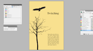
This is the image that we have been asked to proof.
The first thing that we noticed was that this link was in registration. Registration is the method of overlapping colours on one single image ready for print.
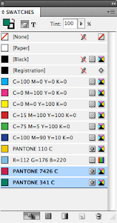
There are unused spot colours in the swatch palette, which could cause confusion when it comes to separation before print.
This Illustrator image was missing.
The effective PPI on this image was too high, which showed that it had been resized whilst in Indesign.
This image was using the RGB colour model, which means that the colours would not print out the same as it shows on screen.
The PPI on this image is set at 72 which is the resolution for screen.
The last problem we found was that there was an RGB colour swatch in the swatch palette.
--------------
File// package
This gathers all of the images, fonts, and everything else that your InDesign file needs to be printed.
-----------------
Window// Output// Preflight
Doesnt give as much information as when you package.
---------------
File// Export// Adobe Pdf (print)// Press Quality
Subscribe to:
Comments (Atom)


