Friday, 27 January 2012

Design for Digital// Top 10: Visual elements..

For my new design direction for my Top 10 title sequence and 4 idents I have decided to go for a more illustrative approach. The imagery will be created on Illustrator as vector images and them placed into  After Effects to add motion. I like the fact that the imagery will be vector based an using block colours but I feel that it will look too simple and plain if the backgrounds were block colour too. So I have looked into having a texture merged with the background colour to give it more detail without being over powering. I wasnt too sure what sort of texture would best suite my designs without being too much to look at, I need something subtle but still noticable.

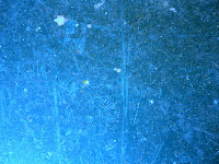
There are a few textures that I found on Google images that seem as though they would work well with my vector based designs. This blue texture has a grungy feel to it which I think would work well in contrast to the solid colour illustrations. It has a very scratched surface, yet it is still quite simple.
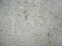
 This texture has a similar feel to the one above but it has less scratching. I do believe this is a concrete texture so it sort of has a smooth look to it. I think this could work well if a blue overlay were added and the blend mode set to multiply.
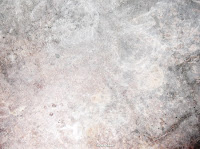
I like how this texture got slightly lighter near the centre, again it has a grungy feel to it. The only down fall is that it has a very dark line and corner on the bottom right hand side. I know I can always crop this so it is still a possibility to use in my sequences.
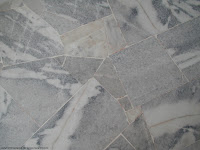

This texture is of marble, I quite like all of the different shapes created by the marble but I think it might be a bit too detailed for my background.
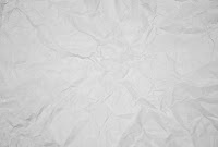

This is a crumpled paper texture, I think this could work really well with my designs but the only problem I have is that someone has already used this texture with a blue background within their sequences and I dont want to seem as if I am copying.
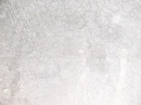
This is the texture that I am going to use within my sequences. It is grungy and simple and the pattern is quite light. There is nothing on there which is too harsh or prominant for my illustrations and with a blue overlay this will look perfect. Just adding the right amount of detail.


This is the colour palette that I will be using throughout my sequences. I have tried to keep them simple by selecting colours that will best represent my topic. I chose the orange and blue because they are used in the film 'The Bucket List'  movie posters and dvd covers. The blue is much like a sky blue, and as I am having a lot of frames with sky within my sequences, I find it appropriate. The orange will be used for some of the type and will also be included in the skydiving frames and the hot air balloon frames. These two colours also remind me off a clear blue sky and a sunrise, which are both very inspiring like my 'Top 10' subject matter. The different tones of black have been used for the character, mountains, bucket and elements of text.


Below are my vector images that I have used within my idents and title sequence. They were all created using Illustrator and I have kept them very simple. I think that the simplicity of the images has worked well because it doesnt over complicate the sequences and what I am trying to communicate.


With the bucket, I found an image on Google Images and then traced it in Illustrator (freehand). I then added the colours myself accordingly.


This is my character who I created to show taking part in the activities from the bucket list. He is basically a blob that I created with the rounded rectangle tool in Illustrator. I think that he works well being so simple because it allows him to adapt to all situations. I created him with a smiley face that again is really simple. I think that his simplicity makes him funny, you cant help but smile when you see him especially when he's in particular situations. I think that his mouth either looks like he's smiling or he's sticking his tongue out, either way it works.


This is the same character as above, but with this I had to give him a temporary 'extension' so that he could 'kick the bucket'. In my crit feedback it was sugested that I give him a real foot, but a tutor said that I would make it difficult for myself if I tried to start animating my character. I decided on just using this method as I felt that it fitted better with the design and detail of the character. I think that a proper foot would have been too much detail compared to the rest of the character and other imagery that I am using.


This fish is for the scuba diving ident and frames within the title sequence. Again I found a tropical fish on Google Images (which is a clown fish) and then traced over it myself and added the colours. There were a few details that I didnt add from the original image, because much like the other imagery, I wanted it simple.


This is probably one of my favourite pieces of imagery that I have created for this brief. Its funny because the character doesnt seem fased by the fact he's parachuting. I havent changed the facial expressions throughout the sequences because I feel that its more light hearted if he just stays happy. In a way I guess it is communicating that all of these activites are good fun if the character has a permanent happy face. I created the parachute from tracing a Google Image and then added the straps to the character. I know that this image is supposed to represent skydiving but he is clearly parachuting. It was more interesting and slightly easier for me to illustrate the second half of a skydive when you are parachuting down. I think that this is one of my favourite images because I can relate to it more as I have actually done a skydive.


This is a speech bubble that I created in Illustrator using the curved rectangle tool and then adding anchor points so that I could drag a corner out. The speech bubble was used at the beginning of my title sequence and the end of a few idents.


This is the character for the scuba diving frames. All I have done is copied the original character and then added scuba diving elements to him. I was going to add flippers too but I felt that it would get too complicated when I tried to make the character and his flippers move in the sequence.


The hot air balloon was also created in Illustrator, I found an image on Google Images and then traced the actual balloon shape. I then added the basket with a curved rectangle shape and added the ropes to attach the two shapes together. I added an Artist effect to the balloon to make it look more realistic, it is a plastic wrap which gives the balloon a 3D look and a slight shine.


This is the bungee jumping character, again I have copied the original character and then tuned him upside down and added safety harnesses and a cord to make it look as though he is bungee jumping. I realised once I had done it that I have made the cord look like rope, and you obviously wouldnt bungee jump with rope as you wouldnt bounce back.


This cloud was created with the free hand pen tool in Illustrator, this was used in the mountain frames to add a more realistic element. They floated across the frame.


These mountains were created for the mountain climbing frames. They are very simple illustrations because I didnt want to add to much detail because nothing else was like this. They are literally made from one free hand triangle I drew using the pen tool, that have been copied and the scale and width changed.


This octopus was used for one of my ident ideas. I created 3 legs then copied and reflected them. The colour of the octopus is the same as the BBC Three logo so that in the sequence I didnt have clashing pinks by using two different colours.


The tattoo parlour was created for the tattoo ident. I used simple shapes to create the shop and the door. With the window I added an Artist effect in Illustrator to make it look more realistic and I have done the same for the glass in the door. I have then added an open sign and used a typeface that reflects on what would be used in a real tattooist.


This is the back of the character, designed to show off the tattoo that the character got in the tattoo frames. I have created bum cheeks and then added a Peace symbol tattoo on his right bum cheek.


Design for digital// Top 10 proposal: Take 2..

I have slightly changed my idea from my initial proposal. My design direction has changed as I felt I was working in a way that was too complex for my After Effects skills and didnt really suite the way in which I wanted to communicate my Top 10. I was going to have quite a formal but light hearted title sequence but I feel that its not really the best way to portray this subject to my target audience.

I want my titke sequence to be light hearted and funny but still obviously communicate my message clearly. So I have come up with the idea of using illustration rather than found imagery and photographs. I feel that it will be more engaging and help push the tone of light heartedness.

The title sequence and idents will have an illustrated character in them that shows the Top 10 in different ways. For example the character would be shown skydiving. I dont want to include type within the illustrations of the activities anymore as I feel it is making my idea too literal and in a way it takes the fun out of it. The opening of the title sequence will introduce what the programme would be about and then the character would briefly appear taking part in the Top 10 things.

The idents would then be taken from the title sequence and edited accordingly to fit within the 10 second sequence.

I am still going to use similar colours as to what I was in my first proposal as I think they are still relevant to my subject theme and the tone of voice that I will be communicating. These colours were a light blue and orange, along with the white of the character and shades of black for other small elements. There will be a visual consistency between all idents and title sequences which will then run through into the packaging design for the submission disc.

My target audience has also slightly changed from the first proposal. It was being designed for 18-40 year olds because I felt this was the age where you were most likely to go off and enjoy life in this way. But after changing my design direction I have decided it best to lower my age of the audience to 16-21 year olds. This is because of the design of my moving image pieces which will be more illustrative, I just feel it would appeal more to a slightly younger audience. Another reason that changed my mind was watching BriBrys (the young Irish guy) Youtube channel. He was a young lad and I found him inspirational as im guessing many young people do. His videos are always fun and light hearted so I wanted to use this approach for my project. When your young you have your dreams and ambitions set and your raring to get out there and fulfill them. So my set of moving image would be there to inspire and motivate those young people to just get out there and do it!

The channel that it would be shown on is BBC Three. The reason for this choice was because BBC Three often show random programmes, that are often just for fun. Including things like Dont tell the bride, Worlds craziest fools, Russell Howards Good News and Family Guy. On their website is also says:

'BBC Three: Never afraid to try new stuff... We're fearless'

This is one solid reason why this channel is perfect for my theme!

BBC Three go live at 7:00pm everyday which means that my title sequence could be played at 7:30pm. The idents would be shown throughout the day at these times: 8:00am, 1:00pm, 5:00pm and 6:30pm. The reasoning for these times are because my target audience are likely to be at school, college or uni during the day. S o I would show one in the morning before they set off to school etc, one at lunch incase they were art home for lunch. Then the two in the evening would be when they are back home from college etc and one an hour before the show would start to remind them it was on.

Tuesday, 24 January 2012

After effects workshop// number 5..


This workshop was about looking at movement and how you could speed up and slow down objects to make things look more realistic.


This is where you can find the option to ease in or ease out objects along a position path. Ease in would make it start slow and speed up, ease out would do the opposite and then there is the option to do both together.


This screen shot shows how the dots on the line appear closer together if the object moves faster over this part of the line.


These graphs give you the option to change the balance of the speed along the position line.


Monday, 23 January 2012

Image// Type as image: Brief two..

The Brief//

Select three quotes carefully from the given articles (each quote must come from a different article) and visually communicate them using only text in which they are written. No additional images are permitted.

Considerations//

THINK VISUALLY. Consider what the visual essence of your subject matter is (the quote) and how best to communicate this. What are the obvious responses? How can you move beyond these?

Will the quote exist in the environment, on someones hand or a wall? Is it handcrafted or digital?

Is colour important? Will you work with just one typeface or will you use a range? Do typefaces have to be hybrid?

Practical considerations//

There are no media restrictions. You can work photographically, across three dimensions, collage, incorporate print making methods or combine all of these processes.

You can work directly onto A1 or carefully attach your type. You must be able to record any three dimensional work in two dimensional form.

Background//

The context of a quote depends upon who said it, whom it was said to (even if there was no one there), the environment in which is said and the tone of which it was spoken. 'Words' do not exist out of context.

Working with type as image allows you to convey more than simply words that have been written.

The quotes exist in the context of the articles so how can this give you visual clues as to how the text from the quote may work as image?

Mandatory requirements//

All images should be supported by a broad range of visual investigation in the form of design sheets and notebooks.

The final image should be presented on an A1 portrait format.

Deliverables//

Three visually resolved quotes submitted on A1.

--------------

My chosen quotes//

Article: This column will change your life: A big effort doesn't always mean a big effort.

'Fuzzy feeling'


Article: Relationship maths.

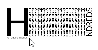
'You have hundreds and hundreds of online friends'


Article: Doctor, doctor: Dr Tom Smith answers your medical questions.

'So if you want to boost your immunity, the easiest way to do it is to exercise regularly'


------------


I have been looking on the DaFont website to see if I can find suitable typefaces for my 3 type as image designs. I have tried to pick typefaces that would be easy to paper cut as this is the media I will be working in. Once I have hand crafted the the A1 quotes I am going to add coloured paper underneath so that they come through some of the letters. Again the colour will be chosen for the appropriateness of the article.


-----------------------

After trying out the method of paper crafting the three A1 designs and them not turning out very well I decided to turn my designs to digital.

The quote that I picked for this design was 'Hundreds and hundreds of online friends. The idea that I had was to create 100 stick people to illustrate 'hundreds of friends' and then play with the word 'hundreds' to make the message more obvious. I then placed 'of online friends underneath. I think the concept works well but the way in which I have executed it isnt the best it could be. The typeface could be changed and also the arrangement of the contents.


With this design I tried to cut the words out of the people in Photoshop but it didnt work.


These designs have worked much better. I decided to change the typeface to a simpler one that fitted with the designs of the stick people. Then rather than having the word 'hundreds' I used exactly 100 stick people to illustrate.


I then started to play around with where I could place the remaining letters of the word 'hundreds'. I think that this composition of this design works well as its balanced and not too complicated. I have tried to make the main focal point being the 'hundreds' thats why I have made the 'of online friends' a lot smaller.


I think this design worked apart from the letter 'h' as it makes the design unbalanced and look as though its tipping it all to the left. I tried placing the 'of online friends' on the opposite side but it didnt have much effect.


This design is similar to the one above apart from I have made it balance out better by rearranging the letter 'h' and the 'of online friends'. It looks better than the previous but I think that the remaining letters of the word 'hundreds' that are at the bottom are too over powering and take your eye away from the people.


I then tried making the type smaller but it still feels really unbalanced.


I then moved the lower remaining letters to the side on an angle but its starts to look too complicated and I need my designs to communicate clearly.


I made the letter 'h' the same height as the people and then kept the remaining letters the same as the design above. I think this works better, because although the letter 'h' is big I dont think that it over powers the people.


I then tried changing the composition of the people to see how this effected my design. In a way I think that it works better than the previous designs, it feels less bulky this way.


On this design I added the 'of online friends' next to the letter 'h'. It looks okay there but it wouldnt make sense as its not the order of the words in the quote.


I then moved the type to either side of the people, this doesnt work at all as it makes the design really unbalanced.


After thinking about how I could add an element that would make the fact its about online friends more obvious, I tried adding a mouse arrow to the design and changing back the people to the original composition. I think the use of the arrow works well.


I then tried to make my design even simpler by taking away the word 'hundreds' and just using the people to illustrate one hundred, because of the plural I added the letter 'S' to make it clearer that I was trying to communicate hundreds. I have then placed the 'of online friends' with the arrow underneath the letter 's'. I think that this way of approaching the type as image has worked well because at first I found it difficult to think of ways to actually use type as image for this quote. But by using the people an less type it seems to have paid off.


On this design I have kept all of the elements the same as the one above except moving the arrow and 'of online friends' to underneath the people, aligned left. I then changed the colour of the type to blue as I feel this linked in with online friends such as Facebook social network.


I tried adding in the letter 'h' on the other side but I dont feel it works as well as it starts to become too busy.

To finalise my design I have added an effect on Illustrator which pixelated my design. The reasoning for this was that it helps better communicate the link with online.


------------------------


For my second quote from one of the articles I looked at 'fuzzy feeling'. I picked out this particular part of the article because I had an idea for it already. I decided to play on the visual elements of fuzzy. In this case I have used the static of a TV to visually communicate a fuzzy feeling. I traced a TV from an image using Illustrator and then used an effect in Illustrator which makes a shape look fuzzy like TV static. After creating the base I added type which also had the same effect on it and placed it on the TV.


This is the final image for this quote. I think it works really well and visually communicates 'fuzzy feeling' clearly. I decided to use Cooper Black as the typeface as it is very bold and curved which I felt suited the TV illustration. I also wanted to keep the typeface simple as it was going to be harder to read any way with the effect that it has on it.


I tried changing the opacity of the type to see how light I could make it with it still being readable. When I printed this one out, you can read what it says but you have to look closely which is what I think works best about it.


----------------------


This is the last quote that I looked at 'I wish I could', I think that this design is really simple but it does work. Stars are often associated with wishes, so I played on this when I used the stars. Its a really simple design. I decided to use this typeface because it reminded me of Hollywood and typefaces that are used in the movies. I placed the stars in random places because I already felt that the type was neat.