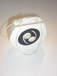
As part of my big idea for this brief I am creating a look book that polka dot lovers can take away with them when they leave my event. The book will come in a bag, which I have started experimenting with below. I tried to create round bags so that it links in with the theme of polka dots, I also didnt want my packaging to be anything too ordinary, as polka dot lovers tend to be quite bold and 'out there', this needed to be reflected in the packaging.
----------------
I tried to design a net where I would make a circular bag, after a few attempts I managed to design a net that was circular but with a flat base so that it could stand up. This design has a diecut front which reveals the brand logo. The bag would be made out of thick, pure white card and the logo would have a matte, black finish to it.
---------------
This bag uses the pattern from my previous poster and billboard designs. The pattern is at the front of the bag and will be diecut. The back of the bag will have a diecut hole on the back with the logo printed onto acetate filling it. Again the bag will use the same stock as stated in the first design. The logo on the front of the bag will be silver foiled to add sophistication.
---------------
This bag would simply have the logo printed onto it using a black spot varnish. This design is very simple but if I were to carefully select appropriate print finishes, it could make it look very sophisticated.
---------------
This design again uses the pattern I designed for my promotional material. I have used it on the front but it will not be diecut. On the back there is a polka dot pattern that will have some dots diecut, so that you can see a snippet of what is inside the bag. The design on the back and front could use spot varnishing on selected areas.
--------------
I really like this design, I think its very fun and reflects the polka dot personality. The front will have the logo on it with the pd being diecut. The inside of the bag will have a polka dot printed all over it. The logo circle would be spot varnished.
---------------
This was one of the first I designed, hence why it has a flat top and bottom. This design is the same as the one above apart from it has no polka dot pattern on the inside.
-------------


No comments:
Post a Comment