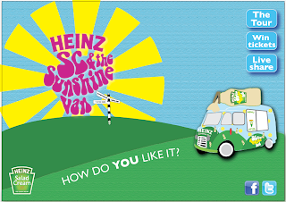
These are the website Home page designs that I did. We decided to just do the home page to give an idea about the tone of voice and what the content of thewebsite would be if we were to design the whole thing. This was the initial design that I came up with. I tried to link it with all of the other designs that I had created to keep it consistant. The links on the Home page include info about the site, how to win festival tickets, the tour and a link about Heinz Salad Cream.
I think that it became too over complicated with the name of all the festivals and a link for the tour.
So with this design I took away the festival names and use one direction post with just a few festivals names on it that wouldnt be links, just to give an idea as to where the tour would take place.
This design worked a lot better as it was simple and gave all the information needed. We didnt use this one in the end though as it did have a resemblence to the Snap Tag poster.
This is the final design that me and Lisa decided on. Its still very simple and we have taken away one of the links that was not necessary. The design approach is consistant with all of the other designs.
This is what the Home page would look like.


No comments:
Post a Comment