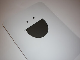
As part of the OUGD202 submission we were asked to design a
packaging for the DVD that we would be handing in. I decided to use my character
from the 'Top 10' brief because I feel he was the most prominant part of my
module. I have kept the designs simple giving the character a front and a back.
Giving him a back allowed me to incorporate one of the 'Top 10' which was
getting a tattoo.
All of these designs are pretty much the same apart from the
fact that I have changed the colour and positioning of the text. This will be
printed A3 so that the DVD will fit inside. With this design I have placed
my name, course, year and module code on the bottom left of the front of the
character, with the module code in bold, using Century Gothic. Im not really sure if it works here. It seems to make the characters
face look squashed.
On this design I have changed the text colour to orange, there are two reasons for this. One, I love orange and two, I have used orange in my sequences.
 I then tried blue to see what it looked like, as this was also a colour that I used within my sequences quite a lot. I think that the blue works better with the colour of the character than what the orange does. It makes it a lot softer but you can still see its there.
 This is the one that I have decided to use. I have moved the text to the back of the character because I felt that it fitted in better there and didnt look like it had just been stuck there like it did on the front. I have also made the text into two lines rather than four so that it doesnt look so bulky.
I will be printing my final packaging onto white card, the actual character has a light grey tone fill so the inside of the packaging will be white and the outside grey. There is then a semi-circle which will be stuck at the sides so that the DVD slots in.
These are the final versions of my packaging for the submission DVD//
I am really pleased with the final print out. I think it works really well because it is so simple. It is printed on white card and is very sturdy. My name, module code, course and year is printed on the back. I think it is funny that the character has a front and a back which meant I could give him bum cheeks and a tattoo like the sequence.
This is the back of the packaging, as you can see I have made it so the character has bum cheeks. There is also a small slot at the side to close the packaging.
This is the inside of the packaging. I made a flap and stuck it with double sided so that the disc would slot into it. I made the inside a different colour to the outside so it didnt look so plain.
This is a view of the back and front of the DVD case. It just makes me laugh that I will be handing this in! Hopefully he'll bring me good luck!!


No comments:
Post a Comment