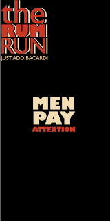
These are some initial ideas for the Bacardi rum run menu. They all need developing a lot more. The colour scheme is based around the Bacardi logo.
I decided to change the format of the menu so that it felt more masculine.
The square format works a lot better than the taller one.


No comments:
Post a Comment