

As part of the Good is brief, we were asked to create packaging for our good. We were given a series of four nets to design for. They were bottle packaging, an envelope, a CD case and a folded flyer. The nets were taken out of standard commercial net books. Our packaging had to reflect and represent our good, the task was to also link to our logo designs. We were told to be as creative as possible with the nets, which meant we could add and take away elements from the them. We were to use 2 colour plus stock. It would be useful for us to also experiment with stocks to see how this effects a design and what feel it gives. We had a week for this task.

This was one of the first designs that I ddid for this task, I found this net fairly easy to work with, there wasnt too much restriction and there was plenty you could do with it. I started off by using black and white (the stock would be white). If im being completely honest, I struggled a lot with this task as I have so much going on at the moment. My lack of time and levels of stress reflect in my work and I dont feel that my designs are the best that they could have been. With this above design I used the logo that was chosen for me last week, I reversed it out as I felt that the black worked better in the circle with the white text, the other side was then the inverted without the text. It almost feels as though the right hand side has been cut from the left hand side. I have then used the logo again on what would be the inside of this net.

This was the CD pocket net, the best element of this design in my opinion is the play on the logo. I have used a curved line to link to the 'o's in the words polka dot, to make a smiley face. Im not sure if the polka dotted space works well, I have designed it so it is uneven but it does actually look really wonky and just doesnt seem right. Again I used black and white, but I feel that it needs something else.

This packaging is one that works fairly well, its very simple though. The large circle spread across the majority of the design would cover more than one side, like wrapping. I then have the back as polka dots and the logo has been placed at the bottom and top of the bottle packaging.

I based this design on the one above with a few changes. I tried using more white within this design to try and balance it out, it would also make it seem less empty at the top. I have moved and edited the logo and placed it in the centre of the front bottom of the packaging. There is something about this logo that isnt really working for me.

This design again is a slightly edited version of the one above, I have added another bar of polkadots. I do think works well because it links the front and back of the packaging, whereas with the one above the polkadots look like they have just been stuck there for the sake of it.

I really like the polka dots in used in this design. I think that bigger polka dots like this look more fun than the smaller ones. This design also has more visual consistency. I think that if I were going to use this design in real life then I could use die cutting for remove some of the polkadot counters, maybe like the middle row across the net. I do feel like the top half needs something else, maybe continuing the polka dots inverted on the two black spaces.

I started to experiment with colour as the task restrictions was to use 2 colour plus stock. I decided to experiment with red because this is a colour that is often used in polka dot patterns (especially in fashion). I used a CMYK red and then a Pantone spot colour with what would be white stock. I used the logo as more of a pattern in this design, it is behind the envelope window which makes it look like a swirly illustration. I have then used the spot colour in polka dots on the outside flaps. This design and the one below remind me of an American diner, I think its because of the red and the white polkadots and also the logo.


I have then tried it reversed out, the red isnt really working for me, I dont think black and red work too well together. Because the Pantone red is a spot colour and it is from the metallic coated swatch book it looks dull on screen, whereas if it were printed for real it would have that metallic shimmer to it.
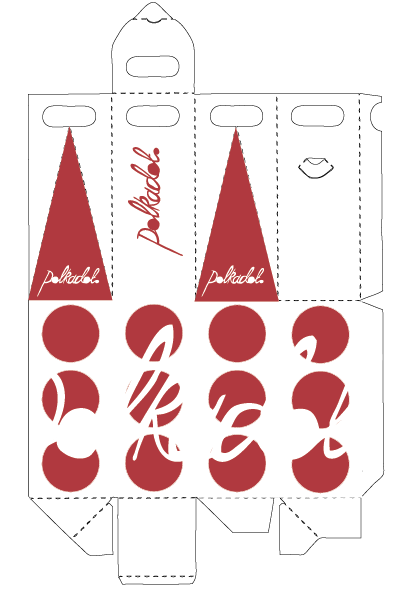
I then went back to using two colours to experiment with, I decided to carry on using the Pantone red to see if I could make it work without the black. I based the above design on a previous one but replaced the black with the Pantone red. I used my logo over the top of the polka dots so it cuts them up, I really like this effect because you can still make out what the word says.

I added my smiley logo to overlay one of the polkadots, this makes it a little clearer of my branding on the packaging. It also adds the second colour to the design (black).
----------------------
After being designing all of the above packaging, I was disappointed in myself that they werent that good at all. There was no visual consistency and the designs werent very well though out. If I am being honest with myself, I know I can do better! They were a lesson learnt and thats why I decided to re- do them all until I was happy.

This design was for the envelope, I have used circles to break down the black. Using the circle to cut one side works very well, it gives you a focus point. I have also made an informed decision about my logo, I dont feel that it relates well enough to my 'good' therefore I am going to start using a different logo which I feel represents my concept better. With this envelope design I have included both, having them together on the same design allows you to see which one works better and I do feel that it is the simpler logo within the circle.

This above design is for the inside of my envelope and bottle packaging. I have used my new logo repeatedly and then added a gradient overlay. I really love this logo as it is so simple, it communicates what it needs to and its not too fussy. I can imagine this working for all sorts of designs, things like the inside of shopping bags, notepads, pens, because it is so simple it can pretty much work on anything.

I still cant decide on whether or not this design works, I think that I have used to many overlaying circles on the top middle square, it just looks a bit messy. I think that the polka dot squares would work well for a background for text, it just adds that little something rather than it just being on white or something. This would look more complete if it had like information on it about my 'good', just so my target audience knew what it was for.


I dont know why but I found this net ^^ the most restricting to work with. I think this may be because it is in three sections but it looks like one piece. I didnt know whether to keep the three sections seperate from one another or have one image that spreads over two sections. The middel section is probably the one that doesnt work too well, it just looks like its been stuck there, but this might be because the two ends are black and the middle is white.

This was another polka dot design that I could use for the inside of shopping bags or envelopes.

With this design I tried to use the blue in a more creative way, so I used tints of the same blue to create this polka dot pattern. I have then overlaid it over black which adds another colur element to the design but still within the given restrictions of 2 colours plus stock. The shape of the envelope would tidy up the design, it would print out like this then I would cut around the net to finish off the final design. I have used a circle and my new logo at the top which would be the part of the envelope you open, again it adds another element to the net rather than it just being a standard envelope.

I applied the blue tinted polka dots to another net to see if it would work as well in the same way. I think that its one of those designs where you have to see it finished so fully appreciate or even know if it works well. The big blue circle in the bottom left hand corner is a guide for me, I would cut this out and fill with accetate so you would have a window to see what was indside the package.

This is the same design as above but I have changed the blue tints to black tints. I dont think it works as well as the blue tints, it seems to dull it all down. If it were just pure black and white it would be completely different.

I then tried it on this design, where I think it does work a lot better, this design is less complicated than one of my previous designs. The black tints work really well when they are overlaying the larger tinted circles. Using tints is a cheeky way of getting a better variation of colour within design whilst still sticking to the brief restrictions.

This is an example of what the above design would look like with a blue logo in the middle square. I think it needs that bit of blue to help the logo stand out.

This is the bottle packaging net, what I have done is used my design for the inside of the envelope and placed it over the whole net. I think it would make it a lot more interesting to look at, but I have to be careful not too add too much more incase it gets confusing.

I did however add a darker logo on the back side of the net just to make a point. Ive then got an example of what it would look like if I used the blue logo. The reason I used blue was because I felt that blue was a very uplifting colour, this particular shade reminds me of a sunny blue sky, it fits with the personality of the polka dot and its a very neutral shade, so would appeal to males and females.

This last design looks a bit weird without the net shape being cut out, but I wanted to try a design with large polka dots and try and keep it really simple.
-----------------


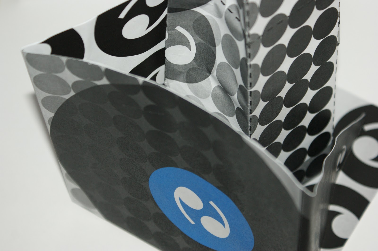
These are the nets made up, I am glad that I decided to re design my packaging. I feel that these designs represent my 'good' more appropriatly and I feel that they reflect on what I can achieve when I put my mind to it. These were printed on the laser printers in the mac suites as mock ups, but I do plan on getting them printed in the digital dungeon on suitable stock. I have been thinking about what stocks I could print onto and what would be suitable for the designs. I think that white card or cartridge paper would work well, they will enhance the colours and add a great finish to the designs. If I were to send these off to be professionally printed I would add some print finishings. It would be interesting to see the logo either spot varnished, embossed/ debossed or foiled, just to make it really stand out. This print module is so fascinating, I love how geeky I am becoming about paper, print and just Graphic Design :)


