After having my first crit with Jo and Amber and presenting my initial ideas, i have started to develop my ideas and designs to come up with something original.
Crit feedback:
- i have a strong concept, which has the potential to work well.
- they don't see the relevance of the 10 small boxes that i wanted to make, this is because i wanted to make these purely because i wanted to do packaging design.
- packaging/ method of delivery needs to be thought about more and more original and relevant to my product.
- an idea was to create a survival pack for 1st year students, that they would receive within the first half hour of starting the course. It would be something that they could look at together in the group, kind of like an "ice breaker" pack.
-----------------
For my pack i wanted to create branding, such as a logo and a specific 'style', so i had visual consistency throughout my designs. I started off by designing a logo. I wanted the logo to be kept simple and straight to the point. Below are some of the designs that i came up with.
This logo above is the logo that i decided to use in my work, i felt that it represented well what i was trying to communicate. I have used century gothic as the typeface, as it is simple and san serif. I didn't use a serif font as i thought it was too much detail. The heart was created on illustrator and is meant to represent the love for graphic design. I chose to use these colours as to, again, keep it simple. The black and white help bring out the red which emphasises the heart. The logo just looks really crisp, i think that this is the style that i enjoy working in and is similar to my own logo which i have also included in the designs.
After designing the love heart, i tried other logos that incorporated it. Most of the elements from this logo are in the one that i am going to use, they have just been slightly moved around. I liked how the heart has been intercepted by the two larger letters, you can still tell that the letters are G and D and you can still see the shape of the love heart. Im not really sure if the black text underneath works, i couldn't use red or white if i wanted the logo this compact because it would be lost in the centre or at the sides, depending on which colour i used.
I really like the simplicity of this logo, although maybe it doesn't have enough information on it. People may not understand what the GD stands for, which is bad communication. I just like the slickness of it and the colours.
I tried just using the same concept as the one above and just change the typeface and angle. the type face doesn't work at all, i think it makes it look cheap and unsophisticated.
This is using a combination of the one i have chosen and the one above this, the logo nearly works apart from the crap typeface. The two typefaces clash and it just doesnt look good.
This is like the one above i have just changed the typeface again, this one works slightly better, but it just seems a bit too jagged. i dont like how the letters are joined, they are one line that do not come together.
This is another favourite design, it works well because of the angle that the heart is at and also the line of diagonal text. It just makes it look more visually interesting to look at. The typeface that has been used in the centre of the love heart also works better than previous because it is a san serif that is bold and smooth and it fits in with the shape of the love heart.
-----------------
After deciding on my logo, i started to design things that could go into the pack for the newbies. When you first start somewhere new with new people and you have to talk to people it can be hard to remember names. The last thing you want to be doing is making a friend then forgetting their name and calling them anything. So i thought that something useful that would prevent embarrassment and awkwardness, would be to create name stickers.
I cant remember if we were given one of those white stickers at the start of the course so we knew each others names, but if we did they were just plain boring ones. I have designed stickers that look fun and cool for the newbies, something that will make them want to wear them and look at them, rather than feeling like a complete donut wearing their name.
I have used a similar style to the logo as to keep visual consistency. I have reversed some designs out to see what they look like. I prefer the black designs, although i am going to print all of them out, so that the newbies have a choice. It makes it more exciting if you get to choose which sticker you want to wear.
I also designed a batch that have a hand drawn pattern behind then, but it makes it hard to see the text, so i wont be taking them to print. They do look really good though!
The hand drawn pattern below came from me doodling, i just drew lines and patterns started to emerge. I have used this in my designs because i think that a hand drawn element makes something feel more personal and special. I hand drew the whole thing onto large A4 and then scanned it in and live traced it in illustrator. I didnt use the whole thing in my design as some parts looked a bit odd and random. I picked a part that had a consistent pattern.
Below i tried out my logo on the selected part, i think it looks quite good but the small text at the bottom is slightly lost because its stroke is similar to the pattern. I wont be using my logo with the pattern to this extent because i feel its just too much.
Above is the full logo on top of the original pattern, it looks groovy but the right hand side of the pattern is really bugging me because it isn't the same as the other side.
This is another experimental design where i have used my original logo over the pattern and then changed the blend mode to multiply so that the pattern shows through the type and heart. At this size it works really well, as it subtly adds detail but at a smaller size there would be the same problem where the smaller text would be lost and illegible.
---------------------
As i am wanting to make a box i figured it would be a good idea to start designing packaging. I went for a simple net for my box, which will be a square box. I have used the pattern to cover the box and the logo is on the bottom. I added red shapes with the multiply blend mode, i don't know why the shapes are relevant i just thought id see what they looked like. I havent used this design for the final thing because the shapes are too random.
I then moved on to just circles, the circles as a shape aren't relevant but i feel that they don't need to be, it just breaks it up a bit and makes it a little easier to look at. Everything else has been kept the same.
On the design below i have changed the blend mode of the logo to normal, but i feel it sticks out like a sore thumb.
Below is the design that i have chosen to use, including the design for the lid. I have changed a few elements of the design to make it look more visually interesting. The logo has been put onto the lid instead of the bottom of the box, as this is the only part that indicates what the box is. I have replaced the logo with my own logo but scaled down. I want to include my own current logo because i want to show that i made this, i feel that it fits with the subject of the brief which is speaking from experience.
Above is my personal logo and the logo for the pack.
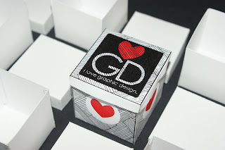
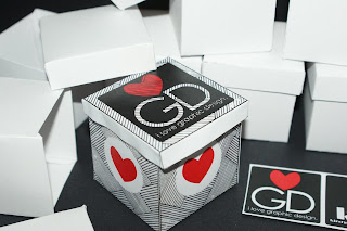
I made my box up and took photos of it with the 10 white boxes that i had made (for reasons i cannot remember). This is just to see what it would look like "finished".
--------------------
After the crit, Jo suggested i have an object for each commandment that i had written, that would be useful to the newbies. With my commandment 'make mistakes', i thought it would be a good idea to design a pen case. It would only be designed to hold pens because you cant erase pen, therefore if you make a mistake you cant try to conceal it, you can keep it as proof that you have tried it.
I used similar visual aspects as the other designs. The case is long enough to fit a standard size pen in it and wide enough to fit a fair few. The front of the case is the left hand side, this has the two logos and the commandment in a simple design. On the back of the case is the commandment, an explanation of the commandment and a small 'diagram' saying "pen=permanent=good", basically saying that using pen is good because most of the time you make mistakes with them and cant erase them.
The design above also has a 'crumpled brown paper' effect on it but i dont think that it works very well. I decided to try out in the first place because i thought it might give it an even more hand rendered feel.
the design below has kept to the 3 colours that i have been using. It looks more sophisticated and clean, the brown became too fussy and over the top.
After having a funny five minutes thinking the brown looked good, i also added it to my packaging design. It looks crap and will not appear on my designs from this point forward.
-------------------
Trying to create something for each commandment proved quite difficult as im not sure what i could design for ' laugh a lot'? So i thought it would be a good idea to design a small book with all the commandments in, just so they are easily accessible and clear. I decided to go for a hotdog book, because i have fallen in love with them since the book fair! I also think that the space they provide is just right for the content i shall be adding.
I have came up with a few designs that i will take to the next crit, where i can receive feedback on which one to take forward for the final one.


