This workshop was to help us design things for print using Photoshop and to help us understand and look at the ways in which you can use colour within your designs that will be ready to go to print.
The first thing we did was create a square and fill it will RGB's greenest green, it is a very luminous green. We then changed the colour mode to CMYK and the colour changed dramatically. This is because RGB and CMYK take up different areas on the colour gamut. RGB is screen based colour and can produce more colours, but with CMYK there is a limit on what colours we can print because of ink mixing, whereas RGB is made with light.
Above is the CMYK verion of the RGB green below, the CMYK is a lot duller.
Next we looked at how we could edit an image on Photoshop and know whether or not we can use particular RGB colours that are also in CMYK range on the colour gamut.
The gamut warning is a very helpful tool on Photoshop, once you set the gamut warning it turns all the coloured areas that woudlnt be able to print as you see them on screen to grey. This then allows you to change these areas to a colour within the CMYK gamut ready for print.
One way of chnaging the colours to within range is to use the saturation levels tool, lowering the saturation takes the brightness out of a colour. By using this tool it allows you to be in control of the changes being made to the grey areas. As the saturation levels are dropped the grey areas start to disappear.
There will probably still be a few small grey areas within the image because if you lower the saturation too much the image may become obviously dull.
Another option is to use the replace colour tool. What this does is allows you to specifically change the colour so it is within the gamut.
Once you have chosen an area where the colour must be changed you pick a colour with the gamut and then use the fuzziness tool to control how much and where you want the new colour to be used.
On this example I changed the blue in the sky so that it was in the CMYK gamut range. To be honest you cant see that much difference between the RGB version and the new CMYK version, which is obviously a good thing.
The next thing we looked at was how to create colour swatches. This was using the Pantone colour books in the colour library. By using the Pantone books you are able to get the unique reference code for every colour, which means you could send your work anywhere in the world to be printed as Pantone colours are a globally recognized colour referencing system.
These are the Pantone colour books available on Photoshop.
We also looked at applying duotones to images using spot colours. Spot colours do not use CMYK, they are their own solid colours, much like the colours in the Pantone swatch books.
By using the duotone option under image/mode you can change the black used in this monotone image to a colour and its tints.
Using one colour is called monotone, and this tool allows you to change it to duotone to enable you to use two spot colours together.
These images show the process of changing the colour using monotone and how it effects the image.
You can also change the way in which the new colour replaces the old one.
Duotoning works in the same way, you change the setting to duotone and then pick a second colour.
The above image shows how the duotone has effected the image. What they do is combine together to make a mixed colour. Using spot colours like this makes it a lot cheaper when it comes to taking design work to the printers.
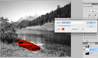
Creating new spot channel layers in the channels palet means you can choose specific areas to adjust the colour. Below are examples of spot colour particular areas of the image. You can either use the lassoo tool or masking tool to select the desired areas.
Another way of applying spot colouring which gives a really interesting effect is by using the gradient tool on a new spot channel, again this means that you get to choose where the colour changes rather than the duotones mixing together.


