Monday, 23 January 2012

Image// Editorial image: Brief one..

The Brief//

You have been given three articles, which you must produce an image to accompany. The image (s) will sit along side the text from the article in a page format so therefore must refer to the article directly.

Considerations//

THINK VISUALLY. Consider what the visual essence of your subject matter (the article) and how best to communicate this. What are the obvious responses? How can you go beyond these? How subtle can you be? Do your ideas operate as a set, series or sequence?

Practical considerations//

There are no media restrictions. You can work photographically, across three dimensions, collage, incorporate print making methods or combine all of these processes.. however you must be able to record these in a to dimensional (flat) form of the final outcome.

Background//

An image rarely exists out of context. What an image is in response to or the environment it is placed in (or a combination of the two) will define the context.

This is clear within editorial illustration/ photography/ print making etc.. you are responding directly to a body of given text and it sits within a publication (its environment).

Mandatory requirements//

All images should be supported by a broad range of visual investigation in the form of design sheets and notebooks.

The final image should be saved alongside the article on the digital file supplied with the brief.

-------------

The first article that I focused on was the Facebook relationship one. The article was about how you could determine how long you and your partner would stay together by working out how many mutual friends you had on the social networking site. I wanted to create something fairly simple and something that also reflected on what the article was talking about.

In my flat we have fridge magnets that are cut from magazines and newspapers. The letters, numbers and  glyphs could be moved around to make any word you wanted. I photographed arranged characters and used them for the first image and article.


This image I just tried using less characters but I dont think it is clear on what the article is about. The FB stands for Facebook and the two characters below are what you need to use to make a heart on Facebook.


This image works a lot better. I used more characters to write out the whole word which helps it make more sense. The article gave you a formulae on how to work out how long you will stay in your relationship. I tried playing on this by putting 'love divided by Facebook'.

------------

The next article that I focused on was the one about how we as a species have no idea about numbers. We do not grasp how numbers work and we have no idea how to handle big numbers.
I decided to again use photography. I made a number mobile, using a coat hanger, cut out card numbers and fishing wire. I then asked my flatmate to dress smart (like a business man) and look confused whilst I hung the numbers around his head.


I took a few photographs to then try and get the best one. Some of them he looks more constipated than confused. I decided to use black and white because I think it works better. It keeps the image simple and to the point.


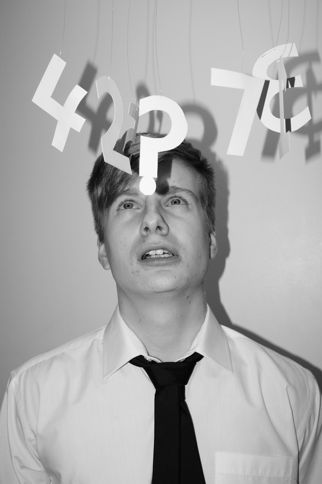
He looks quite scared of the numbers here. I tried to make it look like the numbers were hanging round his head like a bad headache (a bit like in cartoon when they see stars if they've been hit on the head).


This one looks as though I have hooked the question mark onto his nose. I made it look as though he was trying to push the numbers out of his way because he was so confused.


This is the photograph that I ended up using for the final article. I decided on this one because he looked very confused but in a comical way. The numbers were arranged in a confusing way. I think it works really well in response to the article because it ads a bit of humour. The article is quite serious so I wanted to lighten it up a bit.


This is what the final article looks like. I think the images work really well with the layout of the newspaper and also the tones of voices of the articles. The Facebook imagery doesnt work as well as the other image, I think this is because the space for the image was round and my picture would work better using a rectangular format. I also like the fact that the larger image is a bit comical as it lightens the mood of the page and in my opinion makes it more engaging to read.

The final article.


After saying this would be my final article ^^ I decided to re- visit the Facebook article image as I felt the standard of the one above wasnt up to scratch. I decided to create my own space for the image rather than sticking with the circle as I felt this restricted me and also made it difficult for anything to work in that frame.

-----------------------------


What I decided to do was use the Facebook icon within my image but simplify it, I then made a similar icon to the Facebook icon, but used a love heart instead. This meant that it communicated the link between Facebook and relationships. With the design above I put the icons into an equation trying to communicate the message of the article. I think it works quite well, it fits better with the tone of voice of the article and the style of the newspaper.


This is what it would look like on the spread with the article and another article and image.


With this design I thought I would see what the article would look like with just the one symbol. It is clear that it has something to do with Facebook and love. I think it works well because its simple and distinctive.


I changed the red to a slightly lighter shade as it was hard to distinguish between the heart and the background colour.


In the end I decided to combine the two previous icons into one which shows both elements of the article, those being Facebook and relationships. I have then kept the icon big and used it on its own. Its easily recognized to be associated with Facebook as I have used the blues and the white heart in replacement of the white letter 'f'.


This is what the final two articles will look like. I think they have come out well. They fit well with the article content and they are in context. I think it works well how I have used a photographic and illustrative element on the spread as it makes it more interesting. The photography worked well because it was humerous and lightened the tone of voice of the article without being out of context. The Facebook illustration works well because its simple yet it still communicates what it needs to.


-------------


This is the other article image that I created as part of this brief. The article was about exercise and how it will keep you fit when you get older. For the image I have designed an illustration of a red blood cell doing weights to communicate how exercise is good for your body.

I dont think that it works that well and I feel I could have maybe thought of a better idea.


Thursday, 12 January 2012

Design for digital// Top 10.. Idea proposal..

I will be creating a 60 second motion graphic sequence which will be based upon the theme of Bucket Lists. I have a Top 10 of things on a bucket list and will be creating short clips within my sequence of each one. The illustrations will be traced from sourced imagery in Illustrator. These will be kept quite simple in terms of detail and colour. The illustrations will have a 4-5 second slot each, within this time the illustrations will move in some sort of way within the frame and will then disappear from view, this will then allow the activity to pop up (using type) before moving on to the next activity.

The opening of the title sequence will give a short overview of what the programme would be about, before going through the Top 10. I think that I will also be using the definition of Bucket List within the beginning of the title sequence just in case my audience is unaware of its meaning.

For the end of my title sequence I am going to have a James Dean quote fade in, the quote will be:

'Dream as if you will live forever, but live as though you will die today'


I think this is a very appropriate quote to use because it is inspiring and obviously relevant to my chosen subject. The aim of my title sequence is to make my audience want to watch a programme that will motivate them to try new things and live life to the full.

The colours that I have chosen to use are a sky blue and a warm orange (including their tonal values). The reasoning behind these colours is that they are both used on the Bucket List dvd cover and they are also very inspiring colours when you think of blue skies and sunrises.

I have chosen an audio for my title sequence which will be The Bucket List soundtrack No.19 A wink and a smile. The audio is jazz music and its a very upbeat and happy song.

My target audience for my title sequence and idents is 18-40 year olds, male and female. The reason I chose to target this particular age range is because 18 is when you start to decide what you are wanting to do with your life, so my programme would inspire to try new things and the upper end of my target age was chosen because they say life begins at 40, some people think they may be getting old so my programme would inspire them to get out there and again try new things and have fun.

The purpose of my title sequence/ idents and programme would to be light hearted and inspirational, it would also be a bit educational as you would learn about the Top 10 and hear stories about experiences.

The title sequence would be shown on Channel 4 at 7:30pm. This would be just after the news and before Location, Location, Location (which would link well from my sequence). I decided on Channel 4 because they often have TV programmes on that are factual and random. The idents would need to be shown in the morning around 8:00am and the evening at around 5:00pm, this is because my target audience would most certainly be working throughout the day.

Wednesday, 11 January 2012

Design for digital// Top 10.. Idea generation..

These short videos are my initial ideas for the 'Top 10' brief. I wanted to use existing imagery that I found online and edit and manipulate them to a design approach that I wanted to work with. I traced the photos in Illustrator and then took them into After Effects and applied a white solid layer which turned the stroke and fill white, on some though, this didnt work too well because the outline wasnt always drawn the same.


This short video above is one of a skydive. I have applied a blue solid layer background to represent the   sky. I have then used the scale and position key frames to make it look as though the skydivers are free falling. This was made when I first started to learn how to use After Effects and I feel that it is very basic and possibly too simple. There is no sort of effective transition and it looks too plain. It was good practice though, in how to use certain tools in After Effects.


In this short video I have tried to make it look as though someone is running a marathon. I had to be careful not to show his legs too much or it would not seem realistic. I made the runner run along the bottom of the frame and 'bop' up and down using the position key frames. Unfortunately this didnt work too well as you could still see his legs. Placing him at the bottom of the frame also meant I was wasting a lot of the space and not using it to its fullest potential. It also doesnt work how I have started with a white solid layer background which then fades into blue. I didnt really have a point for this and it just doesnt make sense how it goes from white to blue. I also had a problem with filling the person with a white fill like the skydiving example and the outline on its own doesnt work, its too dull.


With this video I tried combining the two above to experiment with transitions. They dont really work too well because the transitions are not smooth enough. I think that I need to reconsider how I am going to approach this brie, as so far I am not happy with what I am producing. They dont really feel as though they have had much effort put into them.

Monday, 9 January 2012

Design for Digital// Silent movie final sequences..

Below are my 5 final 5 second sequences working with the word expand.

These are my five final five second sequences for the Silent Movie Brief. I am pleased with the final outcome of this brief, I feel that I have communcated the word 'expand' well within each one and I have done so in a different way each time. I decided to use the colours orange and white for my sequences because I love the colour orange and I think it works well with a white background.


This is probably the second best out of the five. It is one of the first ones that I did and I think it communicates the word well. I decided to just expand the axis of the letter 'x' as I felt this was the most prominant letter in the word expand. I think the fact that I have expanded and then contracted the word makes the sequence a bit more interesting. I did this by using the position key frame tool in After Effects. I set up a key frame at the time I wanted the letter to expand and then drag the axis outwards to make it look as though it were stretching.

Below are my 15 screen grabs as a PDF uploaded to Issuu. The screen grabs are taken of important key frames within the sequence.


This is my favourite sequence out of the five final ones. I think its because of how well the typeface suites the word 'expand'. The typeface has a hand rendered feel to it which I think makes the way in which I have added motion, makes it more fun. I have again focused on the letter 'x' for the same reason as before, I have made it so that the four corners of the letter expand out one at a time. I did this by using the position key frame tool, it makes it look as though it is dancing. The letter then transforms into a distorted shape and the remaining letters reverse out into the white background.

My 15 screen grabs are in a PDF below as an Issuu publication.


This is my least favourite and successful sequence out of the five. I feel that it didnt really do what I wanted it to do and it could possibly cause confusion over what I am trying to communicate. I think that the typeface works well and the way in which I have approached the word 'expand'. Its just as it gets near the end of the sequence there starts to be a bit too much going on. I focused on the serifs of the letters and expanded them by using the position key frame tool. On some of them, the lines became to thick which made it look a bit messy.

Below is my Issuu publication of the 15 screen grabs of the sequence.


This is one of the last sequences that I made for this brief. I have again focused back on the letter 'x' and expanded it to the size of the frame and then contracted it back and placed it with its word. I think that it  clearly visually communicates the word 'expand'. It is a very simple sequence that shows my skills of using the scale and position key frame tools in After Effects.

Below is an Issuu publication of my 15 screen grabs for the above sequence.


This is the last silent movie sequence that I made in After Effects. It is a very simple piece of motion graphics but I think it works well. I have used the scale key frame tool to change the scale of the word using two key frames along the time line. I could have maybe spread the letters as the word got larger and expanded.

Below is the Issuu publication showing my 15 screen grabs.


Friday, 6 January 2012

Design for Digital// Expand: Experiments..

Silent Movie// Brief one:

Below are some experimental examples of my 5 second sequences for the word expand. They have been created in After Effects and each one is visually communicating the word expand.